If you want to become a digital artist, but you don’t know where to start, this series is for you! I’ll explain to you all the basics in an organized way, without assuming any prior knowledge about the topic. In this second part I’m going to show you the most important differences between creating traditional art and digital art.
Part 1: Digital Drawing for Beginners: Best Program for Digital Drawing
Some people say that drawing on a computer is not really drawing, because the computer does the job for you. Others claim that there’s no difference between drawing on a sheet of paper and a graphics tablet—after all, you hold the pencil and the stylus the same way. But I would say that the truth lies in between.
In this article I’ll show you what makes digital sketching different from traditional drawing, and what to expect when you transition from your paper sketchbook to a digital workspace. I will be using Autodesk SketchBook as an example, but the same rules should apply to other drawing programs.
What Image Size Should You Use?
When you draw on paper, the size of the drawing doesn’t matter so much—if you want to make the artwork bigger, you just need to bring it closer to your eyes, and it will be magically enlarged with no loss. You can also take a photo or scan it, and create a huge print even out of a tiny artwork.
In traditional art, size is relative
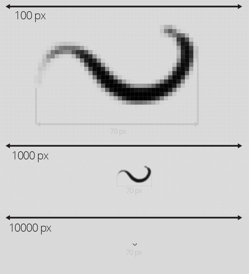
In digital art, it doesn’t work like this. Yes, you can zoom in, but at one point your image will start to get pixelated or blurry. Why? Because traditional lines are made of infinitely small particles, and digital lines are made of pixels.
There are special algorithms that can remove the pixelation, but it never compares to the quality of the original size
Let me show you how it works. Your digital canvas is like a grid made of tiny little squares called pixels. When you draw, you simply fill these squares with colors. The smaller the pixels are, the smoother the lines look. So we want to keep the pixels as small as possible!
The size of pixels is relative, so the more of them you have in the image, the smaller they will seem. That’s why it’s so important to choose a proper image size before you start drawing. In theory, if we want to keep the pixels as small as possible, we should pick the biggest image size possible. But big size comes at a cost. The more pixels in your every stroke, the more work your processor has to do to display it. If you notice any lags when drawing, this means that your processor has a hard time catching up to your hand. So we don’t need a huge size, we only need optimal size.
Optimal size depends on how you intend your artwork to be displayed in the end. If you want to create a printed artwork, pay attention to the Document Size values. They show you the maximum size of the print you can create with the current image size. Resolution of 300 pixels per inch means a very high print quality, but you can lower it to 72 pixels if the artwork will be mostly seen from a distance.
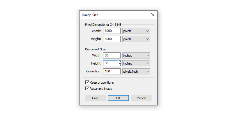
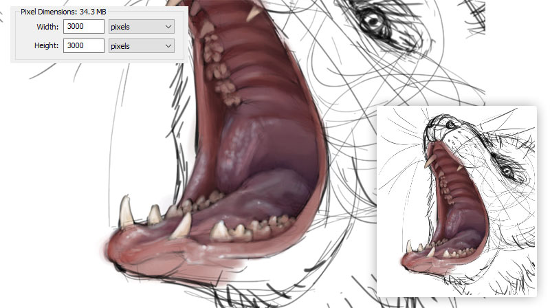
Go to Image > Image Size to see this window
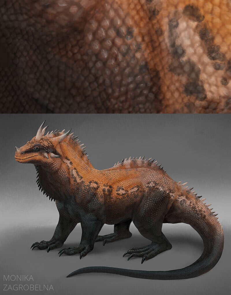
If you want to publish your artwork digitally only, you have to consider two things separately: working resolution and target resolution. Working resolution depends on the amount of details you need. For example, if you want to draw scratches on individual scales of a dragon, you need a high resolution that will allow you to keep these scales big. But if you want a more stylized artwork, then smaller resolution will be fine.
In SketchBook, default resolution is 3000 pixels wide and high. This is perfect for most sketches, so I usually start my drawings this way. And if I want to move to the detailing stage, I simply resize the image to around 6000 pixels wide.
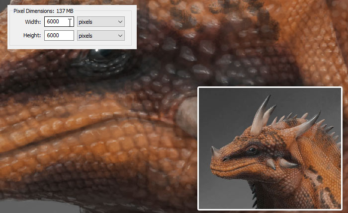
Bigger size gives you access to the tiniest of details…
… but you don’t always need them.
But working resolution is for you, not for the viewers. You don’t want people to analyze every scratch on every scale, you want them to see the dragon as a whole! That’s why, before you post your artwork online, you should resize a copy of the image to the target resolution. Target resolution, the one that your viewers will see, shouldn’t be too big for one more reason—it would make it easy to print the artwork in high quality and sell it without your permission.
For example, a high quality A4 print can be created from an image 2500 pixels wide and 3500 pixels high. Make it twice smaller, and it can still be turned into a slightly lower quality A4 print! So in most cases, I try to keep the longer side below 1500 pixels, and usually even below 1000 pixels. The other reason for it is it simply looks good on most screens—big enough to show all the details, and small enough to show it all without scrolling. But it’s all a mater of personal preference!
Big vs small. Which one do you think looks better?
What Brushes Should You Use?
Your drawing stylus is a magical thing—it can be a brush, or a pencil, or an eraser, or whatever you tell it to be. But how to tell it what you want it to be? Or in other words, how to recreate your favorite traditional tools in the digital environment?
Basic Brush Settings
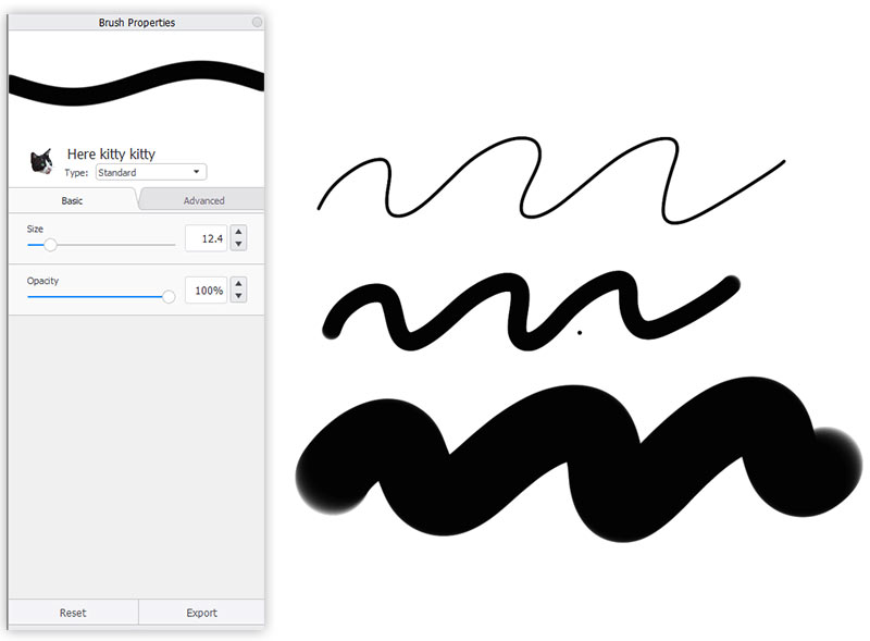
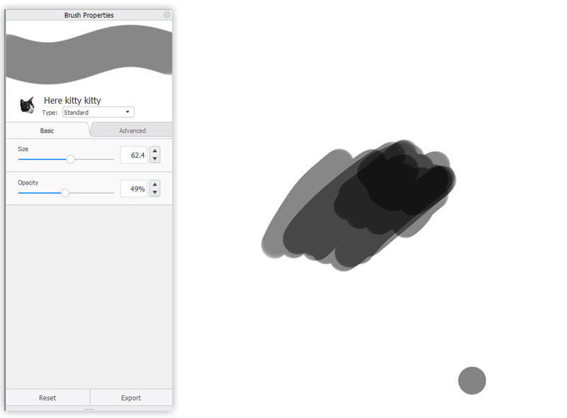
SketchBook offers basic and advanced brush settings. Let’s start with basic ones. You can decide how big your brush marks should be, and if you want them to be fully opaque, or maybe more or less transparent. As for the size, I prefer to change it dynamically with the bracket keys ( [ and ] ). I never change the Opacity here—I prefer to control it with the pressure, or with layer settings.
Advanced Brush Settings
The advanced settings are more interesting. SketchBook divides them into four categories: Pressure, Stamp, Nib, and Randomness. I’ve prepared a very basic brush for you, so download it if you like, and let’s experiment with it together.
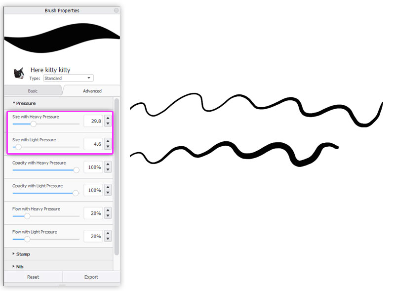
Link Pressure to Size
Pressure means, of course, how hard you press your stylus to the tablet. You can use pressure to affect Size, Opacity, and Flow. Size is pretty straightforward—what do you want to happen to the Size of the stroke when you press hard, and what when you press light? By tinkering with these sliders you can create tapered lines, or thick and round lines.
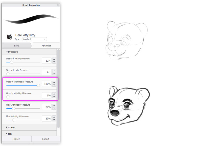
Link Pressure to Opacity
Opacity is even cooler. Let’s say you want to sketch something, but you’re not yet sure what you’re drawing. You can draw very, very lightly, to make these lines barely visible. And when you start feeling more confident, you can just press harder to make the lines darker and more visible. Honestly, I wish such a tool existed in traditional art—it’s like a pencil and an ink liner all in one!
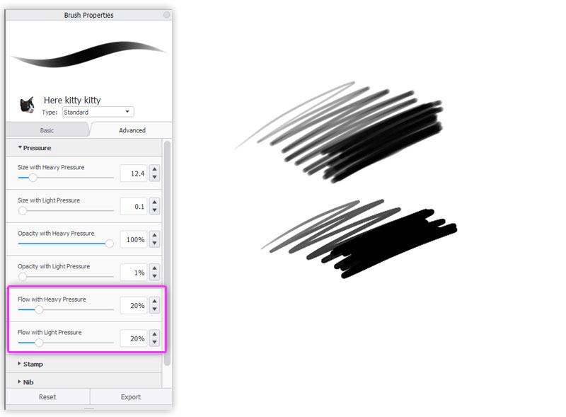
Linking Pressure to Flow
Flow tells you how concentrated the paint is. If Flow is low, you’ll have to paint a lot of strokes until you reach the level of translucency set by Opacity. If it’s high, you’ll get that level very fast. So if you want to add water to your paint, just reduce the Flow.
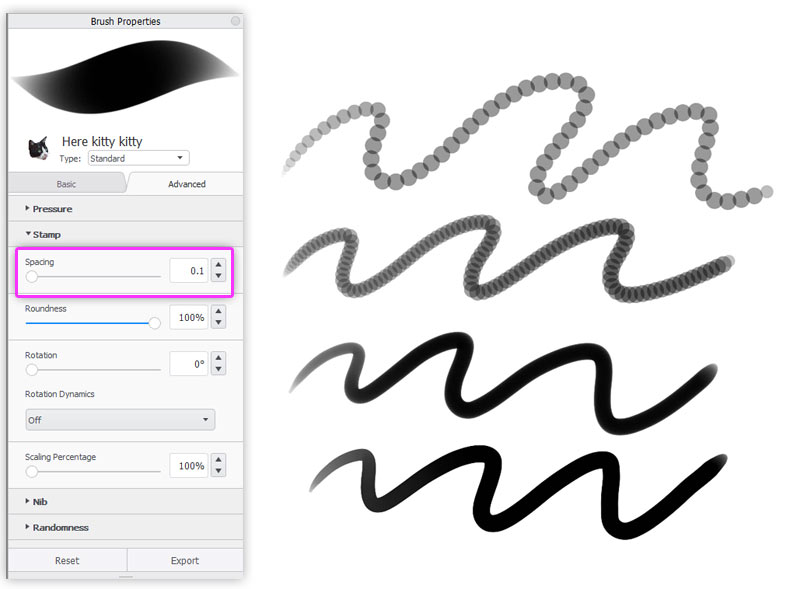
Stamp
Stamp is a name for the basic shape of your brush. You can see this shape by clicking once. You can either draw a lot of these shapes one after one to create an illusion of a line, or add some space in between to create an interesting effect. That’s what Spacing is for. The lower the Spacing, the smoother the line, but be careful—your computer may not handle the lowest setting well, especially if your image size is big.
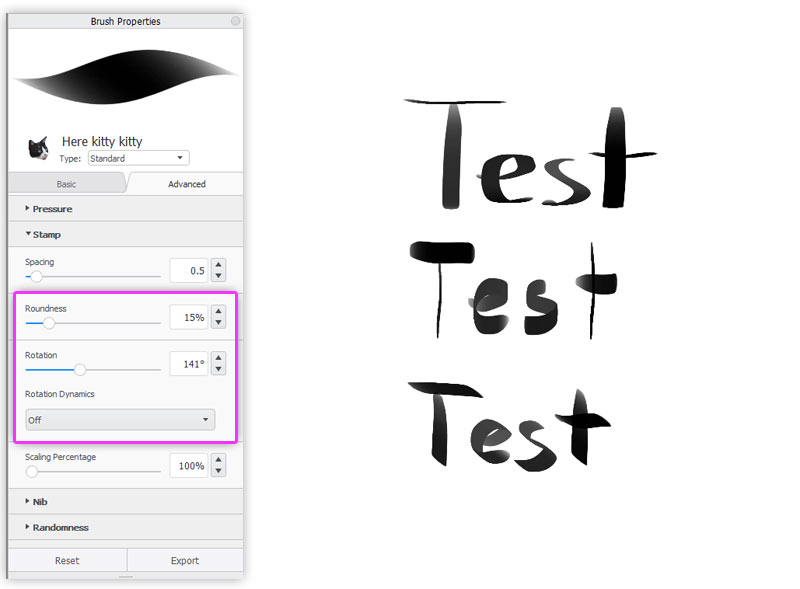
Roundness
To understand Roundness, imagine the nib of your tool. Is it round like a ball-point pen? Or flattened, like a fountain pen? This is where you can regulate it.
When the stamp stops being round, its orientation towards the edges of the canvas starts to matter. You can easily regulate it by changing the Rotation. This is especially important for calligraphy brushes. You can also change the rotation dynamically by binding it to the direction or tilt of your stylus.
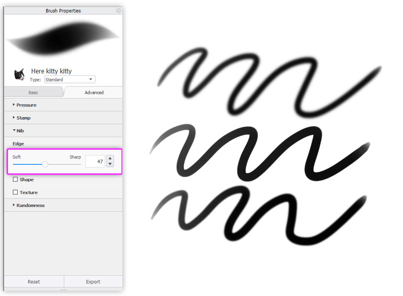
Softness
Let’s go to the Nib tab. Here you can decide if you want your brush to be soft like an airbrush, hard like an ink liner, or something in between.
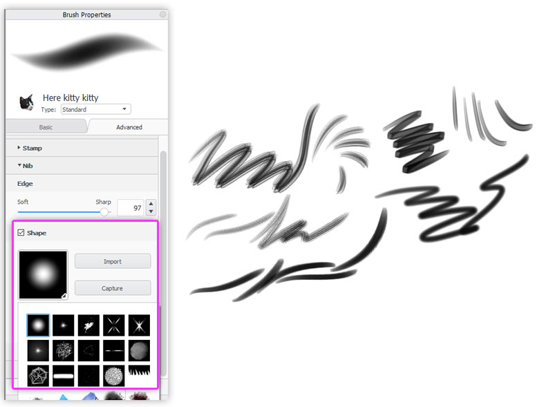
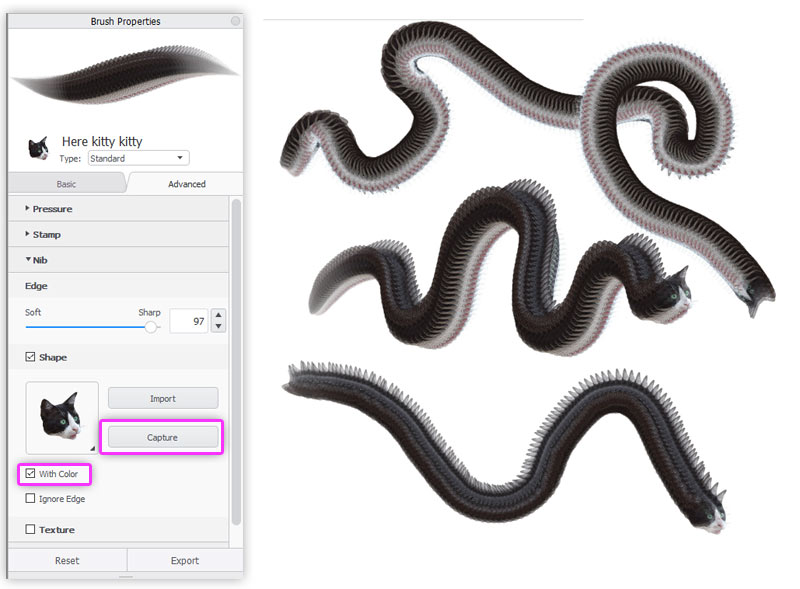
Shape
If you check Shape, you can replace the basic Stamp shape with something more interesting. This simple mechanism allows you to create an endless variety of brushes, even multi-color ones! You can import a shape, pick one from the default list, or draw your own shape with some other brush and capture it directly from the canvas.
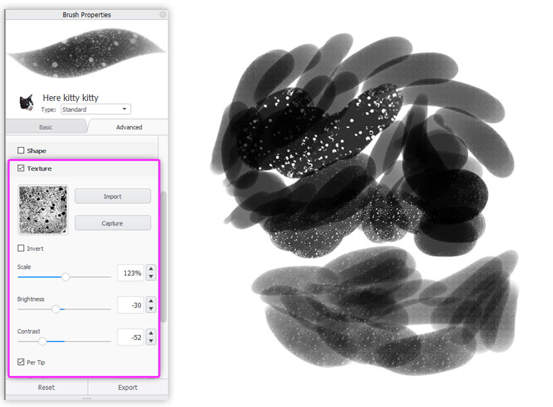
Texture
You can also add texture to the strokes. It doesn’t change the shape of the brush, but rather distorts each stroke with a chosen pattern. Digital lines often seem unnaturally clean in comparison to traditional ones, but adding a texture can help you avoid it. You can use textures downloaded from the internet, use the default library, or capture something from the canvas. The sliders in this section will help you adjust the texture to your needs.
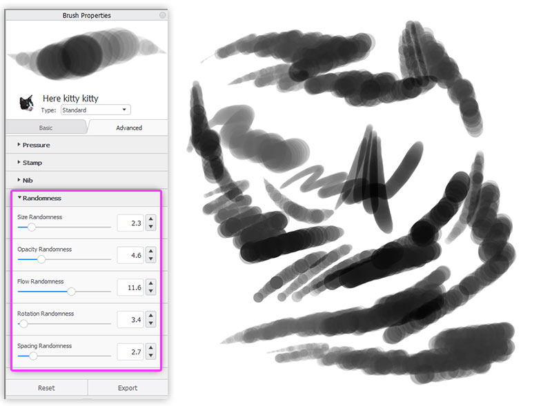
Randomness
Finally, let’s take a look at the Randomness tab. Traditional strokes always have this hint of unpredictability to them. This makes traditional art look more organic, more natural, less planned. But you can simulate this effect by adding a pinch of randomness to your strokes. You might have set a specific Size, Opacity, or Flow earlier, but changing them slightly from time to time won’t hurt—instead, it will give your brush some life of its own.
Brush Type
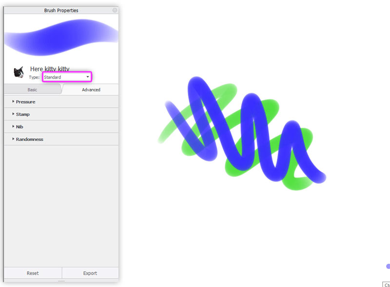
But that’s not all! On top you have a special menu, where you can set the type of the brush. You can choose from the Blend Modes that you may know from Photoshop, but there’s something extra here. The first eight positions define how the strokes interact with each other.
Standard
In the Standard mode, the strokes cover each other according to the Opacity you have set for them. This is very predictable and useful, but also purely digital. If you’re used to traditional tools, you may be more interested in the other types.
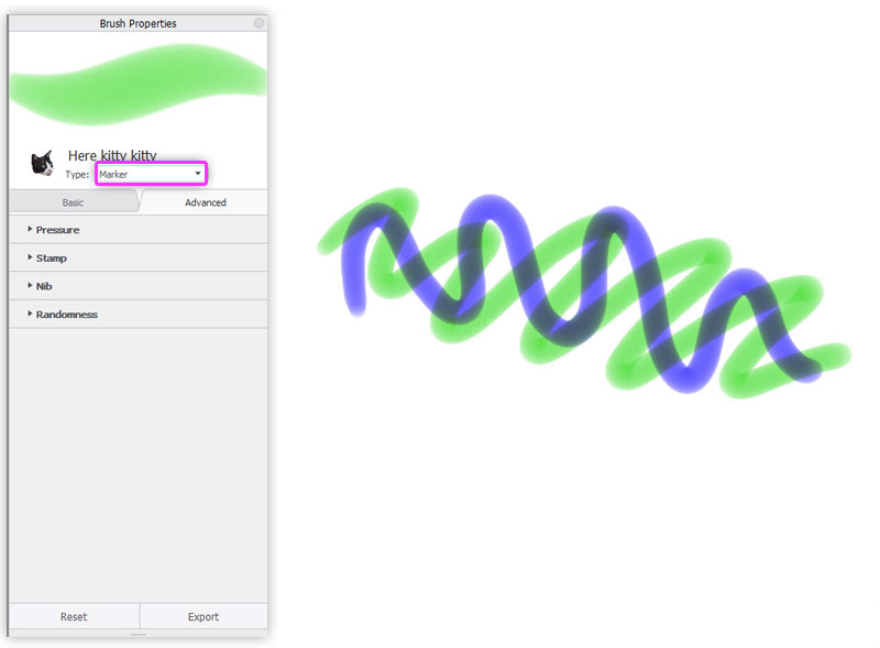
Marker
If you have ever used markers like Copics, you know that they have this special way of blending: they don’t cover each other, but they rather mix in a specific way. And you can’t make a dark line brighter by drawing with bright color over it. So that’s exactly how the Marker mode works. It’s perfect in combination with the default Copic color library available in SketchBook!
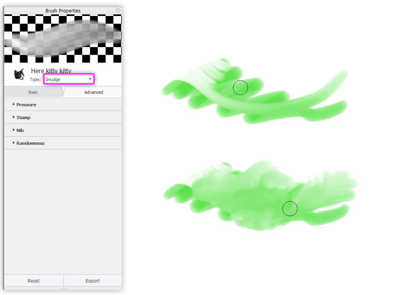
Smudge
The Smudge mode makes it possible to smudge the contents of the layer. You can use it for strong blending, or for creating an illusion of fluffy fur. If it’s too string for you, try Colorless mode instead.
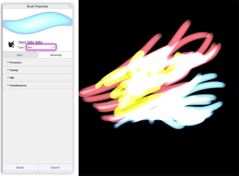
Glow
The Glow mode adds some magic to your brush. It brightness the strokes very effectively, so it can be perfect for painting fire, glowing eyes, or magical effects.
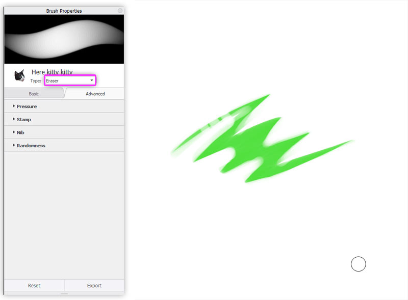
Eraser
With the Eraser mode you can turn every brush into an eraser. It may not sound very interesting, but think of it this way—in digital art, the eraser is an anti-brush, a brush that paints the lines away. It has way more uses than simply removing mistakes!
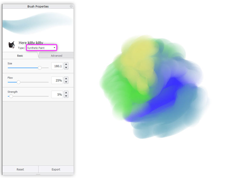
Synthetic Paint
If you’re familiar with traditional painting, you’ll love the Synthetic Paint mode. It blends the strokes automatically as you paint, creating a nice, natural effect, and saving you time. Pay attention to the Strength slider that appeared in the basic settings—it allows you to define how “wet” the canvas is.
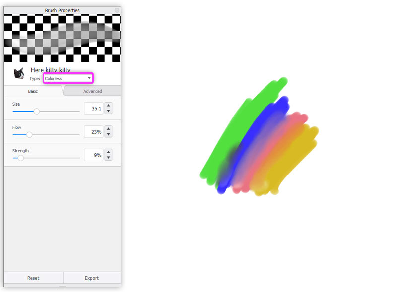
Colorless
The Colorless mode has been designed for blending of all types. You can use it like a blending stump that works for every medium, even oil paint. It works like a softer version of the Smudge mode.
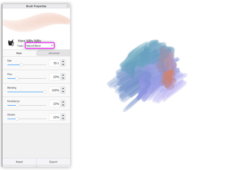
Natural Blend
The Natural Blend mode is perfect for creating pastels. It combines soft and hard blending characteristic for this medium. But because it has three additional sliders to play with, you can use this mode to create other interesting brushes, too!
What Are Layers For?
In digital art you can create separate layers in the artwork. This means that you can draw over the lines, or under the lines, or remove some lines without affecting the others. You can create new layers, remove them, copy them, merge them, and keep them in folders. Each layer is like a transparent foil that you can draw on.
Although it may be tempting the create a lot of layers, try to limit yourself to only a few. First, for practical reasons—every layer is like a copy of the image size, so it can slow your computer down. Second, your strokes can only interact with each other if they’re on the same layer. So you can’t blend or smudge colors from two different layers, and that can make the whole drawing look purely digital and unnatural.
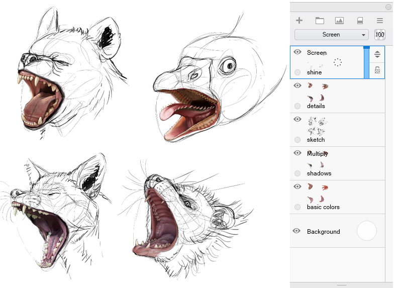
It’s best to use layers for different stages of the artwork. For example, I usually use separate layers for the basic sketch, then for a more detailed sketch, for colors, for shadows, for shine, and for the background. If I want to experiment, I duplicate a layer for a while to keep the original intact. In the final stage I often merge all the layers to work on them together.
Blend Modes
Each layer has a Blend Mode that defines how it interacts with the layers below. Most of the time, the Normal mode will be all you need, but other mode can be quite handy at times. Let me show you a quick overview of the most useful ones.
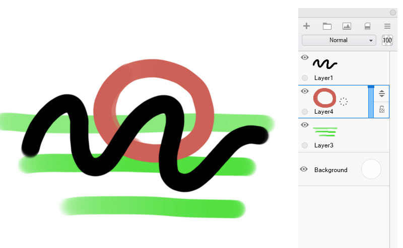
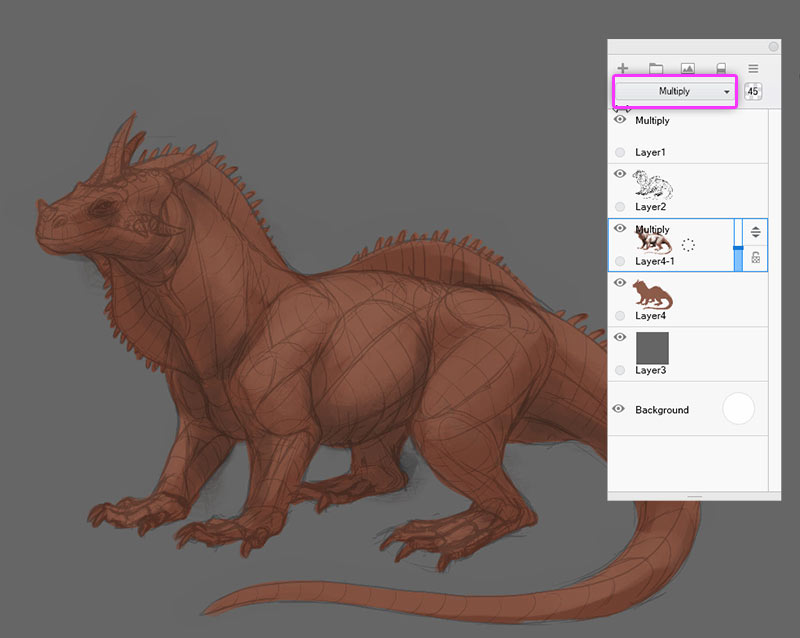
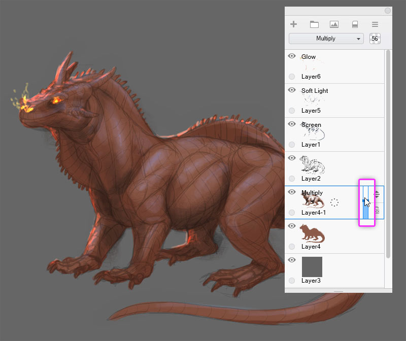
Multiply
Mutliply is perfect for adding shadows. It darkens the colors below—the darker the color you paint with, the stronger the darkening effect. If you paint with white, though, it will remove the darkening effect. So you can, for example, fill the whole layer with a dark color, and then paint the shadows away by painting with white. And because you’re painting on a separate layer, the colors below are not really modified at all!
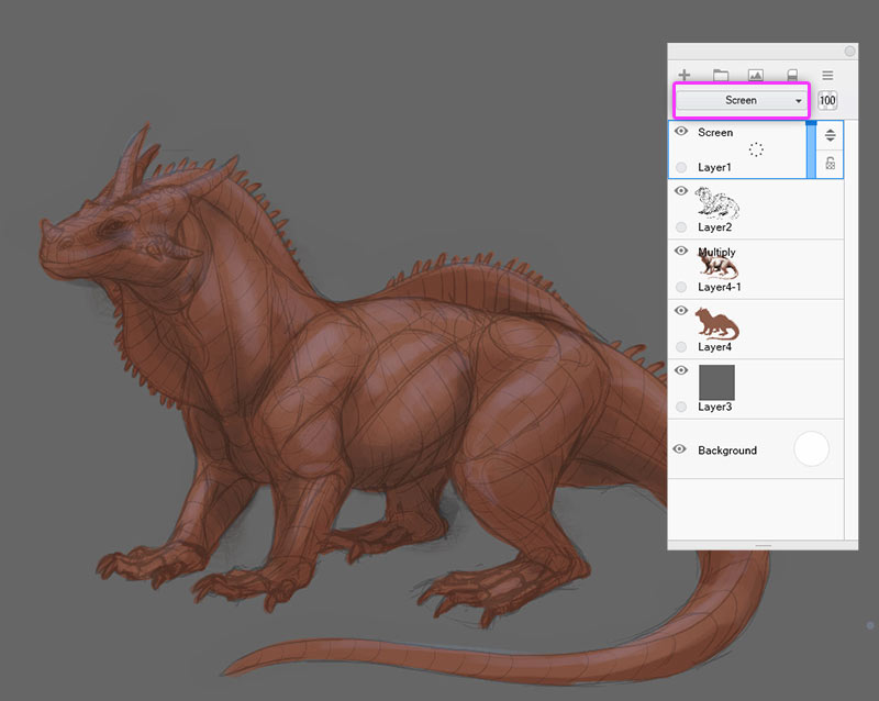
Screen
The Screen mode works just the other way around. Whatever you paint with, it will brighten the colors below. Black, on the other hand, will remove this effect. It’s perfect for adding shine!
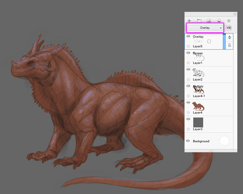
Overlay
Overlay is like is like a hybrid of these two. If your color is dark, it has a darkening effect, if it’s bright—a brightening effect. It results in more vibrant colors than those of Multiply and Screen, so it allows you to create more colorful shadows and shine. If it’s too intense, Soft Light works like a softer version of Overlay.
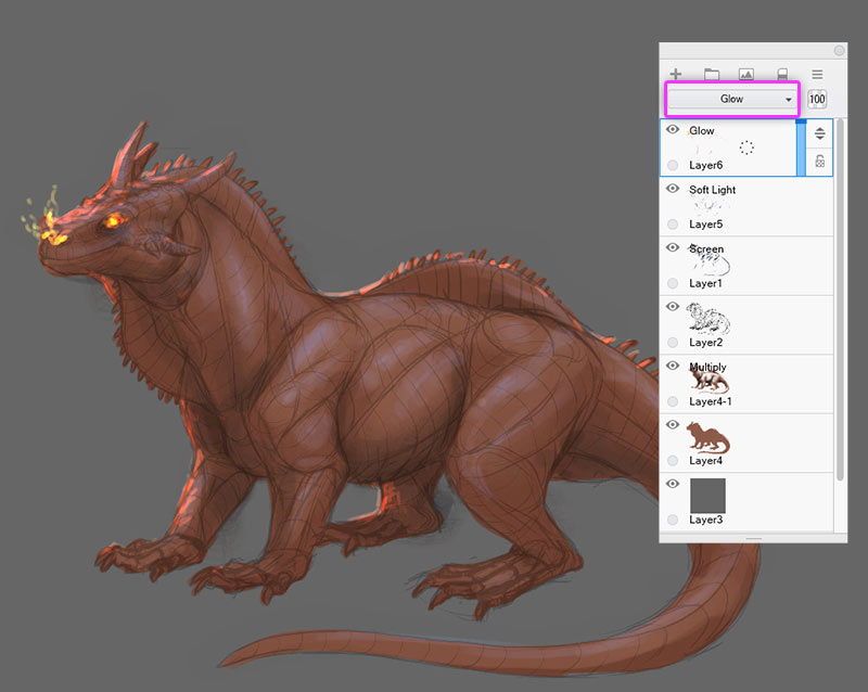
Glow
Glow is a truly magical mode. It brightens the colors vibrantly, much stronger than the Overlay mode. The brighter the colors below, the stronger it works. It’s perfect for painting subsurface scattering, vibrant rim light, or magical effects.
Opacity
Regardless of what mode you use, you can control its intensity by dragging the Opacity slider.
What Can You Do With the Drawing?
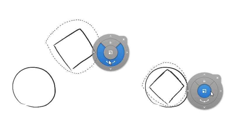
In digital art you can modify the drawing in a few cool ways. First, you can select a part of the drawing and move it somewhere else, rotate it, or resize it—perfect, if you noticed the head is too big or too small, or too far from the body. You can also copy or remove the selected area.
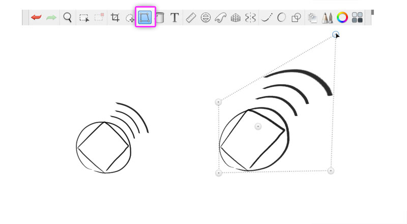
Second, you can skew the drawing—make it longer, wider, or even change its perspective. It can be useful if you want to place a grass texture on the ground and make it follow the perspective of the picture.
Third, you can mirror or rotate the image at any point—either a single layer, or the whole canvas at once. You can also crop the image but remember—you can’t go back!
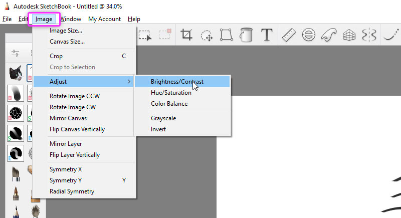
Additionally, SketchBook has a few color adjustments that you can use to make the colors more vibrant, or increase the contrast, or remove the colors.
How to Keep Your Work Safe?
In traditional art, your drawing is material—you can touch it, you can take it with you, and it can be destroyed, but it can’t just disappear. Digital artwork, on the other hand, is only being displayed by your computer. This means a few things.
When you draw digitally, the lines appear on your screen, but they’re not really there—they’re only being displayed, and they’re temporary. If you want to save these lines for later, you need to tell your program to turn your drawing into a digital file. This may be obvious to you, but here’s why I’m talking about it: you need to be aware that if your computer turns off during your work, you lose everything you have drawn since the last save. That’s why you need to make a habit of pressing Control-S every time you draw something you would hate to lose.
It’s hard to believe that all your work is stored here!
Second, your file can get corrupted. It happens when your computer turns off during saving, but there are also other accidents you can’t foresee. That’s why it’s good to create copies of your artwork. In SketchBook it’s very easy—every once in a while, press Control-Shift-S instead of Control-S. Your filename will get a assigned a number and you’ll be drawing in a separate copy from now on.
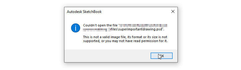
What a terrifying message! Luckily, we have a lot of backup copies available. Or do we?
But your artwork files are saved on the disk, and what if the disk breaks? Your drawings will be lost forever! That’s why it’s good to create regular backups of your art folder. You can use a cloud service (Google Drive, Dropbox), or just send the files to another disk in your home.
I know I may sound overly careful, but I have lost a couple of drawings in the past by being too optimistic. If you can avoid it so easily, it’s not worth taking the risk.
That’s All!
These are all the basic things that I wish I knew when I first started using digital art programs. We’ve just scratched the surface of digital art, but with this knowledge it will be much easier for you to understand everything as you go. Next time we’re going to look into painting 3D objects by understanding light and shadow.
Check out other parts of this series:
0 Comments