If you want to become a digital artist, but you don’t know where to start, this series is for you! I’ll explain to you all the basics in an organized way, without assuming any prior knowledge about the topic. In this last part I’m going to show you how to paint different materials and different colors.
- Part 1: Best Program for Digital Drawing
- Part 2: What You Need to Know Before You Start
- Part 3: Basics of Digital Shading
Last time I showed you how you can create 3D looking objects by using shades of grey only. And although you can draw fantastic artwork this way, our world is full of color and it would be a shame to not use it in art! This time I’ll show you how to paint with colors and how to create an illusion of different materials. If you have problems with muddy colors, or if all your objects look overly smooth, this tutorial is for you!
How to Use the Color Editor
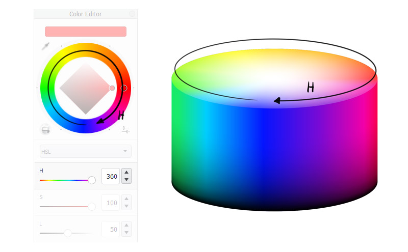
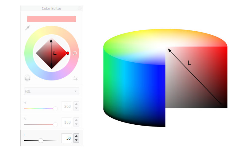
In digital art you don’t buy colors—you create them using a color editor. There are three properties of color that you can manipulate: Hue, Saturation, and Lightness/Brightness. Most programs lets you edit these values using sliders, as well as some sort of a color wheel.
Hue
Hue is simply a type of color, like red or green. There are many shades of every hue.
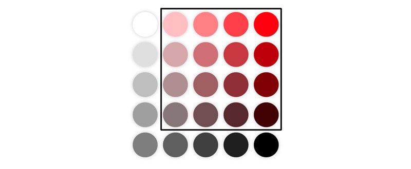
In SketchBook you can pick a Hue you want by clicking on the colorful ring in the Color Editor, as well as by using the first slider on the list.
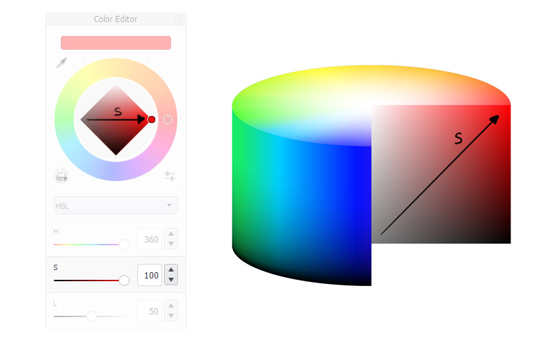
Saturation
Saturation tells us how much pigment of some Hue our color contains. The higher the saturation, the redder the red.
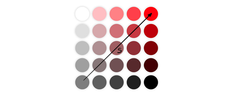
Saturation is linked to Lightness, and in most programs they’re both controlled with a gradient square or triangle. In SketchBook you can increase Saturation by moving from left corner of the square to the right, or by using the second slider on the list.
Lightness
Lightness or Brightness tells us how much black our color contains.
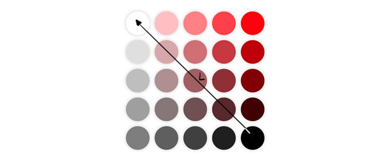
To increase Lightness, you can move from the bottom corner of the gradient square to the top, or use the last slider on the list.
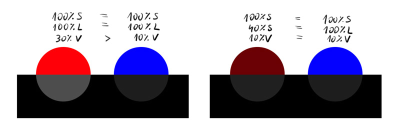
Value
Now you know where you can control these three properties of color. But did you know that there’s also a fourth one? It’s called Value, and it’s linked to Hue. If you compare two colors of equal Lightness and different Hues, you’ll notice that one is brighter than the other. This is something you can’t control with any slider—some hues simply seem brighter to our eyes.
Everything You Need to Know About Color
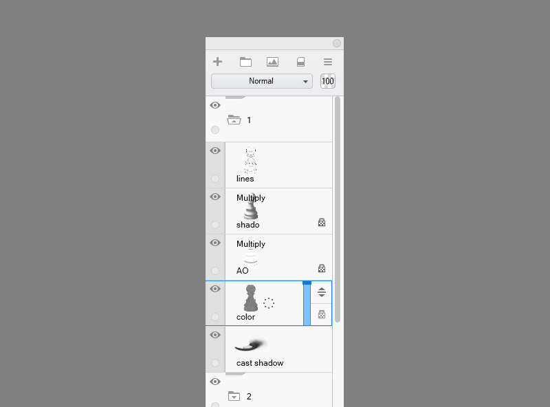
You know how to shade an object to make it look 3D. If you used my method, to add the colors without affecting the shading, you just need to color the Color layer. Just remember to adjust the shape of the pattern, if you use one, to the form of the object.
But if it was so easy, I wouldn’t write a separate tutorial about it, right? There are a couple more thing you need to know to make the colors look realistic. Let’s start with…
Subsurface Scattering
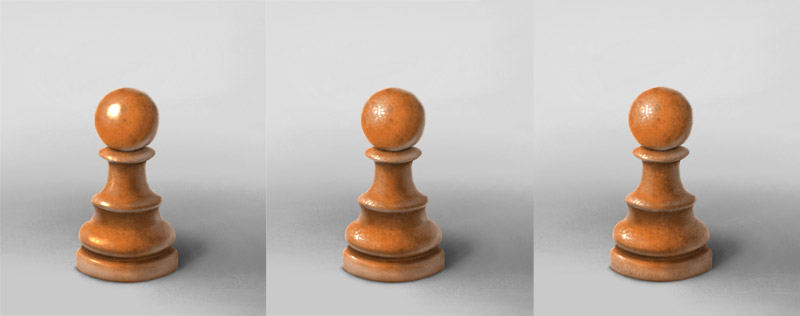
As you remember from the last time, shadow is the area blocked from the light. The light hits one side of the object and gets reflected from it, not reaching the other side. But this isn’t always the case. Some materials don’t reflect light that strongly—they let some of it in. And once it’s in, it can go out the other way—right to the shadow area, brightening it as a result.
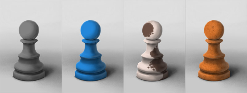
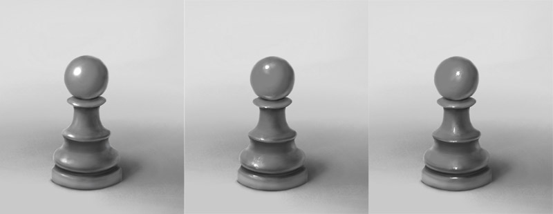
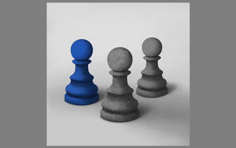
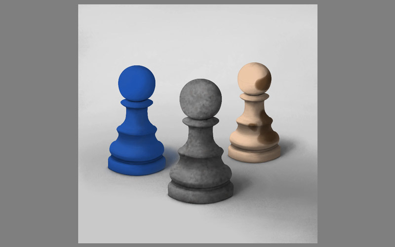
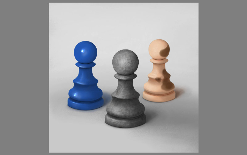
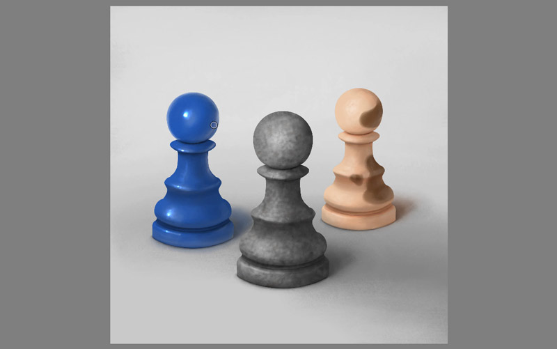
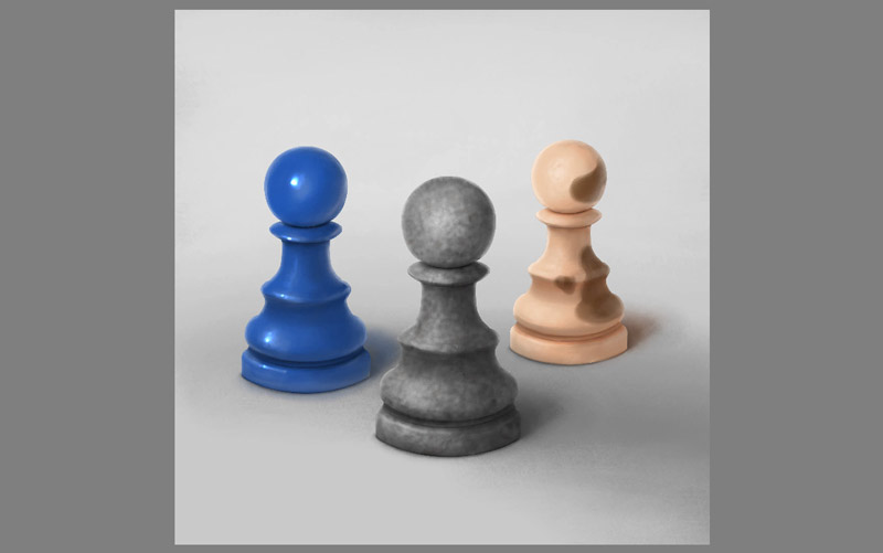
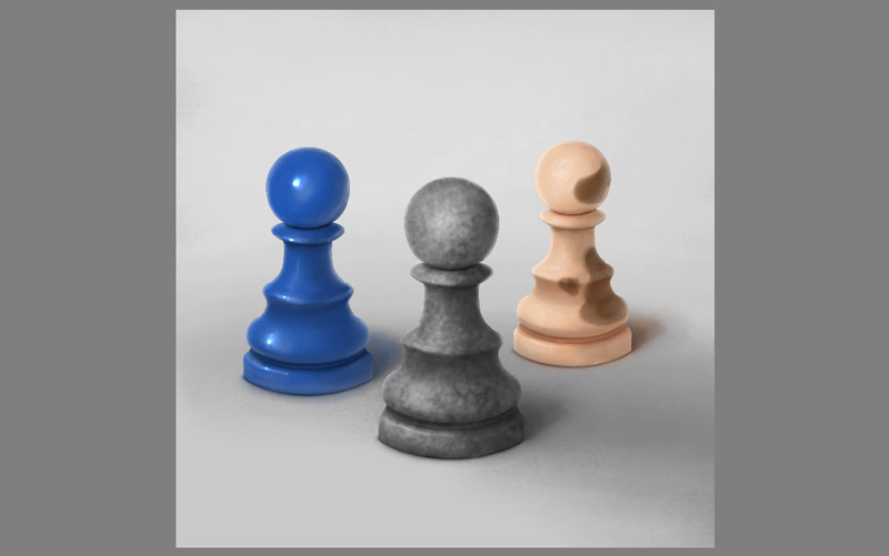
So you can change the material of the object by simply lowering the opacity of the shadow layer and the ambient occlusion layer. Just compare these pawns:
- The first one has 100% opacity in both shadows
- The second one has lower opacity in the main shadow, and thus looks more plastic than the first one
- The third one has 0% opacity in the main shadow, and low opacity ambient occlusion. It looks as if made of jelly, or matte glass
- If you remove the main shadow and keep the ambient occlusion layer almost transparent, you can make the object emit light
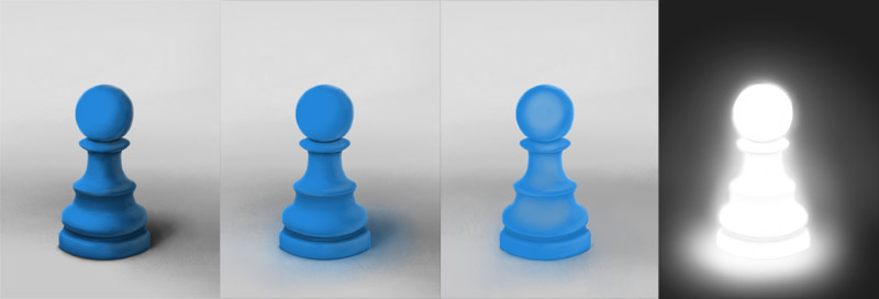
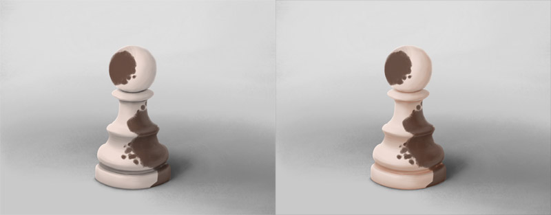
There’s one more thing that subsurface scattering does to the shadows. Some objects, especially organic, have a different color inside. Therefore, when light comes from the inside, it’s colored in some way. In this case, you should color the shadows. Skin is a great example of such material—that’s why, if you shade a face with gray, it looks like a stone statue.
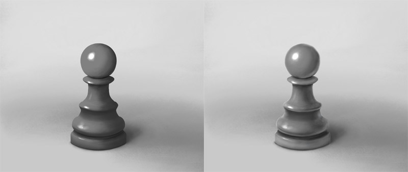
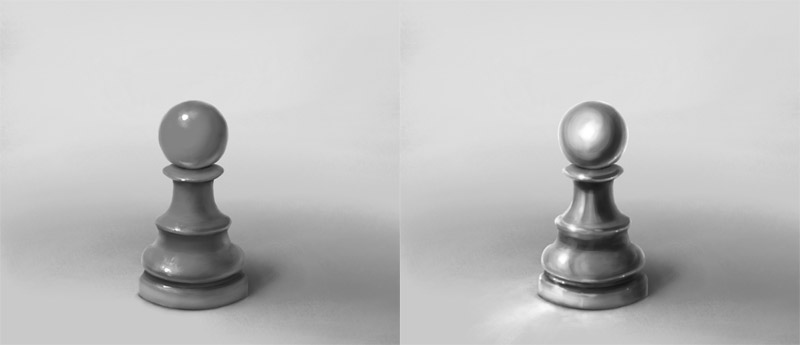
Specular Reflection
These objects are fully shaded and colored, yet they don’t look that real yet. Why? It’s because they lack one important component—the specular reflection, or, in layman terms, shine.
When light hits the object, it usually gets a little scattered before it gets reflected. But sometimes the surface is so smooth that every ray gets reflected exactly in the same way.
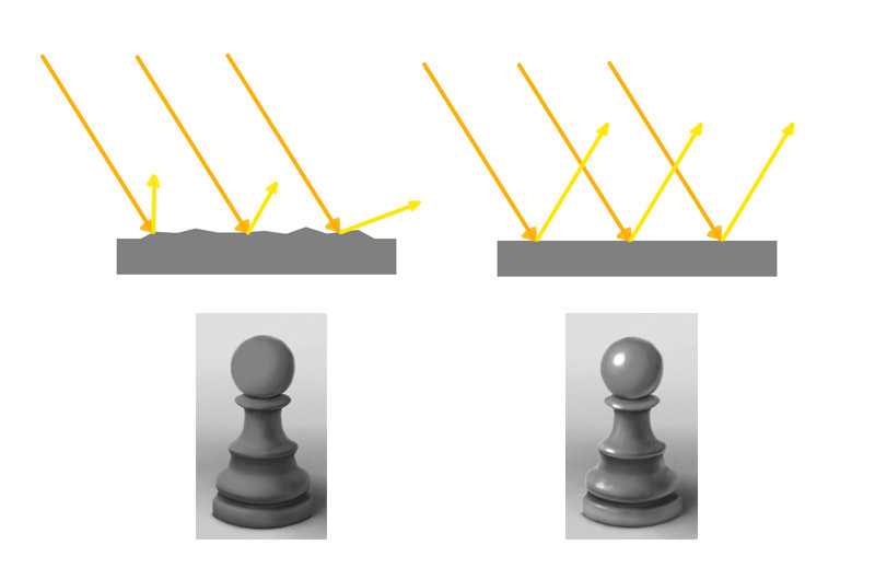
Because of this, a reflection of the light source is created—the smoother the surface, the more perfect the reflection. In art it’s usually called the highlight.
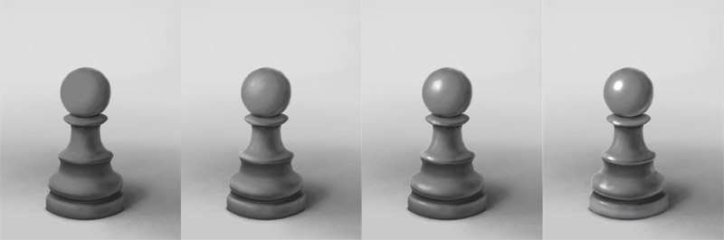
So, where should you place the highlights? Somewhere between the center of the illuminated area and the terminator. Whatever you decide, just remember to keep it consistent all over the object.
But specular reflection doesn’t occur only in the illuminated area. After all, every object reflecting light becomes a light source, in a way. That’s how reflected light gets into the shadow area, remember? And just as the highlight is a reflection of the sun or lamp, the reflected light is a reflection of another object. The glossier the surface, the sharper the edges of the reflection.
Fresnel Reflection
One more thing: can you see the “inner glow” around the outline of the object? When light hits the surface at a sharp angle like this, a lot of rays reach your eyes. This creates a specular reflection in this area even on mostly matte objects. Just remember to keep it darker than the highlight to stop it from looking like a backlight.
Metallic Reflection
Normally objects reflect only the reflected light that is brighter than their surface. But metals are special—they don’t really have any color of their own, so they reflect everything, even shadows, sometimes only tinted with some hue.
Therefore, to paint metal, you need to paint the whole environment onto them—adjusted to the shape of their surface. If it sounds difficult, it’s because… it is. But painting dark and white bands wrapped around the object usually does the trick for me.
Iridescence
Specular reflection has one more effect on surfaces: sometimes an object is covered with an extra layer of material that is only visible through shine. This material can produce different colors depending on the angle. You can easily create it by using one or more hues for your shine, but remember to keep it consistent—one angle, one color.
Texture
Shine has one great function: it reveals the texture on the surface of the object. If the surface is smooth, light gets reflected from it without any disturbance. If there are any irregularities, though, the reflection gets distorted.
So when you paint highlights on a textured surface, you need to treat it as another round of shading—just on a micro scale. Paint a tiny highlight on each micro object within the area where the big highlight would normally appear.
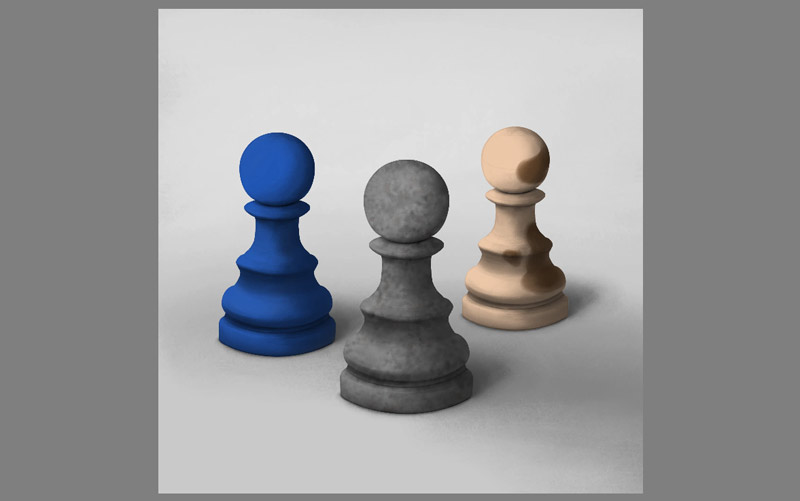
How to Color an Artwork Step by Step
All this info may seem confusing, so let’s put it to practice now. You can download my template file to follow my steps and to see exactly how this all works.
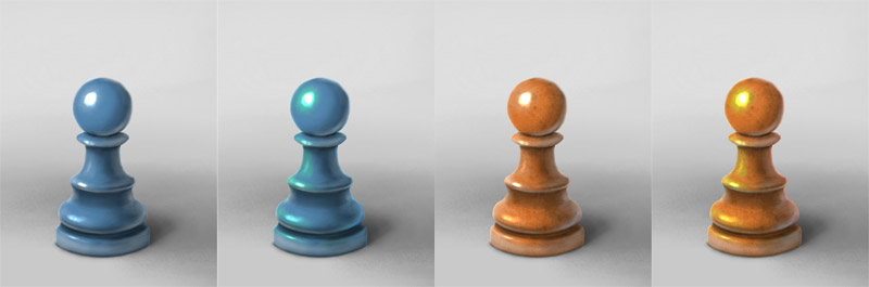
Step 1: Colors
So we have three pawns, and let’s say each of them is made of a different material. The first one will be made of stone. Covering it with some chaotic texture will give a nice effect of a natural, imperfect surface.
The second one will be made of plastic. So we can pick some color that is not very common in nature, like saturated blue, without any texture.
The third one will be made of… let’s say skin-like rubber, because a pawn made of a body would be creepy! So, let’s add something neutrally warm, with a simple pattern adjusted to the form of the object.

Step 2: Shadow Adjustment
Once we have the colors, it’s time to adjust the shadows to the materials. In the stone pawn, the shadow can keep it color and opacity, but if the surface is supposed to be rough, we need to make the edge of the shadow more ragged by adding some details around it.
The blue, plastic pawn needs a brighter shadow, to make it look less dense. We can also color its cast shadow slightly with a soft brush in Color mode.

The rubber pawn needs a similar treatment, except here we also need to make it shadows warmer. Again, you can color the shadows without disturbing their shape by using a brush in the Color mode.
Step 3: Frontal Shine
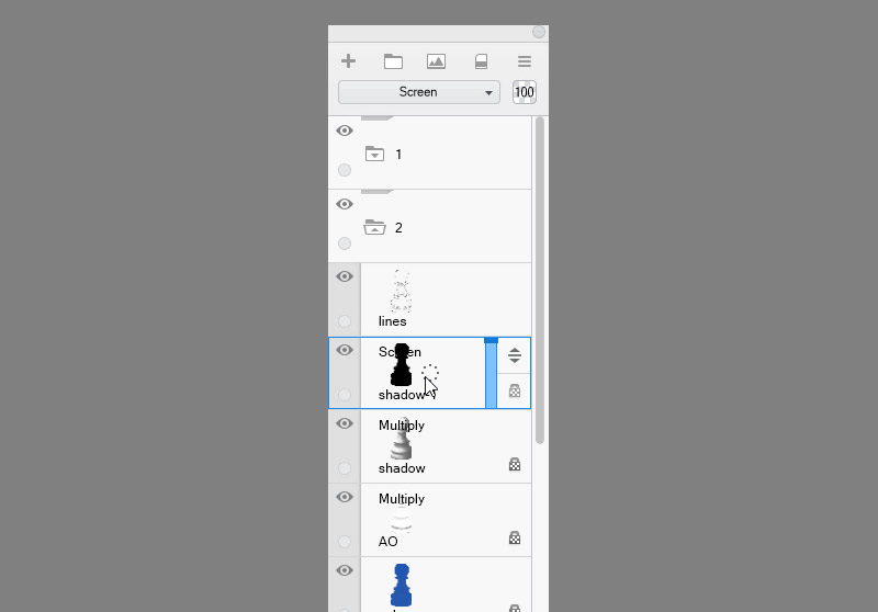
We have the colors and shading, now it’s time for shine. Let’s start with the blue pawn. Create a black outline of the pawn and set its mode to Screen. Use dark grey to paint a reflection of the light source wrapped around he object. The darker grey you use here, the bigger your brush can be.

With the stone pawn we need to be more careful. If you want to give it a rough texture, draw the shine with smaller brush, as if shading the irregularities of the surface. If you used a bigger brush here, you would fill the micro texture with light, visually smoothing out the surface.

The rubber pawn shouldn’t have much of a shine. If you want to accentuate its curves, use a very dark grey and paint over quite a large area with a small brush.

Step 4: Highlights
Ok, time for round two of shine. Create a new layer for the blue pawn, setting its mode to Screen or Glow. Paint over the previously defined area of shine, adding dots of brightness. The brighter the dots, the smaller area they should cover.

The stone pawn will not be that easy. Here you need to think of the texture again! If you want to keep the surface rough and matte, don’t use too bright color (Screen mode will be a better choice here).
The rubber one, again, shouldn’t get any highlights, or it will start looking oily. You can accentuate it gently, but keep it subtle.

Step 5: Reflected Light
Time for the reflected light! Use a screen layer again and paint some light in the shadow, just like you painted shine in the illuminated area. Just keep this light weaker and follow the texture of the surface of each pawn.

Step 6: Fresnel Reflection
There’s one important thing that we can do yet. Use a black Screen layer to paint some light around the outline of each pawn. It should be like inner light, except it must follow the form of the objects. Paint and smudge it to create an illusion of light being reflected at a sharp angle. This will make the edges look softer and more natural. This works even on matte objects, because every matte surface becomes reflective if you look at it at sharp enough angle.

Step 7: Finishing Touches
Finally, you can add some details to the objects, or maybe adjust the opacity of the shadows again for the best results.
That’s All!
We’re done! I hope you learned something from me today. But remember: all of this highly depends on your style. The amount of shine, its position and color, the strength of subsurface scattering or reflected light, it all can be modified to create a realistic, yet unique effect. And if you want to paint photorealistically, you need to study photos to learn from them all the subtle signs of realism. But my job here is done—you know all the basics of digital drawing—now go and create!
And if you want to see my method being applied to real process of painting, here’s a video for you!
2 Comments