Digital artists have it easy—they get all the colors of the rainbow, and they can make them slightly brighter or slightly more saturated just by dragging sliders. No need to pre-mix the colors, or guess what paints you need to combine to achieve a desired shade! And yet, the issue of color remains one of the most confusing aspects of digital painting. I’d argue that it’s even more confusing than in traditional art, because it seems so easy—and it proves not to be, over and over again.
Like… why do some colors seem brighter than others, even though they have the same Brightness? Why some colors blend well, and others lead to an ugly, muddy mess? Why does the color sample picked directly from the reference seem to change once you add it to your drawing? And why adding color to a greyscale drawing doesn’t work as it’s supposed to? In this article I’ll answer these questions—and many more!
In Part 1, we’ll take a close look at how color works—and specifically, how digital drawing apps handle it in their color editors. In Part 2, we’ll cover the practical aspects of color theory. Let’s get started!
Where Does the Color Wheel Come From
Greyscale
Our brain uses color to tell objects/surfaces from each other, sculpting the world around us out of light. But vision started in a more simple way:
First, we recognized the simple difference between the amount of light: no light was registered as black (dark), lots of light was registered as white (bright).
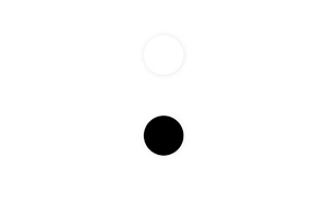
You can imagine a distance between these two shades, which represents the visual difference between them. This distance/difference is called contrast—the longer the distance, the higher the contrast.
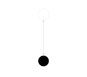
If you move these two shades towards each other, making them less and less different with each step, you’ll land in the middle, creating a neutral, 50% grey. This grey is recognized by our eyes as neither white, nor black—as something separate from them.
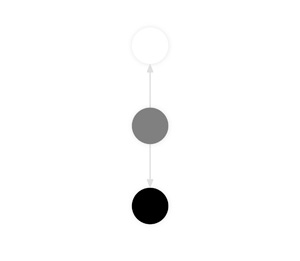
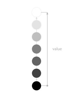
The rest of the distance can be filled the same way, creating a series of greys similar to white, and greys similar to black. This series is called a greyscale, or a Value spectrum.
Hue & Saturation
Because sunlight is so ubiquitous, our brains learned to interpret its color as neutral. But once this neutral light interacts with the environment, it changes—producing different “kinds” of light. These different kinds are recognized as Hues.
Just like we learned to recognize Values by contrast between two extremes (black and white), Hues are also recognized by contrast. In evolution of vision, these two extremes were first blue and yellow—probably to recognize the difference between blue ambient light of the sky, and warm direct light of the sun.
Just as with the Value spectrum, you can imagine a distance between these two Hues:
Then you can remove the difference between these two Hues, by moving towards the middle of the distance. This, just as with the greyscale, produces a neutral grey—something that is neither blue, nor yellow.
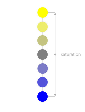
And just as with the greyscale, you can produce the in-between shades—a series of greys similar to blue, and a series of greys similar to yellow. We can call it a dichromatic color spectrum, and a lot of animals—including cats and dogs—perceive the world this way. The distance between the color and the middle grey is called Saturation.
Developing a new kind of a light sensor in the eye allowed some animals to see the difference between certain shades of yellow. This difference is defined by a contrast between two extremes: green and red. Yellow has been reduced to the neutral point between these two colors.
Just as with the saturation scale, you can produce a series of yellow similar to green, and a series of yellows similar to red:
Because green and red are, in a way, a type of yellow, they’re all opposite to blue. This means they’re all “connected” at that middle grey:
Which means you can also produce the desaturated shades between them:
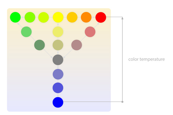
Can you see how the blue lands on one side, and the green-yellow-red group lands on the opposite side? This is just my guess, but it seems to me that this kind of contrast may be recognized by us as color temperature—colors close to blue seem “cool”, and colors close to green-yellow-red seem “warm”. This may explain why desaturating a cool color makes it warmer, and desaturating a warm color makes it cooler—because you’re just taking them closer to the opposite (warmer or cooler) side.
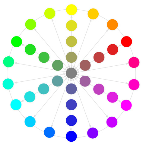
The Color Wheel
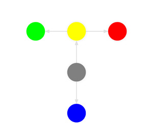
Now, you may ask yourself: if we can connect green and red (with yellow in the middle), can we also connect green and blue, and red and blue? And the answer is: yes, we can! This produces the intermediate colors: a green-blue cyan, and a red-blue magenta.
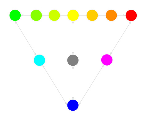
And, of course, you can also produce the intermediate shades between them, too. That’s how we produced all the Hues recognizable as distinct by the human eye.
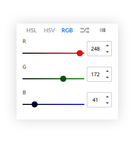
This triangle is the basis for the RGB model—it treats all the colors as a mix of Red, Green, and Blue. These tree colors are called primary colors, and the ones halfway between them are secondary colors. In your color editor, you probably have a set of sliders similar to the one below. It replicates the way traditional painters mix their colors, but since we can create colors directly from scratch, it’s not really useful to us. At best, it helps you to fine-tune the Hue by making it “a little bit more blue” or “a little bit less red”.
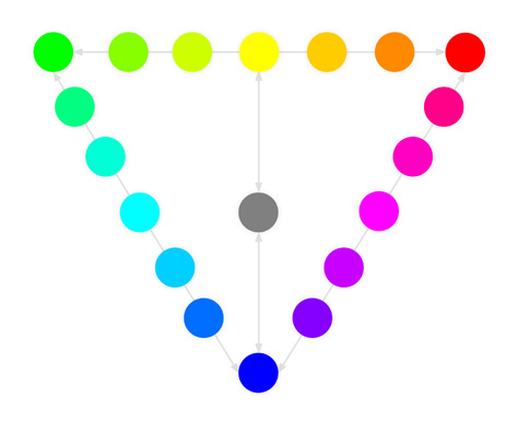
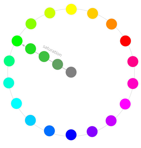
Going back to our triangular diagram, we must notice it’s not 100% accurate—it places cyan and magenta closer to grey than the other hues. To fix this, we need to place all the hues at the same distance from the middle grey. That’s how we ended up with the familiar color wheel!
To keep the diagram clean, I’ve only put a few saturation scales here—but the same thing can be done with every hue in the wheel.
How Does the Color Editor Work
HSB/HSV Model
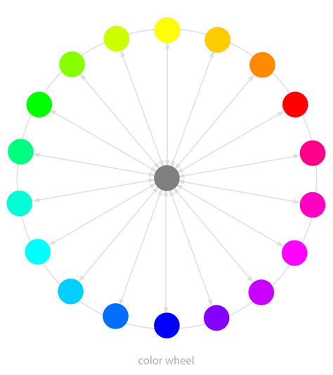
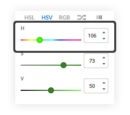
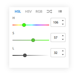
Since we’re already at the color wheel, let’s take a look at the sliders from the Color Editor. No matter what app you use, there’s probably one marked “H” (Hue), which is another representation of the color wheel.
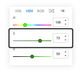
There’s also one marked “S” (Saturation), which allows you to quickly move towards that middle grey.
Then there’s another one, usually marked “B” (Brightness), or “V” (Value). But it’s nowhere to be found in our color wheel! It’s because the color wheel is two-dimensional—it can only show two directions at once. To add another, third direction (Brightness), we need to make it three-dimensional.
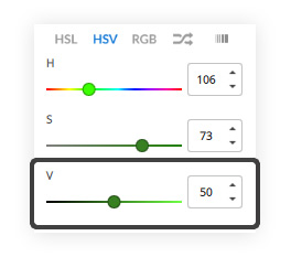
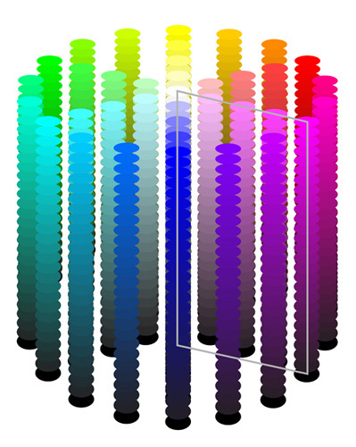
So that’s the whole HSB/HSV model. Notice that the shade of the middle point of Saturation depends on the current level of Brightness—it’s grey most of the time, but black for 0% Brightness, and white for 100% Brightness. In short, in the HSB model:
- Bu changing Hue, you move around the cylinder
- By increasing Saturation, you move away from the middle neutral point
- By increasing Brightness, you move up, towards the brightest version of the color
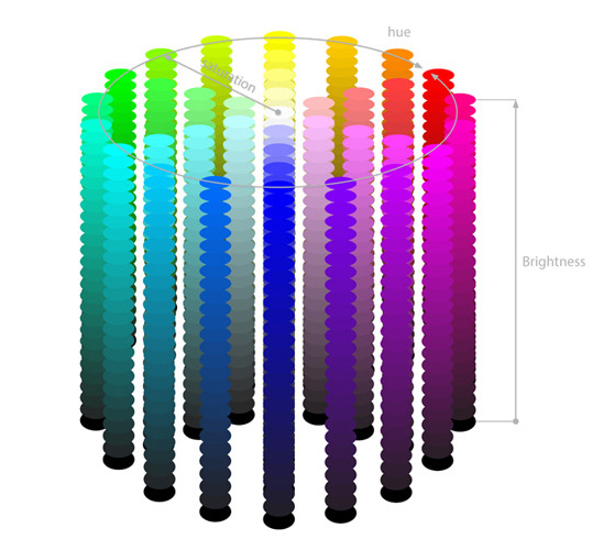
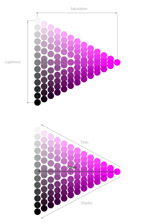
What’s interesting, if you cut a slice of this rainbow cake, you end up with a 2D square you can recognize from some drawing apps:
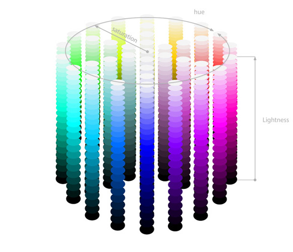
HSL Model
There’s also another, similar model, that you can find in your digital art program. It’s called HSL, and it’s based on Hue, Saturation, and Lightness/Luminance. The only difference here is that when you move up, you move towards white—regardless of the color.
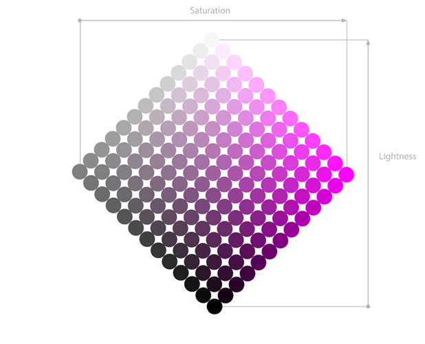
This model can be better suited for you if you’re familiar with traditional painting, because:
- By increasing Lightness above 50%, you’re “adding white” and creating tints
- By decreasing Lightness below 50%, you’re “adding black” and creating shades
- By keeping Lightness at 50% and lowering Saturation, you’re “adding grey” and creating tones
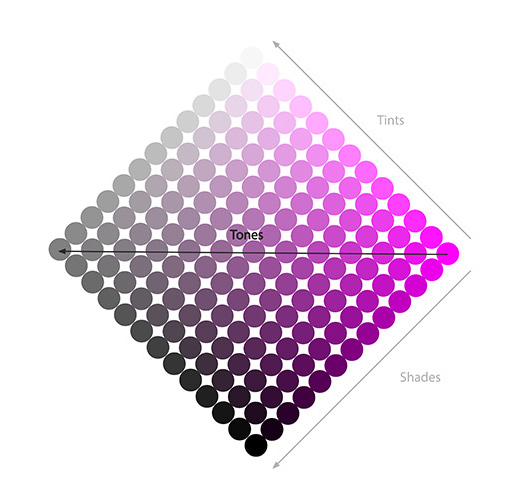
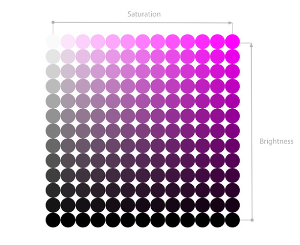
To make it easier to pick tints, shades, and tones, digital art apps often show the whole spectrum of them in a form of a 2D shape. It can be a square, a rotated square, or a triangle. Now that you know how to read the sliders, it should be easy enough for you to figure out how to use the version used in your app!
The Flaws of the HSB/HSL Models
Value & Chroma
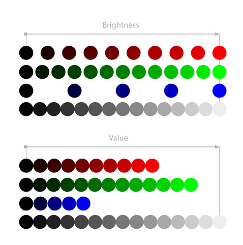
We could finish here, but unfortunately, these models miss one really important aspect of color: Value. The Brightness slider in the HSB model is sometimes called “Value”, but then it’s just another name for Brightness. True Value means something else.
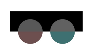
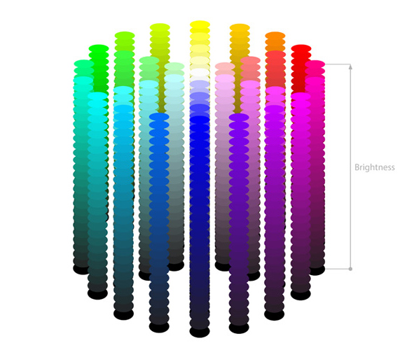
If you compare the Brightness of the three primary hues (Red, Green, Blue), that’s what they look like according to the slider:
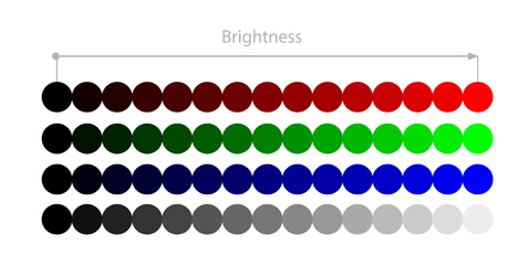
There’s something wrong here, isn’t there? Blue at 100% Brightness looks darker than Green at 100% Brightness. What’s up with that? Well, it turns out our eyes react differently to the brightness of each hue. So a more accurate model would look like this:
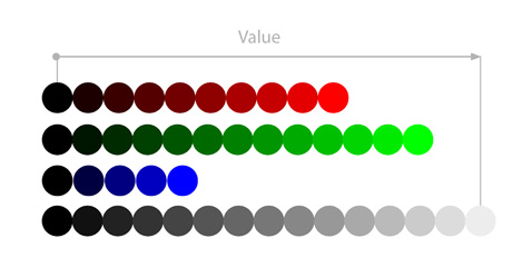
What the HSB model does, for simplicity and consistency, is simply stretching these scales to make their lengths equal:
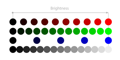
So Brightness refers to this stretched, artificially equalized scale. Value, on the other hand, refers to the relative brightness of a color—how bright it seems in relation to other colors (and, specifically, grey), regardless of its Brightness value.
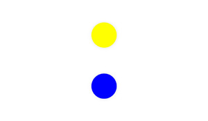
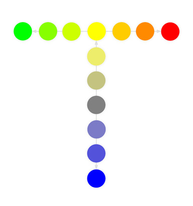
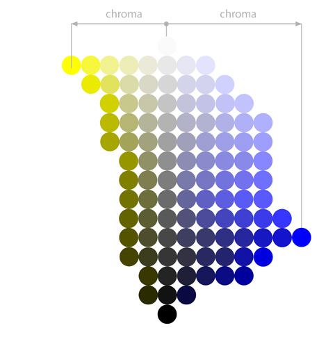
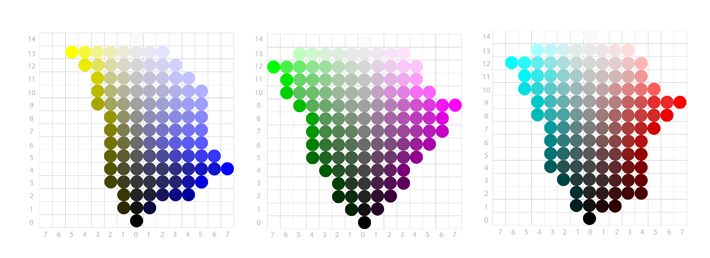
Let’s take a closer look at Value. First, if we try to assign blue and yellow to the Value spectrum, they would look somewhat like this. I say “‘somewhat”, because if you were to assign them yourself, you could make different choices, both because of the properties and settings of your screen, and the peculiarities of your own perception. So treat this diagram only as a symbolic representation of the Hue-Value relationship.
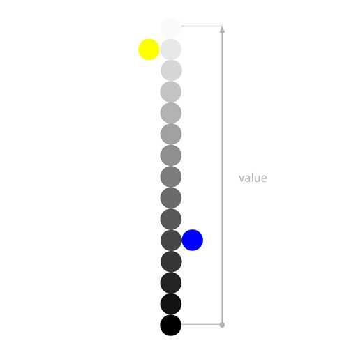
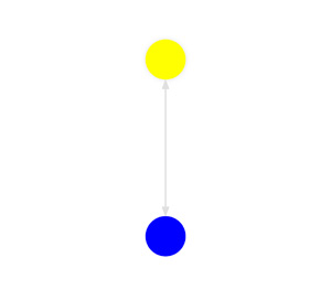
You can fill the space between blue and black, and yellow and black, creating darker shades. Notice there’s a lot of them for yellow, and not so many for blue—that’s something you couldn’t really see in the HSB or HSL models!
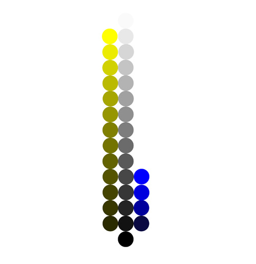
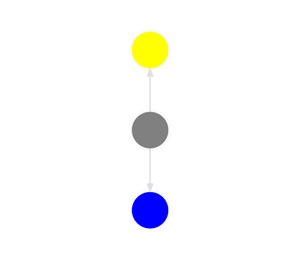
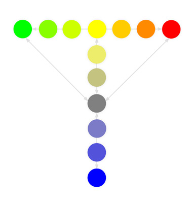
Let’s go further and fill the remaining space between blue and white, and yellow and white. Because blue is so dark even at its 100% Brightness, the only way to make it visually brighter is to lower its Saturation.
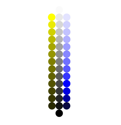
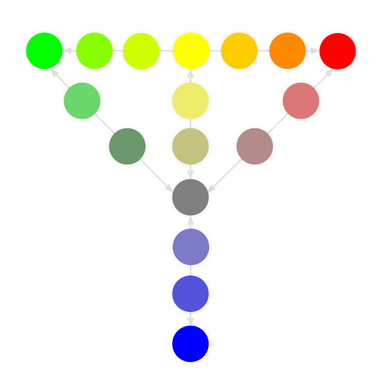
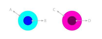
Now, notice something strange: when you look at the color samples, some look similar to the corresponding greyscale samples, and others don’t. This is because of another, less known property of color, which is called Chroma. The higher the Chroma, the more colorful the color looks.
In short, Saturation tells you how far a color is from grey—and Chroma tells you how far it is from grey, black, and white at the same time. So while all these samples have the same, 100% Saturation, one of them looks more vibrant/pure/intense than others—that’s the one with the highest Chroma.
So, to make our diagram more accurate, we need to add some distance between the greyscale, and the color samples. The more different the sample looks from its corresponding grey, the larger that distance will be.
Here’s another obstacle, though. As digital artists, we like to think we have an unlimited access to colors—unlike traditional painters, we don’t have to buy and carefully mix the paints, we can just move the sliders to get whatever we want. Unfortunately, that’s not exactly true!
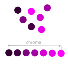
No matter what kind of screen you use—a LED or an OLED—it’s not capable of displaying all recognizable colors. For example, the most popular color space, sRGB, covers only about 35% of all the colors humans can see. AdobeRGB and DCI-P3 (used in higher-end iPads), cover about 50%. So even if we put personal perception differences aside, it’s impossible to figure out the true Chroma spectrum of any of the hues.
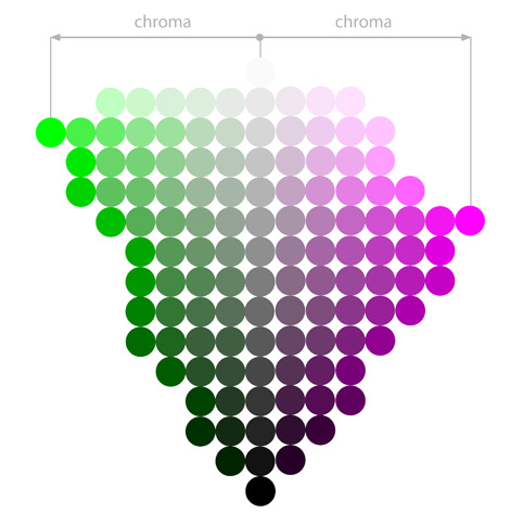
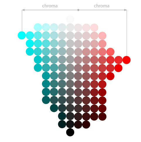
It’s not as bad as it seems, though. In the end, we’re not really interested in reality—we’re interested in how to use what we have. So this is a diagram showing the Chroma of six basic hues—according to my screen, and my own eyes. Again, treat it as a symbolic representation of a Hue/Chroma relationship, and not an accurate model of reality!
Chroma is present, although not named, in the HSB and HSL models—just look at the brightest and most saturated tip/corner of the SB/SL space to find the most Chromatic version of the Hue. In the HSB model, colors have highest Chroma at 100% Saturation and 100% Brightness. In the HSL model, the highest Chroma is achieved at 100% Saturation and 50% Lightness.
Value, on the other hand, has been sacrificed for consistency and predictability of Brightness/Lightness, which places each Hue at a nice, equal distance from grey, black, and white. So you won’t find it in HSB and HSL models (it is there, of course—just all over the place, like Saturation in the RGB model).
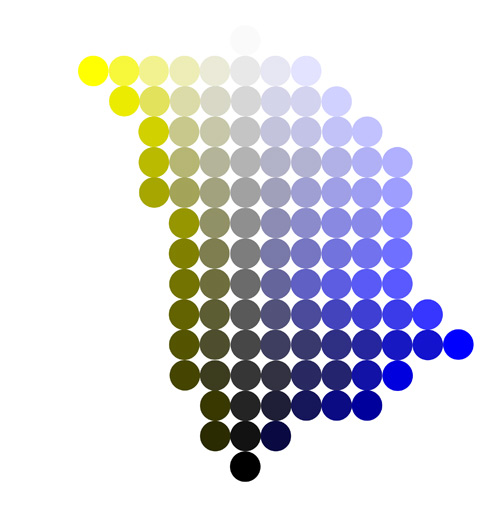
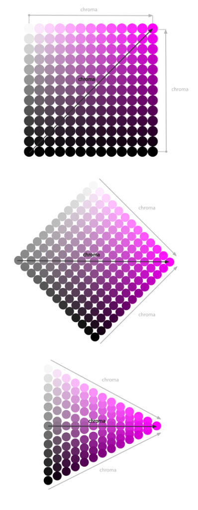
The Color Tree
So let’s build a new model together by combining our Value-Chroma diagrams:
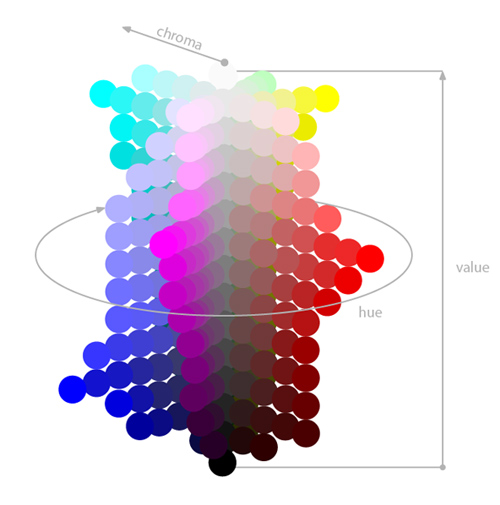
It does look pretty… unique, doesn’t it? It has little in common with the elegant, round shape of the HSV and HSL models. It’s all irregular, “spiky”, unwieldy. But, as the original creator of this system, Albert H. Munsell, once said:
Desire to fit a chosen contour, such as the pyramid, cone, cylinder or cube, coupled with a lack of proper tests, has led to many distorted statements of color relations, and it becomes evident, when physical measurement of pigment values and chromas is studied, that no regular contour will serve.
Even if we we filled the empty spaces with all the remaining hues, and even if our screens were able to display all colors perceptible by humans, this model would still be irregular in shape—because hues are simply not equal to our eyes and brain. Equalizing them by force, as HSB and HSL models do, leads to a neat and set of sliders—but being neat and tidy is their main virtue. Because, honestly—if you’re being told that A and B are equally “bright”, and C and D are equally “saturated”, then don’t these terms lose their meaning in the process?
Unfortunately, this improved model we’ve created together (inspired by the Munsell color system), can’t really be found in any digital drawing app yet. Good news is, you can use the HSB and HSL models very successfully, if you only remember how Hue affects Brightness/Lightness and Saturation, leading to the perception of Value and Chroma. To help you with that, I’ve prepared a set of references that you can use to quickly see the relationships between six main Hues and Value/Chroma. Download them here.
Conclusion
That’s it—now you know how to use the Color Editor to produce the shades you need! But there’s more to it—if you want to make the colors look good together, you need to know the practical implications of all this theory. This is what we’ll talk about in Part 2!

1 Comment