Last time we talked about all the components of colors—Hue, Saturation, Brightness, Chroma, and Value—and how they’re handled in digital drawings apps. Today we’re going to talk about the more practical side of color theory, and how to combine multiple colors in once scene to achieve the desired results. I’ll cover color psychology, as well as special tricks you can use to gain greater control over color in your art. Let’s get started!
Contrast
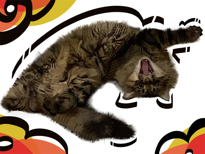
When you put two shades next to each other, an edge is created, based on the contrast (distance/difference between these two shades). The higher the contrast, the more visible the edge—we call it the hard edge. When the contrast is low, and the shades seem very similar to each other, we call it the soft edge.
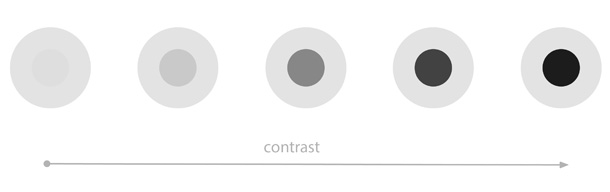
Hard edges are usually recognized by our eyes as a literal edges of the object/material—as a point of separation. Soft edges, on the other hand, are recognized as a color variation of the same material, or as curvature of the surface. That’s why painting with a soft brush only often leads to the subject looking soft and shapeless. To avoid it, use a soft brush for soft edges, and a hard brush for hard edges—or combine the soft brush with the Lasso Tool.
Color Harmony
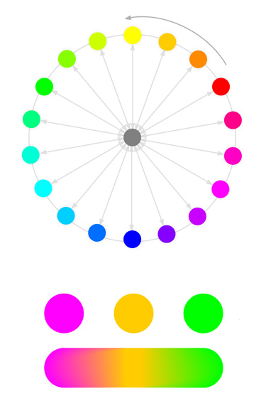
This topic is so popular that it’s often equated with the whole concept of color theory. You know, that idea that certain colors are complementary, or analogous, and that you can create compelling color schemes by drawing triangles or squares over the color wheel.
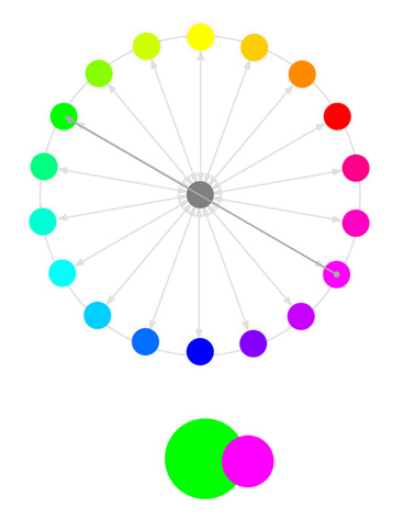
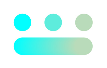
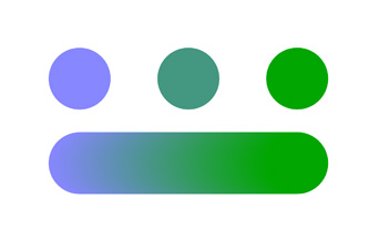
And sure, there’s some truth to that. Complementary Hues—the ones that are opposite to each other on the color wheel—create a strong contrast when put together. They’re basically like black-white dichotomy with a Chroma, so they can be used to easily distinguish areas/objects from each other.
Analogous Hues—the ones close to each other on the color wheel—look pleasant to the eye, even at the highest Chroma. They can be used to add some color variety to one area, or to make multiple elements look like a part of a bigger whole.
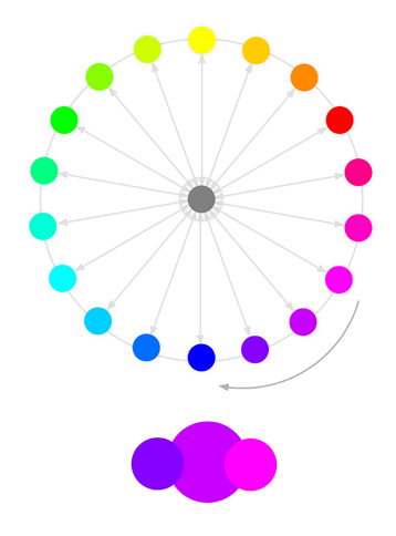
That’s just a part of the story, though. The truth is, all colors that are similar (close to each other on the color tree), look good together. Even complementary Hues can be combined into a pleasant color scheme if they share similar Chroma and Value. And all colors that are different (far from each other on the color tree), look contrasting when paired. High Chroma complementary Hues are just the most extreme examples of that, but this color contrast is a spectrum, and it’s perfectly possible to achieve pretty strong color contrast even with analogous Hues.
The second thing is, colors are not just light, just like words are not just sounds. Colors, like words, have meaning—they carry information about the objects/surfaces/materials they’ve been reflected off. We learn, throughout our lives, what certain color schemes mean, and these meaningful color schemes look consistent and harmonious to us. You can try to explain these schemes by drawing various shapes on the color wheel, but this isn’t really science. Just ask yourself:
- Does orange-blue contrast look good, because these are complementary Hues (on a classic color wheel), or because we’re used to seeing the contrast between warmly illuminated surfaces, and blue tinted shadows?
- Do red, purple, and blue look good together, because they’re analogous Hues, or because they bring the sunset to mind?
- And finally, do we inherently like these traditional color schemes, or are they just so popular that we learned to recognize them as meaningful?
As humans, we like to put things into neat categories, but I believe that doing that with color harmonies is not productive. In the end, we’re drawing objects, not light, so we need to study objects, and not some abstract rules defined by drawing Hues in a circle. Observe reality and learn how various materials produce their own color harmonies, and how these harmonies change when the light changes.
And don’t limit your studies to photos only—cameras distort reality, and they’re particularly bad when it comes to color contrast. You can make your artworks less photorealistic, and more realistic, if you stop treating photos as your only source of references!
Blending
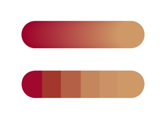
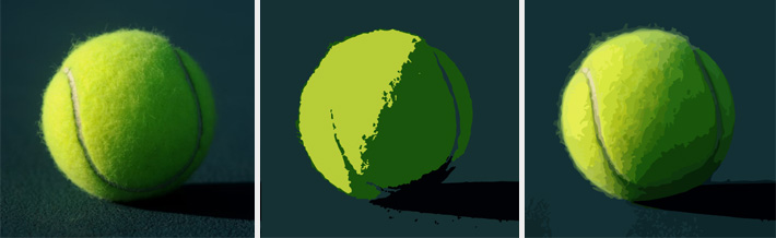
When you blend (whether with a blending tool, or by painting with a semi-opaque brush), you’re effectively pulling both colors closer together. What the result will look like, depends on how similar they are—or, on other words, how close they are to each other on the color tree. Muddy colors are a result of a big distance between the components, in any of the departments (Hue, Chroma, Value)—especially if it’s more than one.
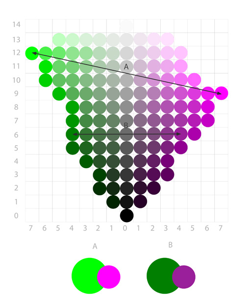
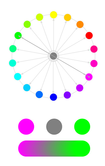
If two hues are close to each other (analogous hues), the resulting color will take an intermediate hue between them:
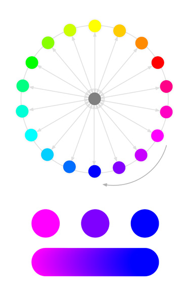
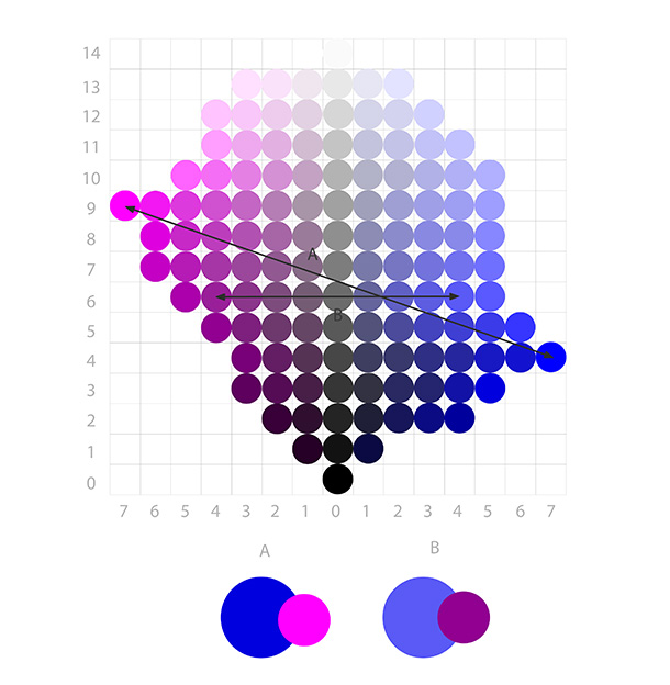
If the hues are as far from each other as to be on the opposite sides of the wheel (complementary hues), the shortest distance between them leads through the middle of the wheel. Which means that the intermediate hue, for them, is actually lack of hue—the middle grey.
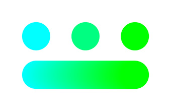
If two analogous colors share a similar Chroma level, the result will keep that Chroma.
But if there’s a difference, the result will have a lower Chroma than the more chromatic of the colors:
Similarly, if two analogous colors share a similar Value level, the result will keep that Value.
But if one is darker, the result will be darker than the brighter of the pair.

If you’re not happy with the result of the mix, it is possible to manually pick an intermediate shade that will work better that the automatic one. All you need to do is to look at the color tree and find an alternative way towards the other color—a way that allows you to stay away from the greys, and keep the Chroma and Value more balanced.
Here, again, you shouldn’t worry about what the classic color theory says about color harmonies. Classic color theory applies mostly to graphic design, to geometric forms and hard edges. In drawing/painting (especially realistic and semi-realistic), we tend to blend the colors—and with blending, all colors can be harmonized. You just need to create intermediate steps between them—the more contrasting (distant) the colors, the more steps you’ll need, but it’s always possible.
By the way, I believe that automatic blending is the main reason behind the infamous plastic, “digital” look of digital artworks. Whether you use a soft brush, a semi-opaque brush, or a smudge brush, you’re sacrificing control over the colors for the speed and simplicity—and that’s always noticeable. I’m not saying it’s a bad/wrong technique, because if you like it, then more power to you! But if it’s something you’d like to avoid, and don’t know how, the next sections is exactly what you need.
Optical Mixing
Manually blending two colors together is not the only way to mix them. Actually, everything you see on your screen is a result of this other type of blending, called optical mixing or optical blending. Every white pixel on this page is actually three diodes—red, green, and blue—but they’re so tiny that the eye can’t pick these colors apart, so they’re averaged instead.
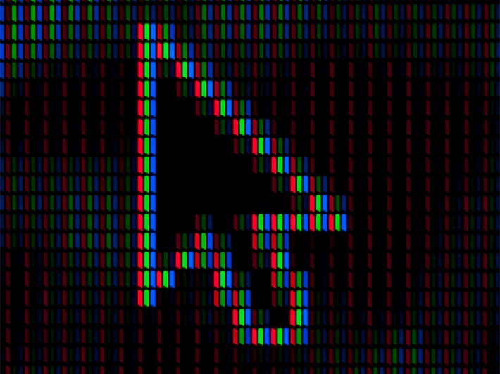
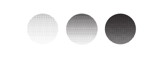
In other words, when we look at small dots of various colors, our brains create a new color based on the middle distance between these colors on the color tree. This happens even if the dots are not that small, only dense enough—although this leads to a decrease in Value. This technique has been widely used in print in order to achieve more colors with less ink—you only need four ink types: Cyan, Magenta, Yellow, and Black. This is where the term CMYK comes from, and that’s also the source of the term DPI—dots per inch (the denser the dots, the better the illusion of mixing).
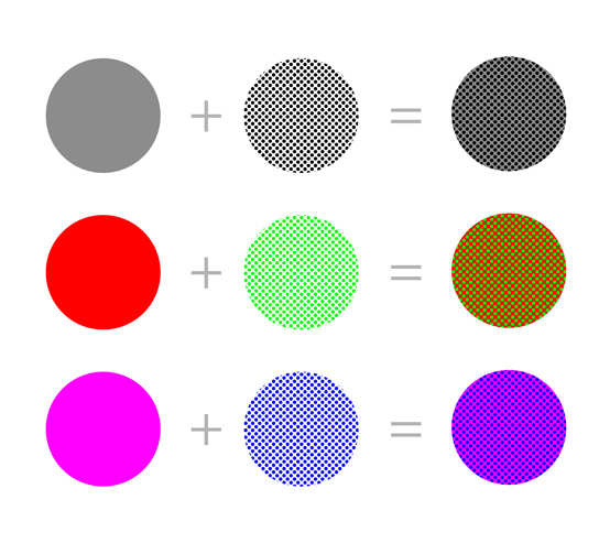
The neat thing is, these don’t have to be dots—lines and other shapes work just as well. That’s how hatching, cross-hatching, and stippling work, allowing you to achieve a variety of shades with just one shade of grey. This technique can also be use with color pencils, to achieve new colors without actually blending the pigments.
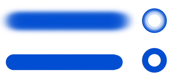
Optical mixing is important in digital art for multiple reasons: first, it offers a third way of blending, something between hard and soft blending. When you use a hard, textured brush, the dense textured edge creates an illusion of color mixing without any “real” blending. It doesn’t only make the surface look more detailed—it’s also better at preserving Chroma of the mix, even for distant colors.
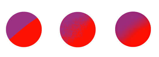
In fact, you don’t need a textured brush either—drawing a series of intermediate shades close to each other is enough to create an illusion of a gradient, even though all the shades are hard-edged. This technique of blending gives you most control over color (because you, and not the algorithms of your drawing app, pick the intermediate shades).
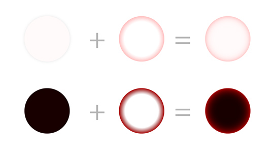
Second, it points to the often overlooked danger of using black lineart. Black seems like a nice, neutral color, that shouldn’t really affect the colors below—but because of optical mixing, it does. It decreases Value and Chroma of those colors, and this effect remains in power even if the lines are thin and light. There are two solutions to this: you can either color the lineart with a Hue/Value/Chroma more aligned to the overall color scheme of the drawing, or simply keep the lineart hidden most of the time and use it only as a reference during rendering.
Third, very high and very low Value colors generally have low Chroma. This means it’s impossible to create a vibrant red glowing ball of energy, or a deep red potion, using the traditional means. Optical mixing comes to our rescue, though—placing a bit of a high Chroma color next to its less Chromatic version will make the latter look more Chromatic.
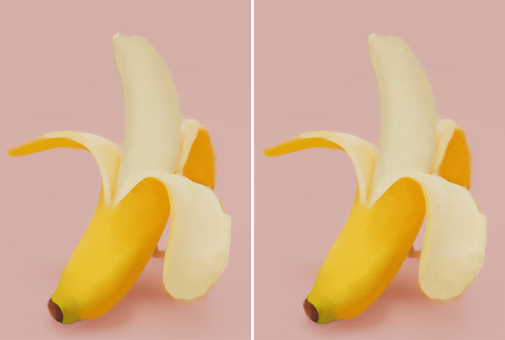
Fourth, even if a surface is supposed to be colored and illuminated uniformly (e.g. it’s a smooth green cloth with no pattern), you can still make it more interesting and rich in color by mixing other Hues with it—just keep them small enough as to keep them unnoticeable. The easiest way to do it is to put some colorful noise on top of the artwork, change its Blend Mode to Overlay, Soft Light, or Color, and lower its Opacity until it mixes organically with the drawing.
And fifth, optical mixing explains why it’s so hard to get the color right, even if you’re looking at it. Grass looks green, but it’s green made out of mutliple shades of green—and you can only capture this exact impression of green by mixing multiple shades. Once you become aware of it, you’ll know when you need to use multiple colors at once, rather than fruitlessly roll around the color wheel in search of that one, perfect shade.
Color Relativity
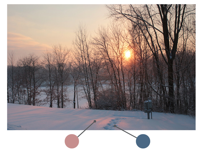
Everything we see exists in result of contrast—it’s the difference between A and B, not the actual content of A and B, which makes us see something. So B doesn’t look dark because of a specific Value—it looks dark, because it’s surrounded by A with a lower Value. It works the same with Chroma and color temperature, too. This phenomenon is called color relativity.
If you’ve ever picked a color directly from a reference, and it looked strikingly different when put on the canvas, this is exactly why. You can copy what a color is (its RGB and HSB/HSV values), but you can’t copy what it looks like—you need to copy the whole relationship for it to look like it does in the original environment. And while you could use the eyedropper for this, it would be counterproductive—because that would limit your artistic endeavors to only the things you can directly copy.
Color relativity causes colors to magically change before our eyes, just by adding or removing a color from the scene. It’s like taking a pinch of salt, and see it turn into sugar once you sprinkle it on your meal. This is especially problematic for traditional painters, who have to pre-mix their colors outside of the canvas, and can’t really blend and correct them too much without muddying them. Luckily for us, in digital art this isn’t the case!
Approach your artwork like a sculptor. A sculptor doesn’t start their work with the eyes, or lips, or nose—they take a ball of clay and first give it a very general shape of the head, gradually moving towards the more detailed curvature. Do the same with colors—don’t start with the color of the skin, hair, or clothing, but instead add the color areas gradually, starting with the big ones, and focusing on their Value first. Here’s an example of such process:
- Sketch the outlines of the scene
- Fill the background with an averaged version of the background in the reference
- Squint your eyes a little bit to see the Value differences in your reference. Capture them in your drawing, including basic Chroma as well
- Add a New Layer on top, and change its Blend Mode to Color. Then add proper Hues on this layer
- Remove/hide the outlines, and add all the details on top
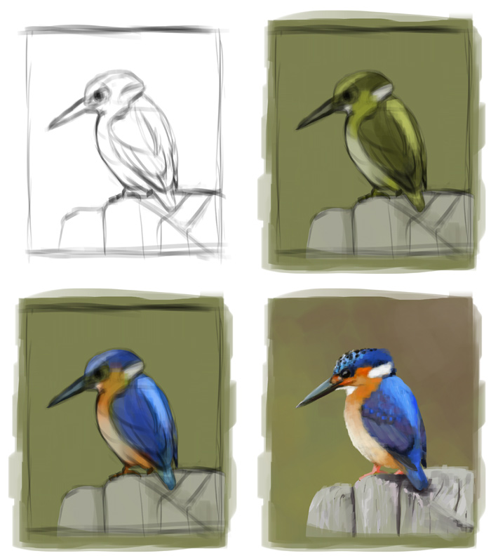
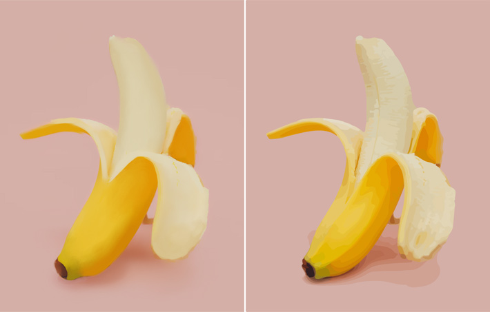
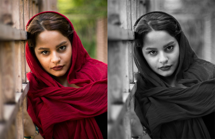
Notice that in this study I’ve included Chroma very early, instead of limiting the colors to their Value only. This is because Chroma affects Value, and these two can’t really be separated. Just look at the image below—in greyscale, the scarf looks darker. So if you turn your reference into greyscale and try to copy it this way, it will be easier of course—but in result, you’ll capture false Values that will have to be modified later.
Color Constancy
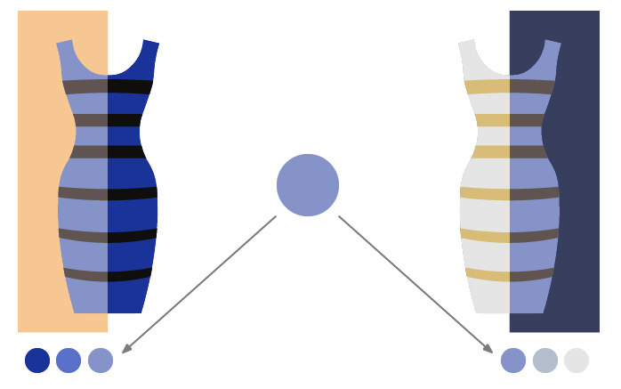
Another phenomenon, related to color relativity, is called color constancy or chromatic adaptation. It allows us to recognize Hues regardless of the current illumination. In a way, our brains “subtract” the effects of the lighting, and let us see the pure color “beneath”. The whole world became very aware of this effect when the Dress got viral.
The Dress may feel like an obscure optical illusion, but in reality, this is an extremely common phenomenon. We never see the “true” color of the object—it’s always affected by lighting, and we do quick mental math to subtract that lighting and recognize the object as something we’ve seen before, in different lighting. The Dress is only special, because this specific mental equation has two solutions—and people choose one depending on their own life experience and expectations.
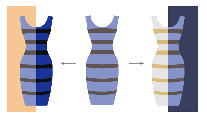
But if you look at this dress, you read it as “red”, even though it consists of a variety of shades, some of which you wouldn’t call “red” if viewed separately:
So in the same way, you can read this shade as a light part of blue, or a dark part of white. Regardless of what the color picker says, there’s no correct answer here—because the color you see is an interpretation of the visual data, and not the visual data itself.
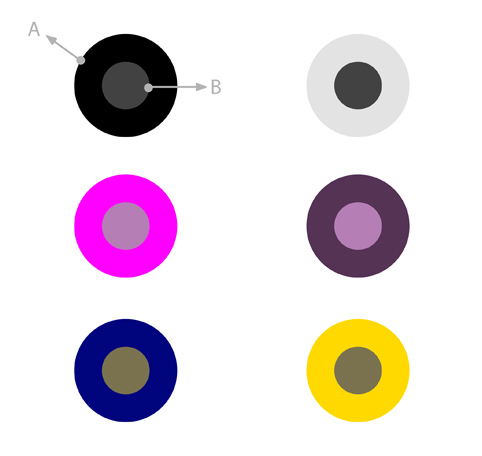
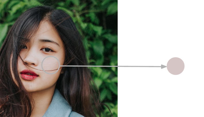
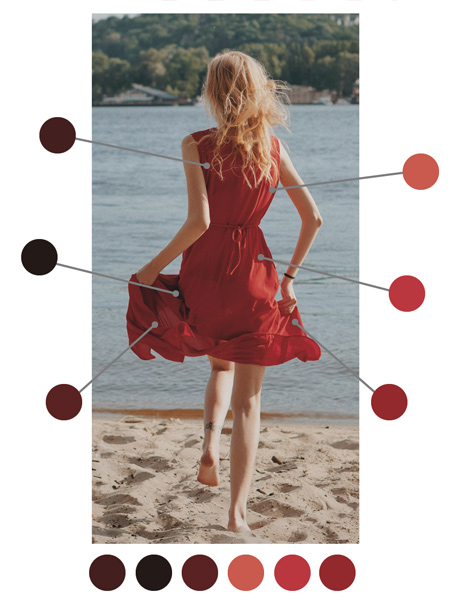
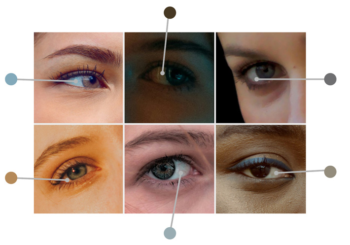
Color constancy may lead to two problems. First, you may see and copy the color in the reference inaccurately, reading it as something it’s really not. For example, the color of sclera (the white of the eye) may seem white to you in all these photos (or grey at best), while it has a different, very much non-white color in each of them.
Second, when looking at an object, you may simplify it in your mind as “true” (local) color + shading (often added on a layer in the Multiply mode). It’s good enough for simpler styles, but if you want to draw more realistically, you need to go beyond that. If you draw the green ball as green in light, dark green in shadow, and then simply blend these two, you’ll lose a lot of detail—and trying to add it back with a fuzzy brush won’t fix that, because it’s not a matter of texture.
This topic is more related to shading/light and shadow, so I won’t explain it in detail here. For now, I just want you to pay more attention to how the “final” color of the object is really produced. Trying to find the best “local color”, and then covering it with a single-color shadow may be easy, but including more colors in both areas is the only away to make the surface look detailed without lines.
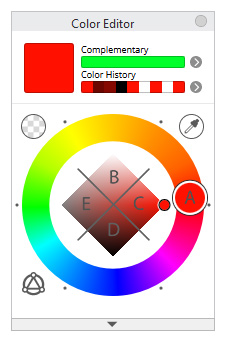
The solution for both problems is the same as presented in the color relativity section, but I just want to add one more thing. When you want to add a new color, first identify its Hue (A). Then try to guess its Chroma/Value by locating it in one of the quarters in the color square/rhombus. To do it, ask yourself these questions:
- Is it similar to white? Pick B
- Is it similar to black? Pick D
- Is it similar to grey? Pick E
- Is it very vibrant? Pick C
Once you put this color on the canvas and see how it looks in relationship to the other colors in the scene, you can adjust it by asking yourself these questions:
- Is it too black? Then move it up
- Is it too white? Then move it down
- Is to too vibrant? Then move it to the left
- Is is too dull? Then move it to the right
This applies to the Hue wheel as well:
- Is it too cold? Move it towards yellow/red
- Is it too warm? Move it towards blue
- Is it too reddish/bluish/greenish? Move it away from that Hue
- Is it not reddish/bluish/greenish enough? Move it towards that Hue
Continue adjusting your color until you get it right. Don’t worry if it takes you quite a few tries—in digital art experiments are free! You’ll also get better at this with practice, if only you resist the temptation to just go and color pick the answer directly from the reference (getting that answer may be useful, though, if you keep trying for too long—just make sure to understand why the answer is the way it is).
Here’s an extra tip: you don’t have to drag your sliders a lot to produce any change. Sometimes making the color just 2 points Brighter leads to surprisingly high contrast, or scrolling the Hue wheel at 5 degrees produces a Hue that clashes with the previous colors. When in doubt, it’s best to keep all colors low Chroma at first (since this makes them all similar enough to make them fit each other), and adjust them later, once you see what’s missing.
There’s a good side to color adaptation, too—it allows you to get more creative with color. Once you understand that one color can actually be multiple different colors, you can use it to your advantage, and create completely crazy color schemes that still seem consistent and realistic.
If you’re drawing a forest, it doesn’t have to be green—it can be full of pastel pinks. If you’re drawing white skin, it doesn’t have to be beige and purple—it can be green, and blue, and orange. As long as you keep the color relationships constant (e.g. all the shadows are greenish), the eyes of the viewer will be able to subtract the craziness and see the realistic colors below, while still recognizing the uniqueness of the coloring.
Conclusion
So, now you know everything about color theory for digital artists! It was a lot, wasn’t it? After reading all of this, you may feel kind of anxious—how are you supposed to pick the right color, knowing what you know now? How to juggle all that stuff about Hue, Value, Chroma, Saturation, Brightness, Color Temperature, not to mentions the phenomena like color relativity or optical mixing?
Here’s the answer: just keep doing what you’ve been doing. Use your intuition, choose the color that you feel is right. And if it works, great—keep doing that! But if it doesn’t, then you can use this knowledge to figure out what’s wrong, and how to fix it. Color theory is not a rulebook that you’re supposed to follow—it’s just a tool that can help you when you need it. And I hope my presentation of it made this tool more accessible to you!
Did you find this post useful, helpful, inspiring? You can say “thank you!” by sending me a little donation:

0 Comments