When you draw on a graphics tablet, the motion of your pen defines the position and curve of the line. How the line will look, however, depends on the settings of your brush. If you change these settings properly, you can create a brush that will work exactly as you need—producing subtle, thin lines with tapered ends, or thick, textured strokes that blend with each other like real paint.
In this article I’ll help you understand these settings, so that you could create a brush set tailored to your needs. I’ll be using Autodesk SketchBook, but the general theory should apply to all drawing programs.
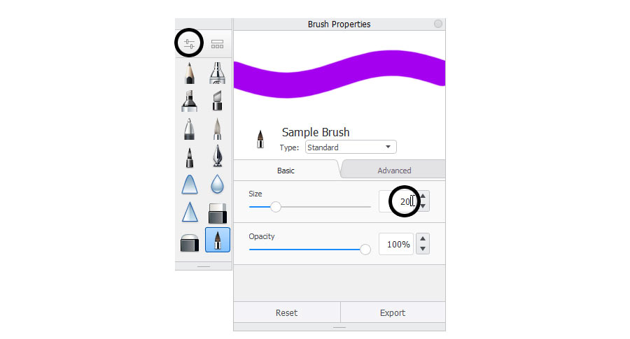
Basic Brush Properties
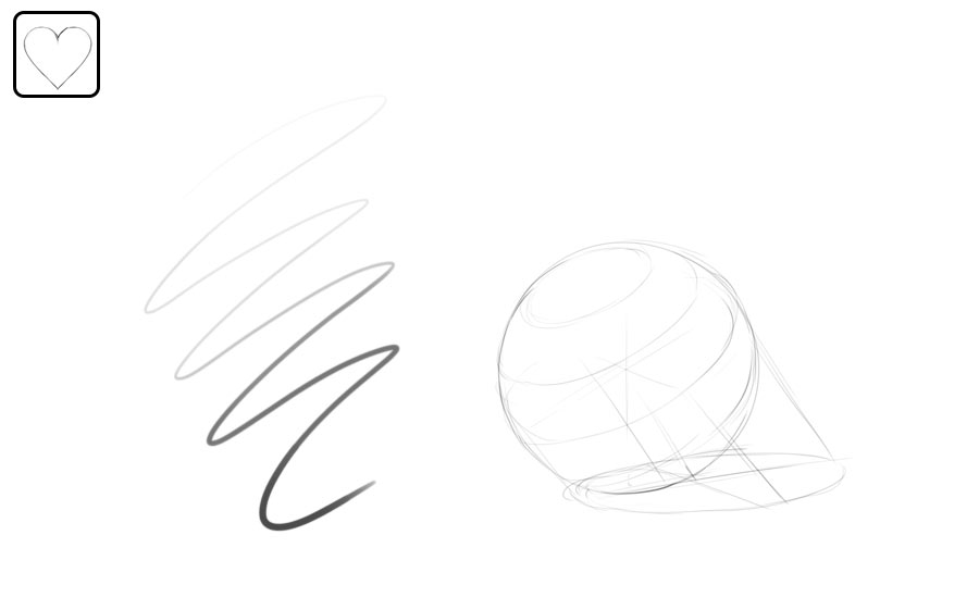
Digital drawing is just like normal drawing in a sense—you draw a line, and a line appears. However, what this line looks like, depends on your choice of the brush. Digital brushes are not real brushes of course—they’re just a set of instructions telling your program what to do with the line you’re drawing.
There’s a limited number of things you can do to a line, so it’s easy to group them into specific properties. We’ll go over them one by one.
Size
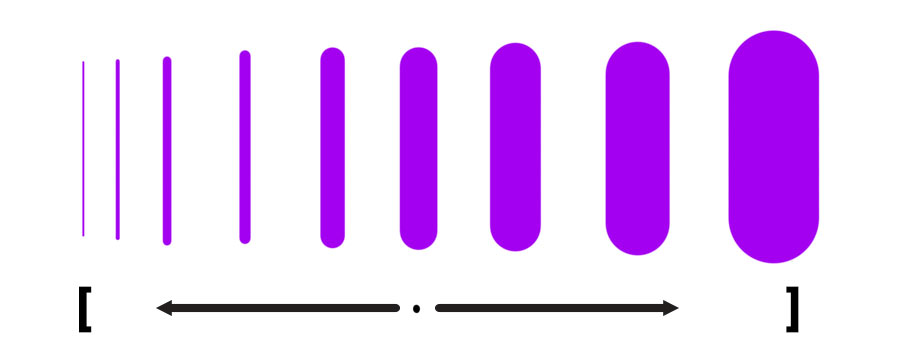
First, you have size. Your tablet pen has a thin, pencil like tip, but you can draw a line of any size with it—just tell your program how big you want your strokes to be. The easiest way is to use the shortcut: press the left square bracket key ( [ ) to make the brush smaller, and the right square bracket key ( ] ) to make the brush bigger. This should work in most programs.
If you don’t have a keyboard, your program should also have a slider of some kind that you can drag to resize your brush.
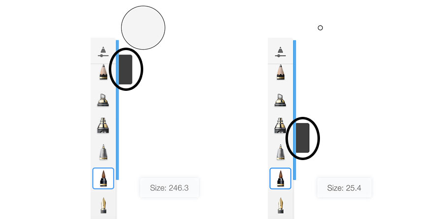
And finally, if you want a specific size, you can just type it in the settings of the brush.
Brushes with small size will feel like a pencil, or an ink liner. The medium size will create a feeling of drawing with a thick marker. The big size will turn our brush into a real painting brush. As you can see, you can create plenty of tools just by switching the size!
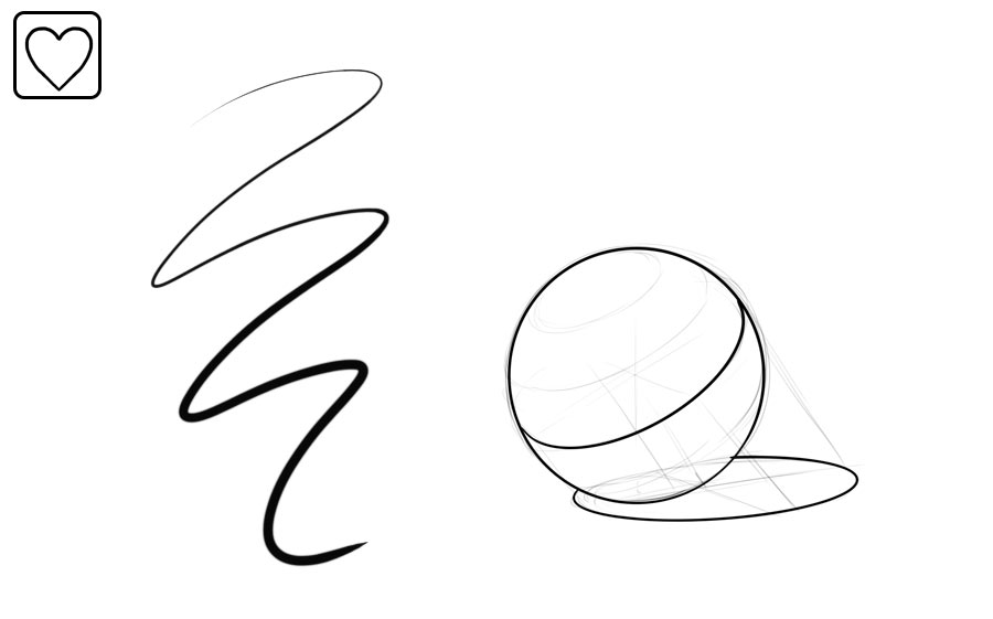
Opacity
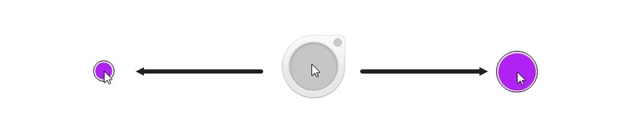
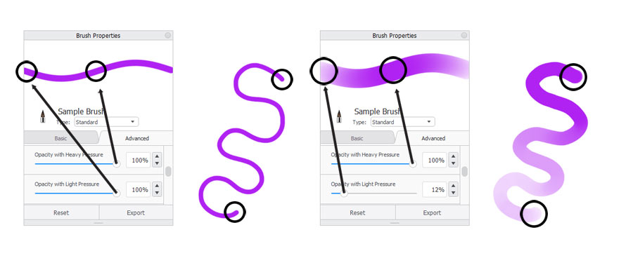
The second basic property is called opacity. Just like with size, you can change it gradually with a slider, or type a value inside the settings. When the opacity is low, your lines are less visible, so you get a chance to draw over them later without making a mess.
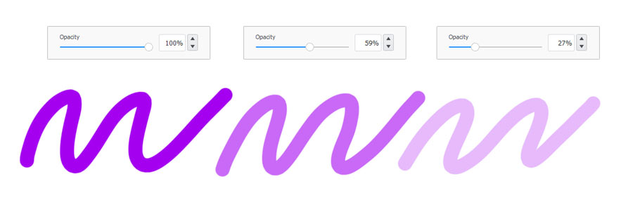
Again, changing the opacity will give you a feeling of different tools. High opacity will fit an ink liner and the oil paint, and lower opacity will fit water-based markers and watercolors.
Pressure Control
If you have a pressure-sensitive tablet, both of these properties will react to the pressure of the pen—that is, how strongly you push the pen to the tablet. So the stronger you push, the thicker or more opaque the line—or both, depending on the settings of your brush. This is something you can’t do with a mouse—and it makes a world of difference!

These pressure-related properties can and should be adjusted as well, if you want to create a brush imitating a traditional tool. For example, a well sharpened pencil has a tiny tip and gets only slightly larger when you press harder. A blunter pencil should start with a bigger size, even if the pressure is barely there. Both should start with lower opacity—after all, the stronger you press, the more graphite you leave on the paper.
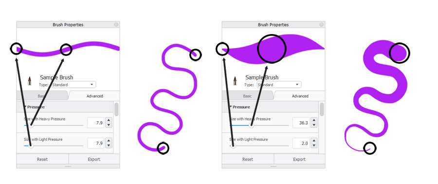
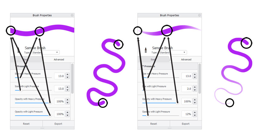
Keep in mind that if you decide to control the size with pressure, then you won’t be able to control the opacity separately—so if you want to draw big lines with variable opacity, you need to give up on the pressure-linked size control.
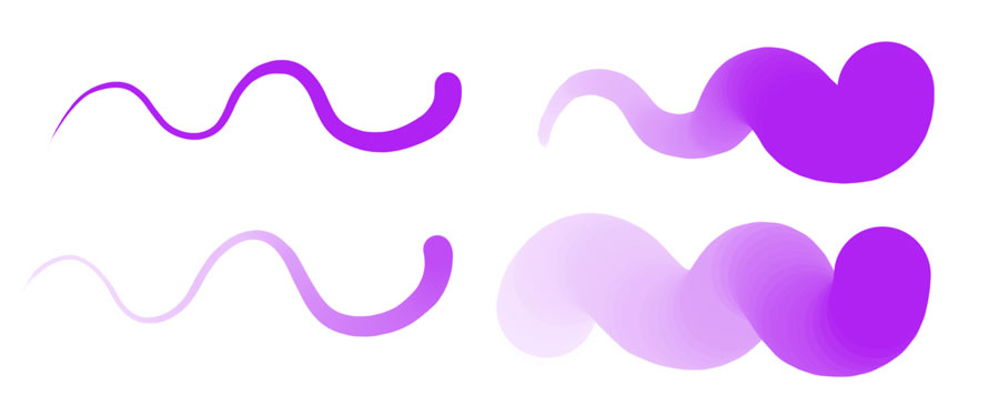
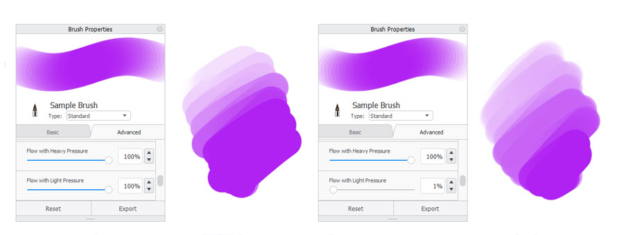
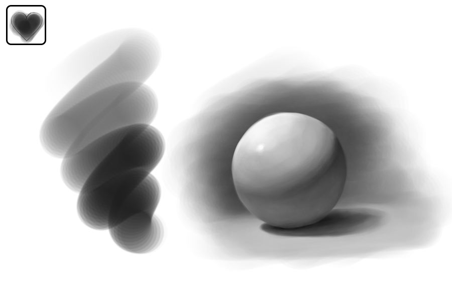
Flow
There’s also a third property. It’s called flow, and it’s related to opacity, although they differ in a subtle way. Flow, as the name suggests, defines how much ink or paint comes out when you press the pen. The higher the flow, the thicker the ink will seem. High flow will therefore be good for drawing, and lower flow will make the mixing of the paint more natural.
Here’s a cool thing: even though you can replicate the properties of traditional tools with digital brushes, you don’t really have to. You’re not limited to what can be done with ink, or graphite, or paint. You can create a completely new tool that works exactly as you need! For example, my favorite sketching tool works like a pencil when I press lightly, and like an ink liner when I press strongly. It’s two tools in one! Similarly, my favorite painting brush has a shape of a marker, and yet it has a covering power of paint when I press strongly.
Advanced Brush Properties
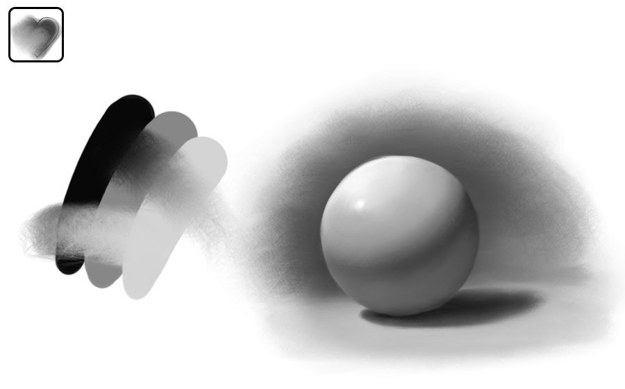
Let’s talk more about the painting brush now. A simple round brush is very universal, but it has this artificial, digital look. If you’re more used to less predictable tools, here’s what you can do:
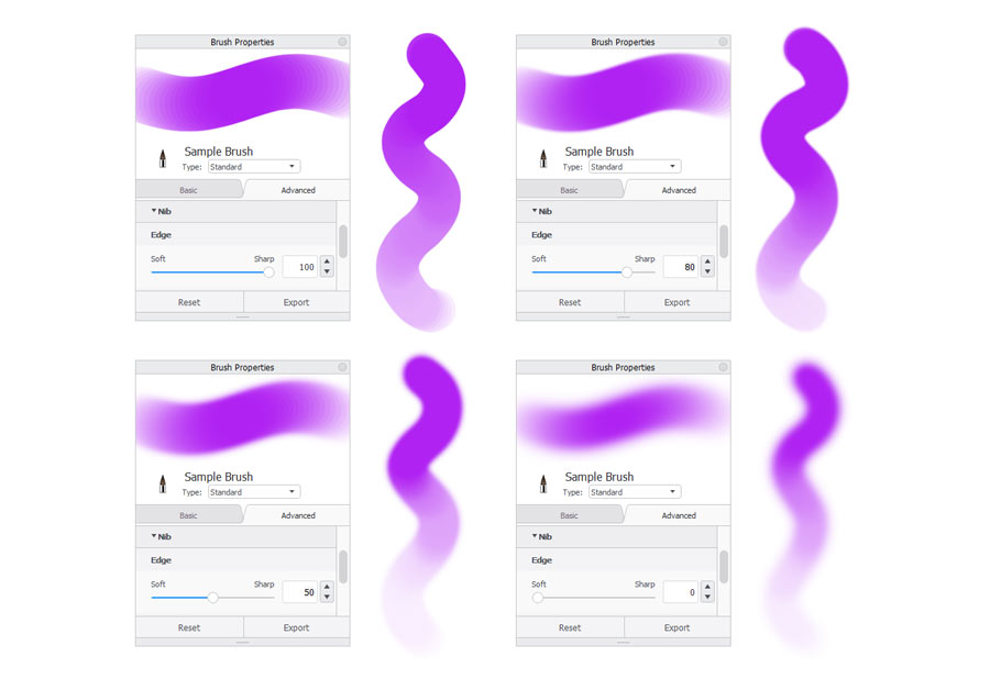
Hardness
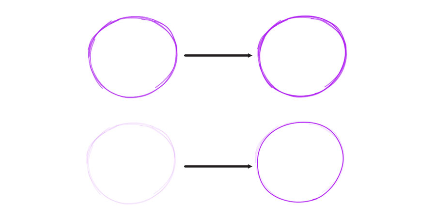
First, you can change the hardness of the edges of the line. A subtle softening will make the lines blend better. Strong softening will create an airbrush.
Shape
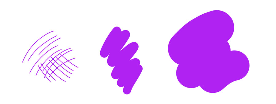
Second, you can change the shape of your tip. This is where the real magic happens. A default line is made of a circle that gets multiplied along the stroke. But nothing stops you from replacing this circle with any other shape. This will make your brush work more like a traditional painting brush, with each hair drawing its own line. You lose predictability and control, but you get a more natural, chaotic effect in result.
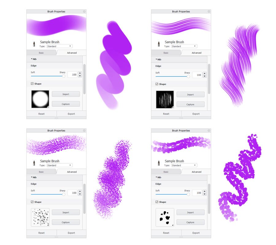
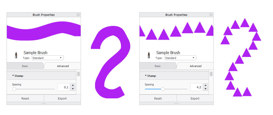
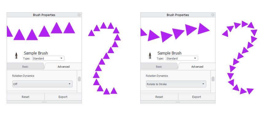
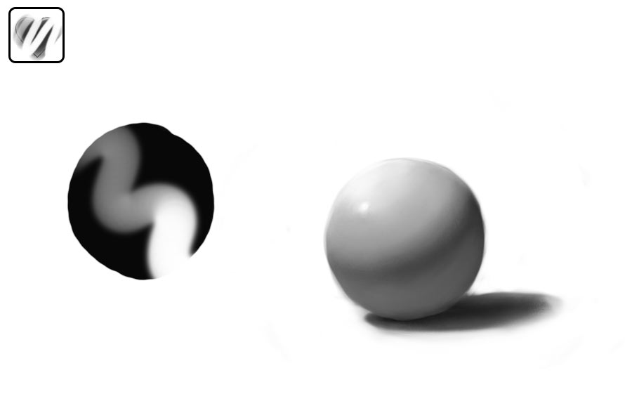
You can also control how the shape will behave along the stroke. First, you can adjust the spacing between the multiplied shapes…
… and second, you can link the direction of the shape to the rotation of the stroke.
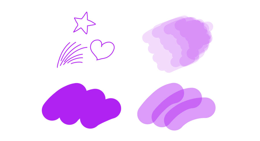
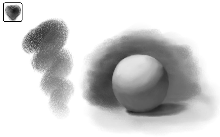
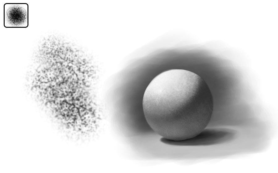
Texture
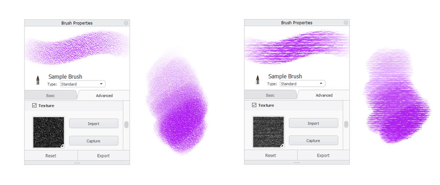
Third, you can add some extra texture inside the line. This option will be perfect for imitating pencils and pastels as well.
Randomness
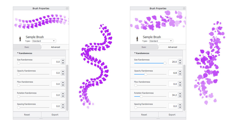
Finally, you can get rid of boring predictability by allowing some randomness into your strokes. Of course, you shouldn’t just drag the sliders randomly—the randomness should be adjusted to your needs, otherwise it will just get in the way.
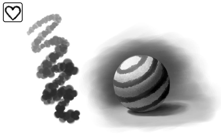
Type
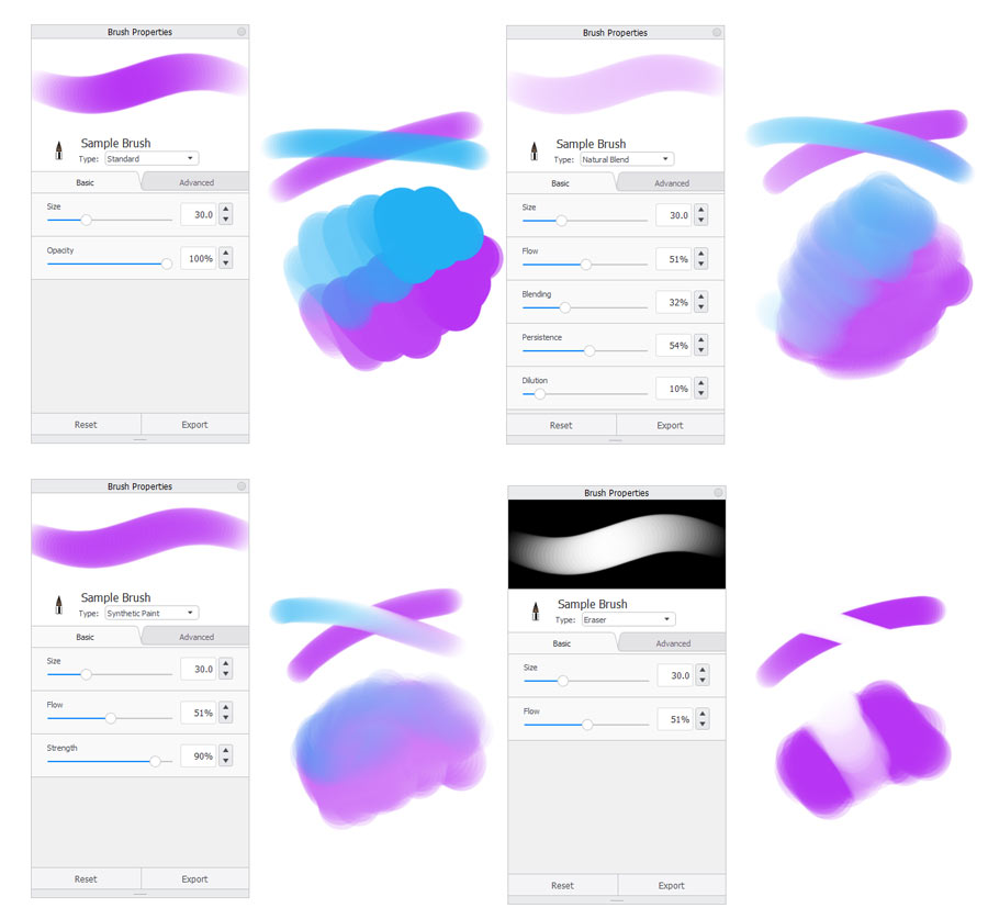
There’s one more thing that makes your lines look digital. Real painted lines interact with each other—they blend into each other or smudge the area. If you want your brushes to behave this way, you can change their type. Not all programs have this option, but in SketchBook it’s just a matter of picking the type on the list. This is also where you can turn your brush into an eraser of the same shape and properties.
What Brushes Do You Really Need
Now you know how to create any brush you need, but here’s the question: how many brushes do you need? You shouldn’t try to create a brush for every object or surface—rather, your brushes should be technique oriented. So don’t focus on what you want to draw, but rather how you want to draw it. Your brushes can behave in many different ways—how do you need them to behave to create the end result you have in mind?
Every artist works differently, so I can’t give you a perfect solution to this problem. However, as a beginner, you probably don’t have your own style yet—you have to discover it first. And to discover it, you have to start drawing, somehow. So here’s a list of techniques that you may use for the start:
Sketching
You want to draw lines that are thin, subtle, tapered, and can be drawn over without making a mess. You want to have full control over the shape of these lines.
Inking
You want to draw tapered lines that will cover the sketch. They should have this final look, so they should be a little thicker, very pronounced and sharp. You need full control over their shape.
Coloring, Digital Style
You want to draw big, wide lines that blend subtly with other colors, but are easy to control and don’t destroy the area around them.
Coloring, Painterly Style
You want to draw big, painterly lines that don’t really look like lines. They should have some texture and organic edges, and they should blend naturally with other colors, even at the cost of changing the area. You’re ready to sacrifice some control to get this chaotic, natural effect.
Blending
You want to draw big, wide lines, that instead of adding colors, blend the area you draw over. To avoid the unnatural, smooth effect, these lines should be textured and slightly chaotic.
Erasing
You want to draw wide lines that are easy to control, and remove the area under them.
Adding Texture
You want to draw very chaotic, heavily textured lines that don’t really resemble lines. You don’t want to control them, but rather let the chaos spread over the area, making it look less planned and therefore more natural.
Textured Drawing
You want to draw lines that are fairly easy to control, and yet their edge is organically ragged, for a natural effect.
Once you have such a list, it’s very easy to create the brushes that meet the requirements. And then your brush set becomes what it was supposed to be from the start: a set of tools to draw with the techniques you wanted to. However, if you still feel overwhelmed, you can also download my own brush set and modify it to your needs:
Finally, the last advice. Generally, the more impressive the brush, the less you should use it. Even if you manage to find a brush that imitates a dragon scale photo-realistically, you still have to sketch, color, and shade the dragon using something much simpler than this scale brush. If you do it skillfully, then it will look great even without the scale brush. But if you don’t, then this magical brush will only accentuate the flaws in your artwork.
That’s what I want you to leave with: in the end, a brush is just a tool. It allows you to draw lines, and that’s it. No matter how beautiful these lines are, they won’t make an artwork on their own. You have to combine them skillfully, using the same techniques as you’d use on paper. So now that you know everything about brushes, focus on developing your techniques. Good luck and remember to have fun!
If you want to learn more about customizing brushes in SketchBook, this tutorial will give you a more detailed overview of all the settings:
And if you need a better introduction into SketchBook, try this tutorial as well:

Was this tutorial interesting for you? Please let me know! I’d love to create more parts to this series, but I need to know if it’s worth investing my free time in.
3 Comments