Let’s say you’re drawing something from a photo reference, and you can see something is wrong—you’re not sure what exactly, but your drawing looks different than the reference. In this short tutorial I’ll show you how to fix this issue by adjusting the proportions.
How to Fix Proportions in Your Drawing
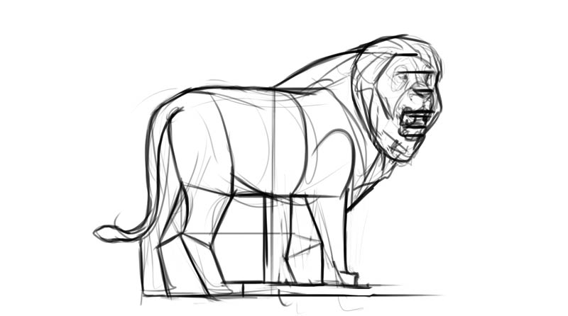
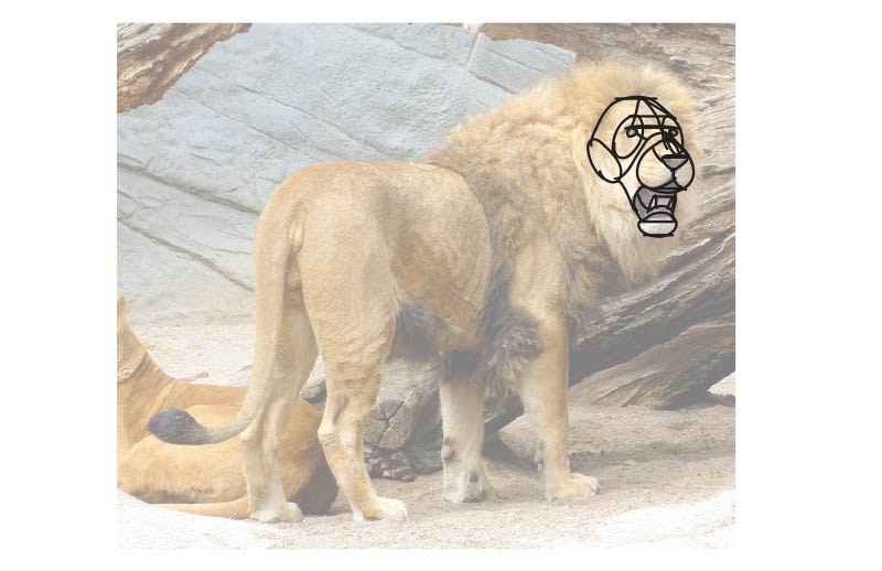
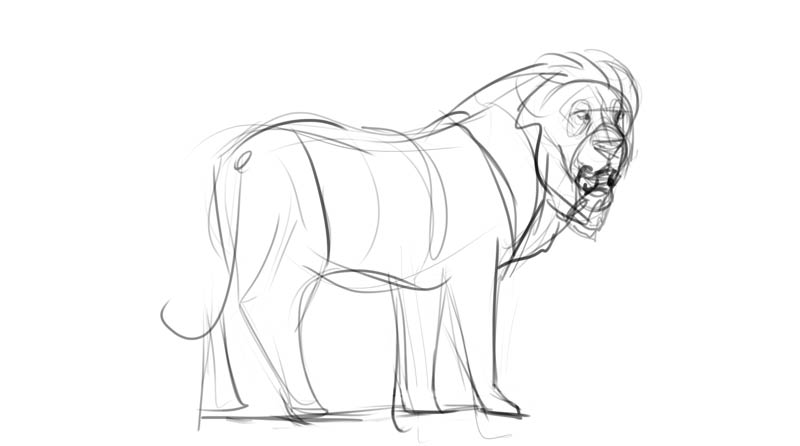
This is my sketch, and this is my reference. There’s nothing glaringly wrong with it, but I think the lion in the photo gives a much stronger impression. So what changes should I add to make it look more like the reference?
Feel free to use my sketch to follow this tutorial. If you use your own, remember that proportions should be adjusted early in the sketching phase, before you add any details. Make sure your foundation is strong before you start building on it!

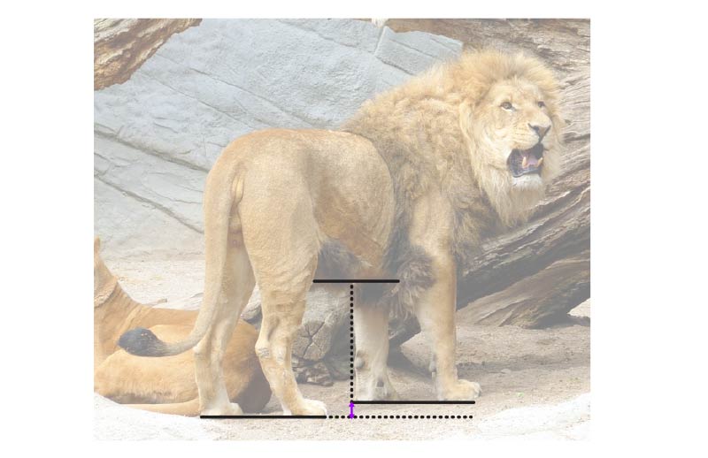
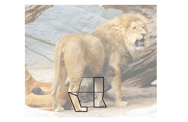
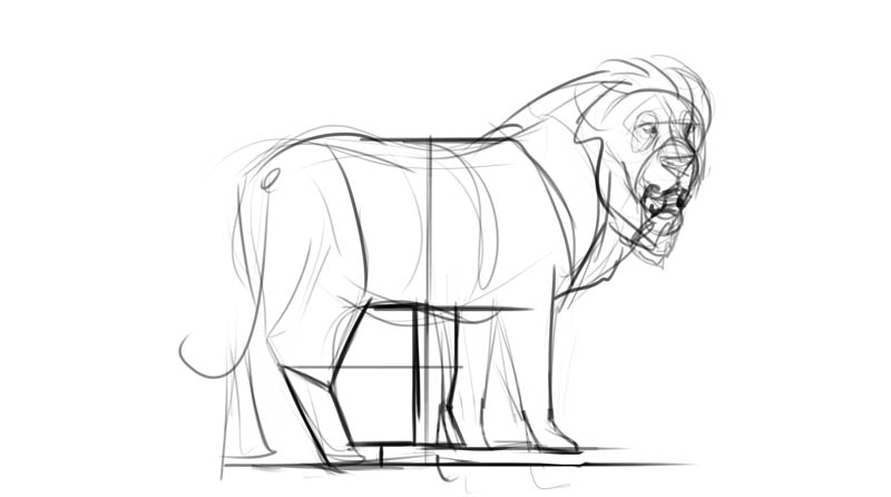
First, check out the distance between the body an the ground. When drawing an animal, the easiest way to do it is to imagine a vertical line going through the torso at its widest point, and then place this line under the body. This will give you a neat point of reference.

In my reference the distance between the body and the ground is almost as big as the width of the torso, but in my drawing these distances are equal. By adding some width to the torso, I’ll make it more robust, just like it should be.

One technical point: you could draw the lines over your reference to see them better, but that’s not very practical. Instead, try the ghosting technique—move your pen over the reference as if you were drawing the line, without actually drawing it. Then copy this motion over your drawing. This will make you see the relationship between the lines in your drawing and this invisible line.
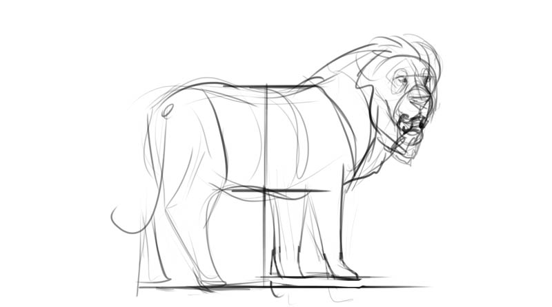
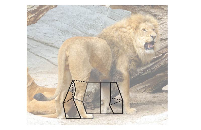
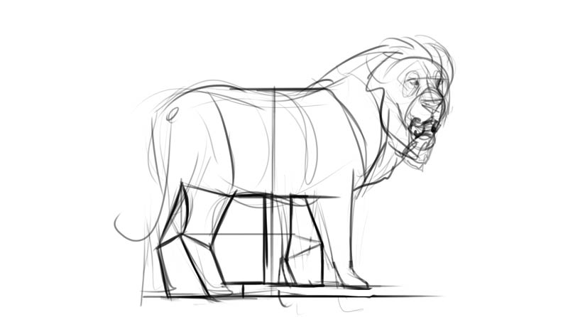
Imagining horizontal lines between parts of the body can help you see the relation between them. In my photo, perspective makes the front paws look higher, closer to the belly than the hind ones. I didn’t include this effect in my drawing, so it’s time to fix it!
If it’s hard for you to guess how far you need to move an element, try to think in fractions. Is this distance bigger or smaller than 1/2? If smaller, is it smaller than 1/2 of this 1/2 section? Or maybe is it closer to 1/3? Use the ghosting technique to see the fractions better.
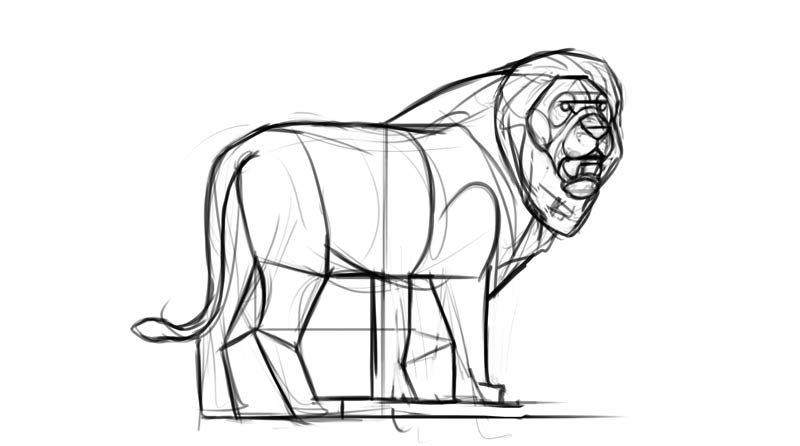
We could continue fixing the whole image by drawing various vertical and horizontal lines and checking their alignment, but usually at this point I prefer to switch to a more intuitive method. If you look closely, there’s a shape between the legs, created by the negative space. This shape is quite simple, so it should be easy to copy.
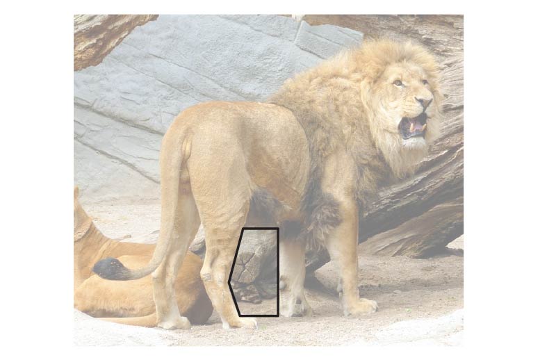
When I copied it, I immediately fixed the position of that front leg, without even trying!
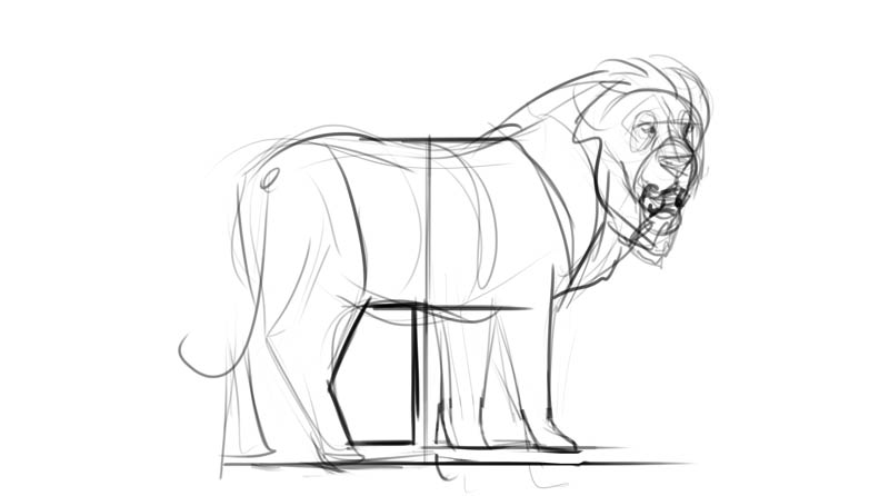
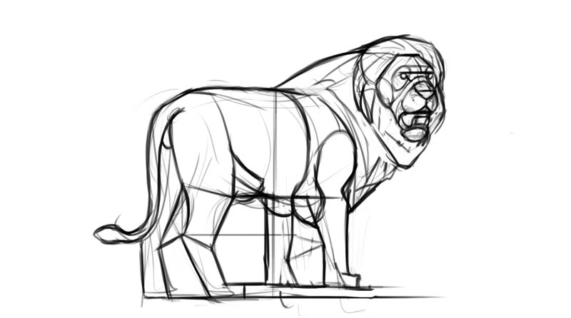
Once you draw one shape like this, you can build on it. It works for both outer and inner shapes.
It may look kind of messy, but remember that these lines are not really there—I don’t draw them over the reference, I just imagine them. Because of this, I can focus on the shape I’m interested in at the moment, ad imagine the other lines when I need them.
With this method you can solve all the issues with proportions, including the distance between the body and the head.

You can draw the head the same way, this time using smaller shapes, but you can also try a different method, First, check out the perspective: if the symmetrical features lie in lines parallel to each other in the front view, they should also be parallel in every other view.

Once you have these lines, try to see more general shapes in the head. The smaller the shapes are, the easier they are to copy, even if they’re curved and complex.
Finally, all the other big elements that you ignored up until this point. Now you’re ready to add the details and finish the drawing!
You might think that we didn’t make any big changes, but when you compare the two sketches, it’s clear that the second one looks more like the glorious lion in the reference. Fixing your proportions with this method helps you draw what you see, rather than what you think you see.
If you want to learn more about proportions, this tutorial will explain the topic more thoroughly:
1 Comment