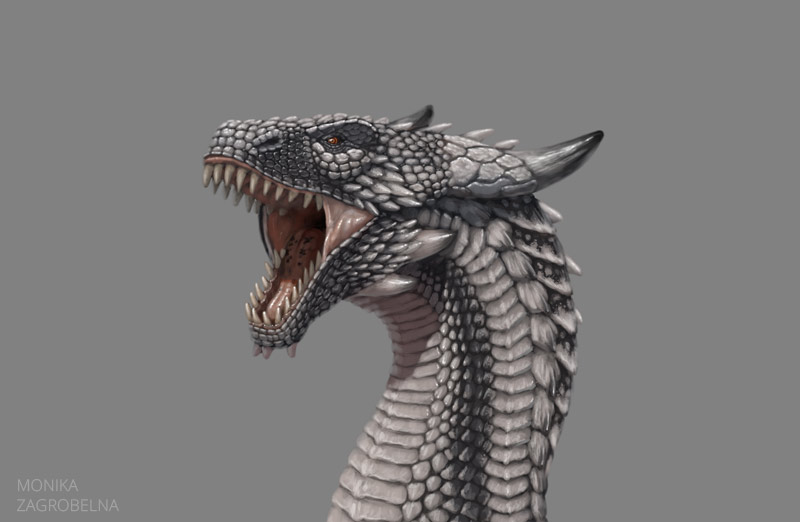
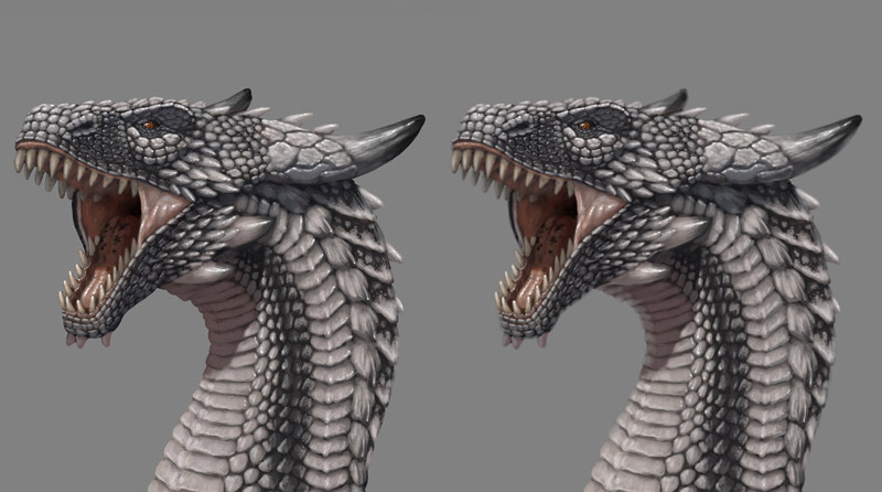
I painted this dragon for fun, but also to experiment with adding a pattern to the scales in a natural way. I ended up with something quite interesting! Keep scrolling if you want to see the process.
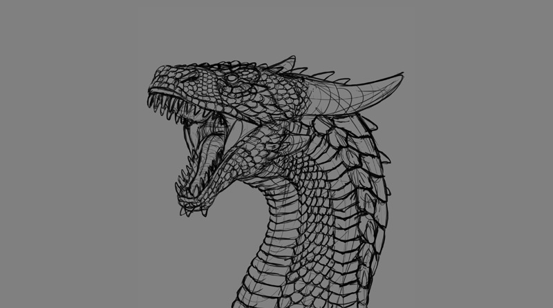
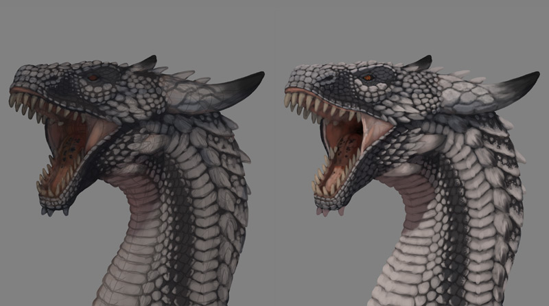
1: Line Art
As always, I sketched the lines first. It’s impossible to paint scales if you don’t plan them first!
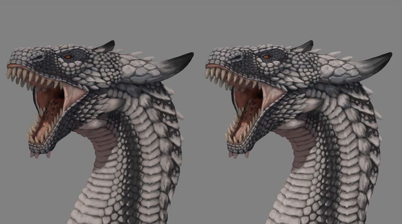
2: Basic Colors
I created a clipping mask, lower the opacity of the sketch, and started painting below it. In this phase I simply color the dragon with basic colors, ignoring shadows, shine, and details. In most cases scales are visible mainly through colors—they have an outline, or a the skin between them is darker/lighter, or there’s dirt between them. So you shouldn’t wait for the shading phase to make the scales noticeable, but rather find a way to make them pop right now.
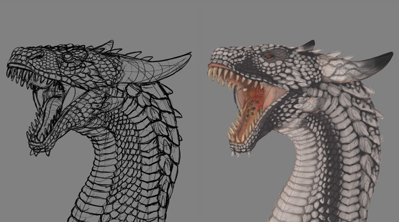
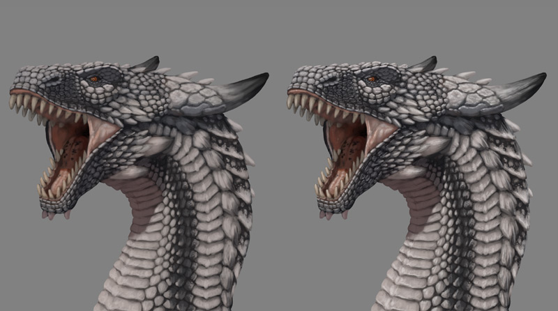
3: Basic Shadows
I added a Multiply layer over the colors. I filled it with dark blue, and then used a soft brush to make the shadows warmer in the throat area (because the light can get reflected into the shadow, making it warmer). Using more than one color of the shadow can add another level of realism to your artwork. Then I painted the illuminated area with white, for now sculpting only the big forms.
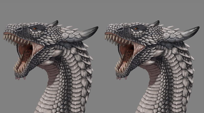
4: Detailed Colors
I added another Multiply layer and filled it with dark blue. Then I added a new layer above the line art and started painting the details, hiding the darkening layer below from time to time to pick the original colors. To create these little, detailed shadows, I just had to skip the area and leave it unpainted.
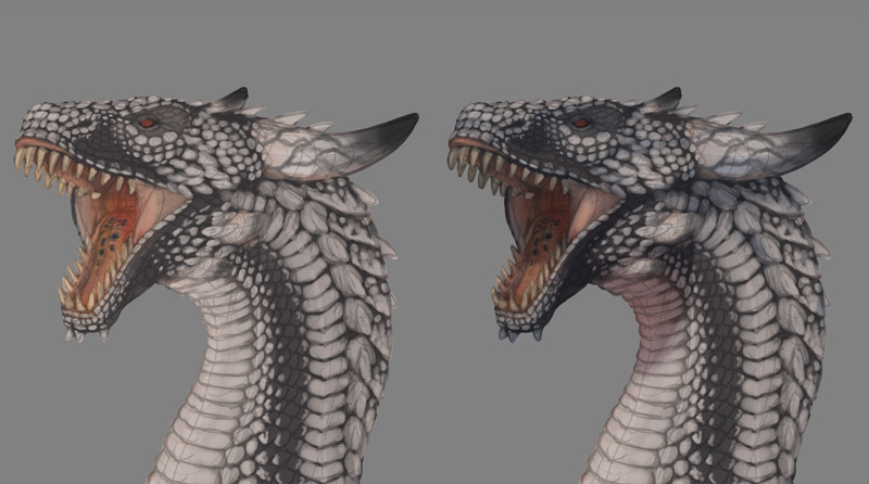
5: Matte Shine
Most of the texture is revealed not by the shadows, but by shine. I started by adding the matte shine that most materials possess. I added a Screen layer and painted with a small brush, marking the surface of the scales. I used dark grey here.
6: Shine
I added another Screen layer and painted with even smaller brush to make the shiny surfaces more detailed. I used about 40% grey here.
7: Highlights
The most shiny, smooth surfaces have highlights. I added another Screen layer and painted with a tiny brush, adding white dots here and there. I probably should use less of this effect, but I couldn’t stop myself!
8: Final Details
Finally, I added some grey light all around to make the edges of the painting softer. I also merged the whole painting and blurred the edges slightly.
1 Comment