This post has been originally commissioned for SketchBook Blog in 2016. After the site’s migration, the original is no longer available, but you can still access the content here. Enjoy!
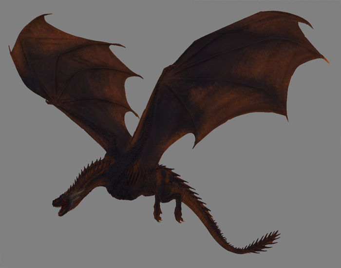
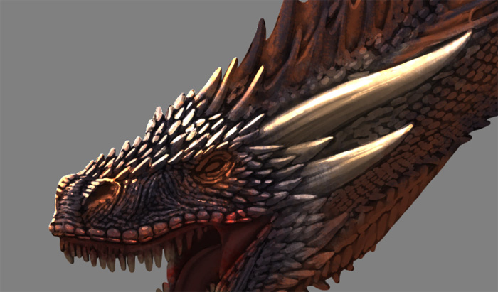
Do you watch Game of Thrones? Well, who doesn’t! This season we’ve had a chance to take a closer look at Daenerys’ three dragons-mighty beasts created with stunning CGI. What makes Game of Thrones’ dragons even more special is that they’re designed extremely realistically! If you like drawing dragons, you can learn a lot from Drogon, Rhaegal, and Viserion.
In this tutorial we will analyze Drogon (who gets the most screen time) and paint him step by step using SketchBook Pro. I will show you how to sketch him, and I will lead you through all the stages of painting: coloring, shading, and rendering. This guide will be technique oriented, which means I will not show you exactly how to draw every line, but rather how to achieve specific effects. This also means you can use it to paint your own dragon!
Tools
I’m going to use SketchBook Pro with a very simple set of brushes. My main brushes are:
- Inking Pen (Basic set)
- Bristle Blender (from the Textured Watercolors set)
Other than that, I also use some textured brushes for coloring, which are entirely optional and can be switched to anything you like:
- Charcoal (from the default Texture set)
- Camo (also from the default Texture set)
You can also download the whole set here, if you want to have them all together. Exercises like this take time, but you will learn so much by taking the time to improve your drawing. I created a speedpaint video of my drawing process, which you can put on in the background to use as an additional reference if you need to follow along with my steps:
Analysis
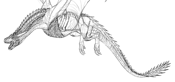
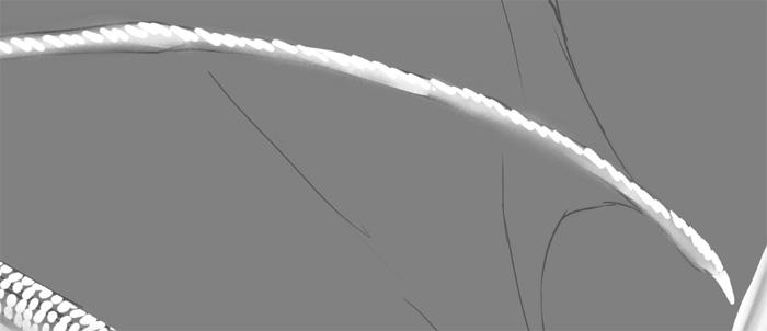
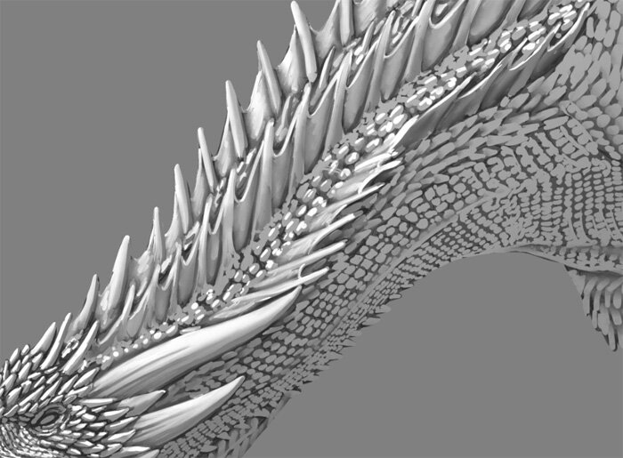
Drogon isn’t real, but he exists in the World of Ice and Fire as a beast with specific features. We need to learn about these features to paint Drogon realistically. In order to do this, skim through the episodes where Dragon appears as a full-grown adult, and take screenshots of every scene where he can be seen clearly. Try to create a collage featuring various poses, views, and details. Save the collage as a single huge image to use it as a reference.
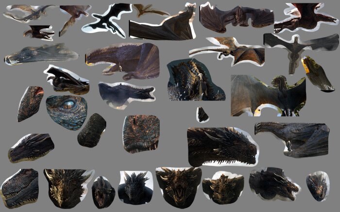
Use this reference to sketch Drogon many times. It’s the only way to learn everything about his anatomy and poses. Don’t try to make these sketches pretty and polished-they should simply be a side effect of your analysis. If you find the sketching challenging, you may need to work on your basic skills some more. Check out How to Draw from Imagination Exercises: Precision.
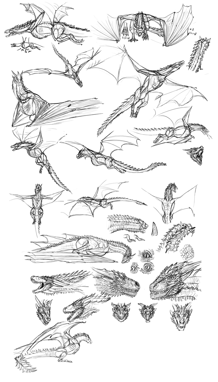
How many fingers does Drogon have in each wing? How long is the tail in comparison to the body? Where is the jaw joint located? You must answer all these questions and more through these sketches.
Now, use all you have learned to draw Drogon in a clear, unambiguous side view. I have discovered that Drogon shares the common features of birds and bats (the only flying critters in our world)-huge pectoral muscles and enormous wings. They may seem ridiculous for someone used to the “dinosaur with wings” type of dragons, but if dragons really existed they would be more similar to this!
Judging from the look of Drogon, he’s a saurischian type of a dragon. If you want to learn more about them (what their musculature looks like, how their skull works) check out How to Draw Dragons: Step-by-Step Instructions from Tooth to Tail.
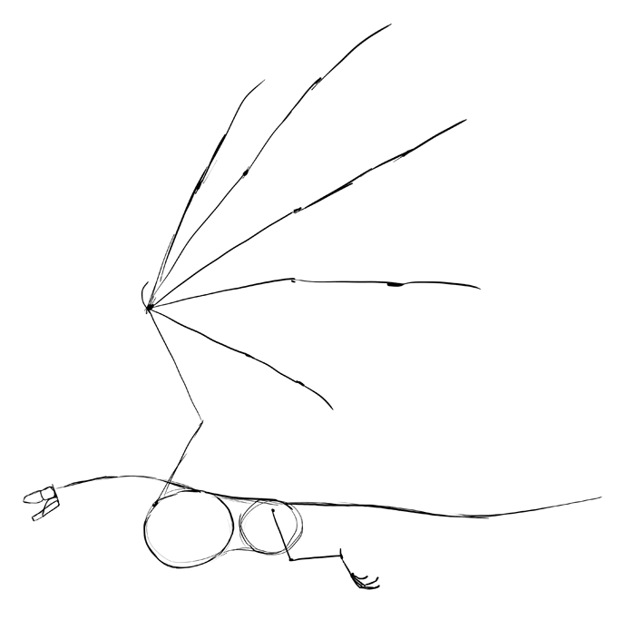
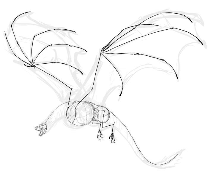
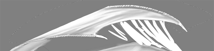
Once we have the body, we can simplify it to a “skeleton”-a drawing with basic proportions, perfect for pose sketches.
Finally, take a look at the colors. Don’t simply pick them with the color picker-each pixel in the photo has a different color, so you can’t pick a “general” color your eyes see. What’s more, white balance affects the colors in the scene, making a great difference between what you see and what the color picker picks.

To eliminate the risk of seeing the colors wrong, try to pick them with your own eyes, seeing through the lighting in the scene. Don’t worry about perfect accuracy-everything can be fixed later!

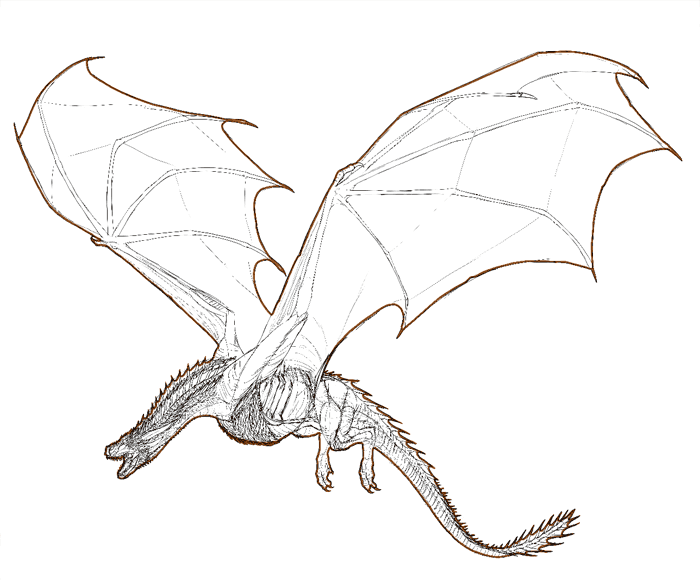
Sketching
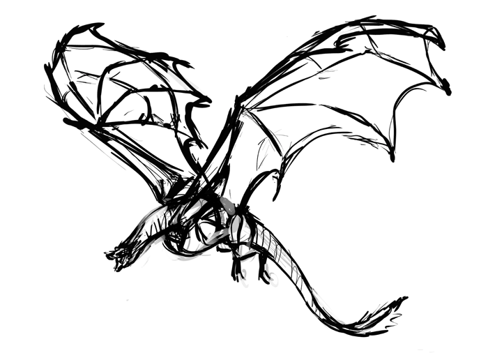
We know what Drogon looks like, and now we need to draw our own version of him. What pose would fit him best? Experiment with different ones to find out.
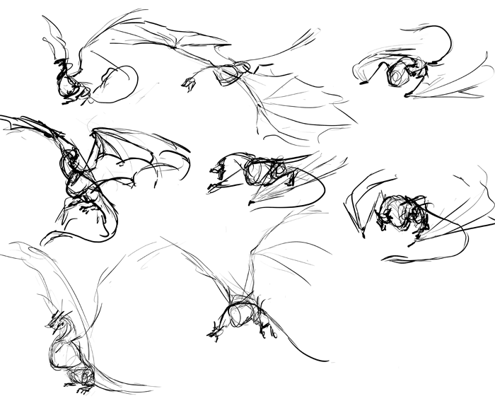
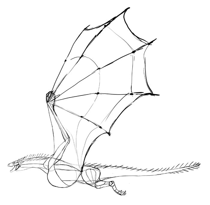
After you find that perfect pose, rework it to make sure it looks the best it can. Wings can be really a pain in the neck-it takes a lot of skill to pose them in a both realistic and impressive way, without covering important parts of the body. If you struggle with this part, try my other tutorial: How to Draw and Animate Wings: Birds, Bats, and More.
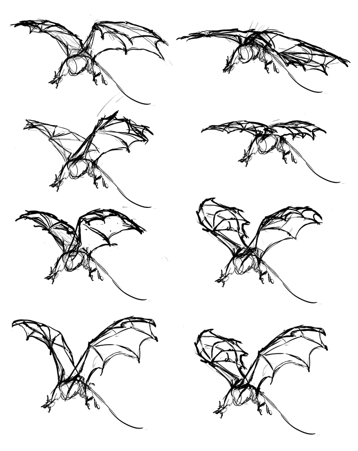
Once you achieve the perfect version, make sure it still has the proportions of Drogon. Use your reference to rework the elements of the body without adding any details yet.
Lower the opacity of the sketch and draw the skeleton on a new layer. This will help you see the proportions better.
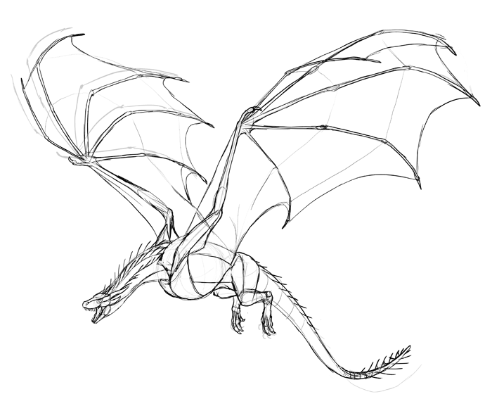
Again, lower the opacity, and draw the body on a new layer. No details yet, just the simple volumes of the body according to our previous side view sketch.
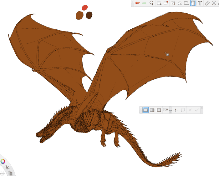
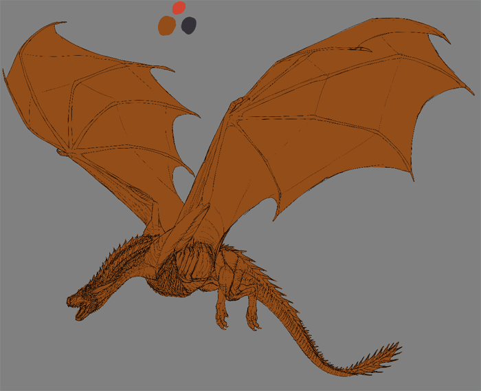
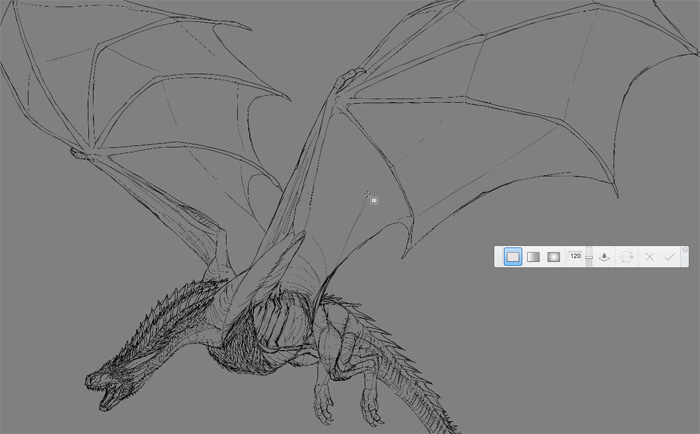
Finally, draw the line art on another layer. Before you start, go to Image | Image Size and make the canvas as huge as you can afford (mine is 8,000 px wide). This will let you add all the details. Draw everything that can be seen on the references. If something can’t be seen in any of the screenshots, then it probably won’t be visible in our painting either – so don’t worry about it!
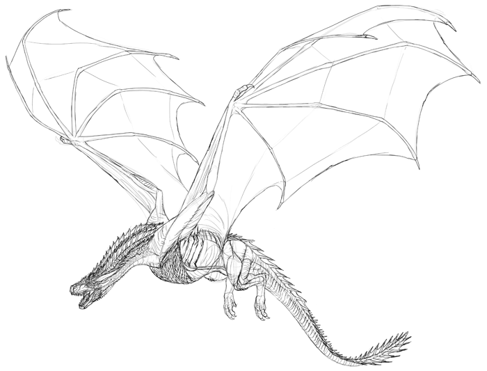
You can download the line art here, if you want to see the details better, or if you want to use mine for the next part of the tutorial.
Preparing to Paint
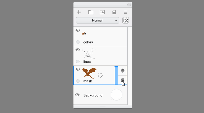
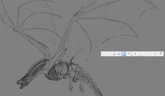
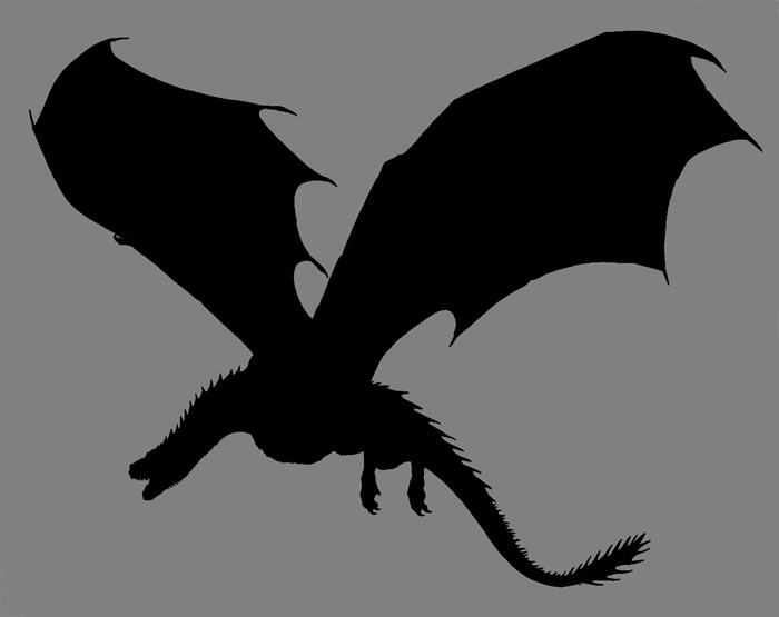
In traditional painting artists sometimes cut a silhouette of painted object in a sheet of paper to cover the area outside it and to paint only the inside. In digital painting we can use this method too. Create a new layer under the line art, and use the Inking Pen to outline the silhouette of the dragon. Don’t leave any gaps!
Now use the Magic Wand (W) to select the area outside of Drogon’s body.
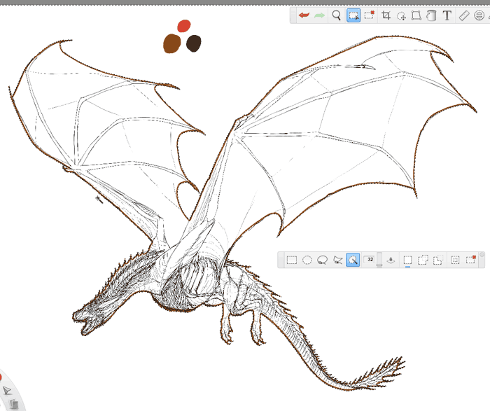
Invert the selection (Control+Shift+I) to select the body only.
Use the Flood Fill to fill the selection.
The mask is done! To make it work, Lock Transparency of the layer.
Test how it works.
Finally, change the color of background to something more neutral than striking white. This will help use see the colors and shades more accurately.
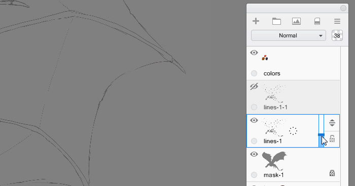
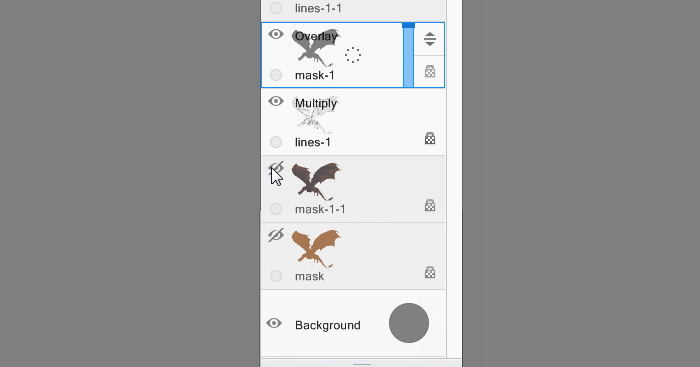
Duplicate the mask and hide the original-we’re going to need it yet.
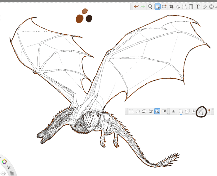
Coloring
Colors are not only affected by light-they are created by light and don’t exist without it. So you can’t really color Drogon without using any lighting. Let’s start with something as neutral as possible, though-colors as seen in medium dark shadow.
Use your reference to choose the right colors, but don’t pick them. Just compare your results to the photos to judge the accuracy. Start by adding a texture all over the body with the Charcoal brush. Let’s cover the orange skin with dark scales.
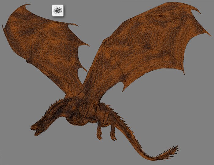
Now take the Camo brush, which is more precise than Charcoal, and color the dragon with more detail. Don’t use total black, or the line art will become invisible.
Adjust the colors until your result is similar to the reference.
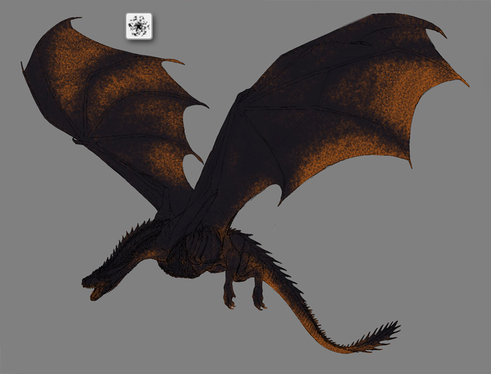
Ambient Occlusion
Ambient occlusion is a term from 3D modeling. It describes the little undirectional shadows that appear in the object even when there’s light all around. For us it means we can add special shadows before adding any direct light, to give an impression of weak ambient light-too weak to make the dragon brighter, but strong enough to define its form.
To add ambient occlusion duplicate the original mask and fill it with 50% gray.
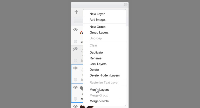
We’re going to make the line art a part of this ambient occlusion layer. Duplicate the line art first to keep it as a backup, and hide the copy. Then use the Magic Wand (W) to select the area outside of the mask, click the line art layer, and press Backspace to remove everything outside of the mask.
Select the copied mask and the line art, and merge them.
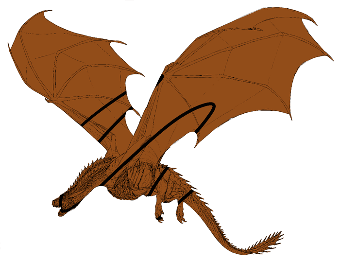
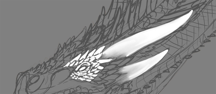
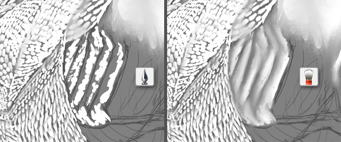
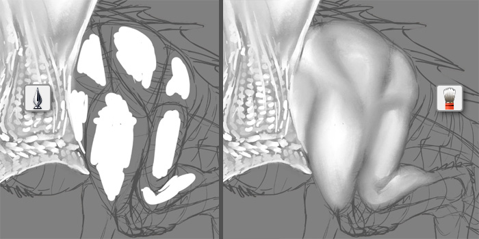
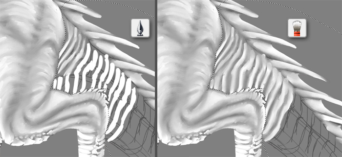
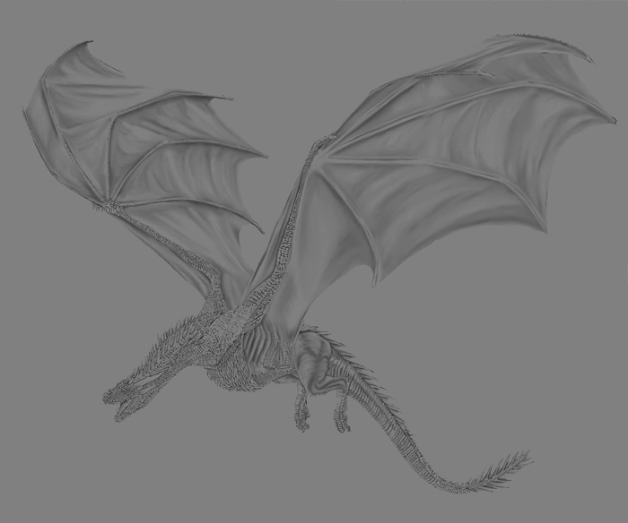
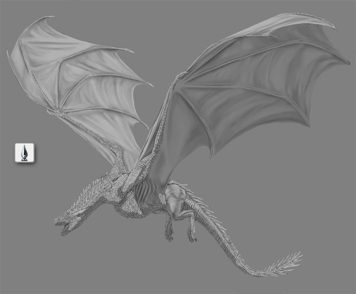
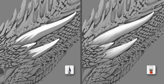
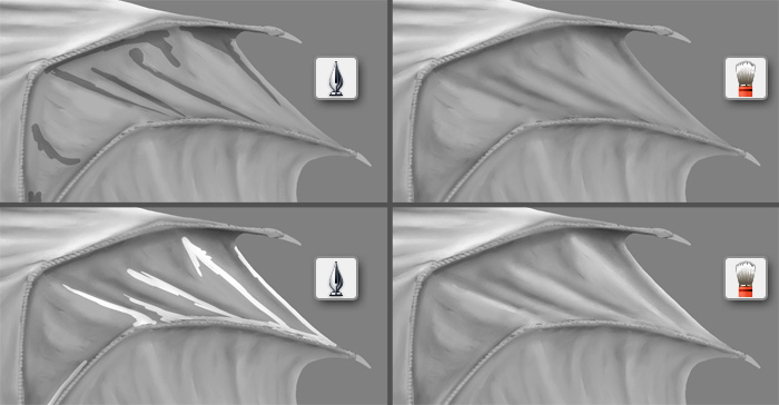
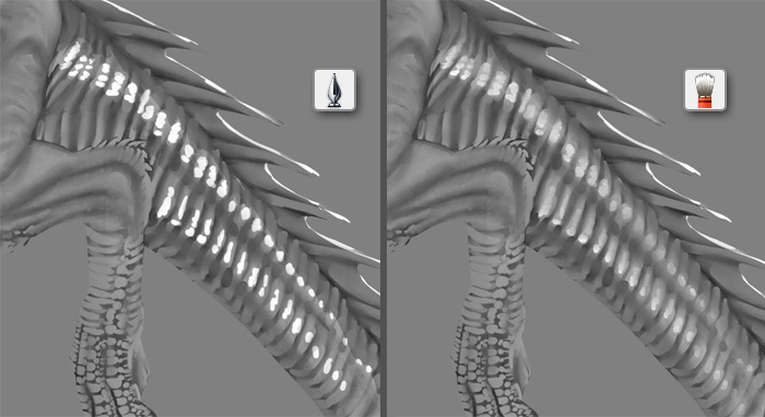
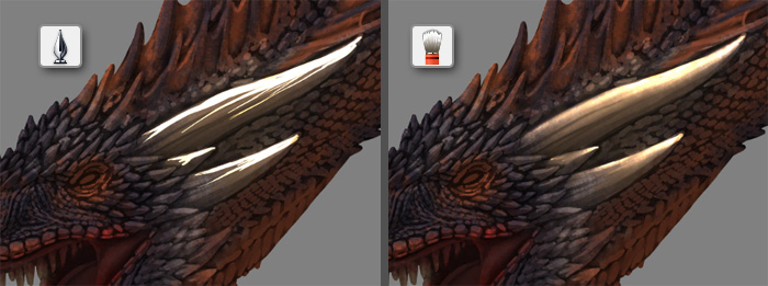
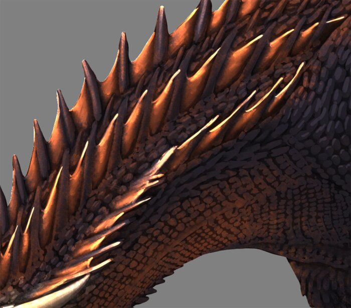
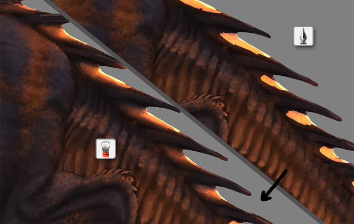
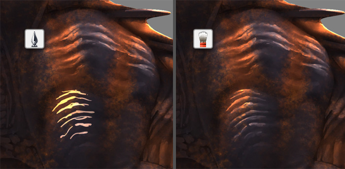
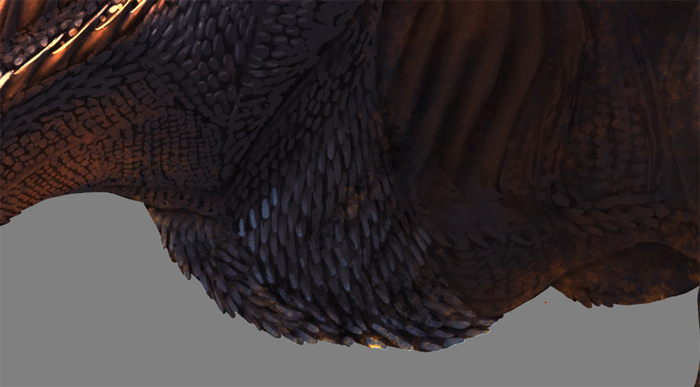
The process of painting ambient occlusion is pretty straightforward. Paint all the details of the body (scales, spikes, fins) with white, leaving some space between each other. You can use the Bristle Blender brush to make the shadow smoother, but it’s not always necessary.
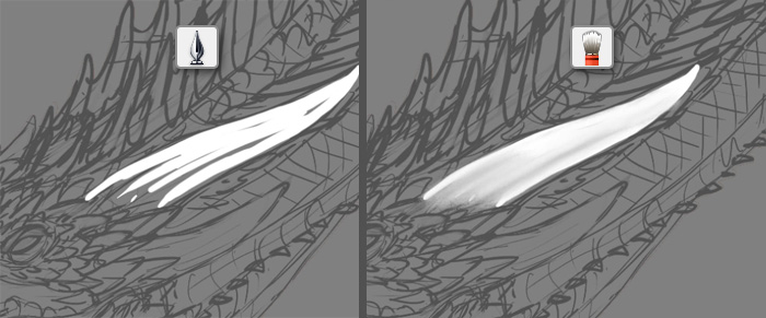
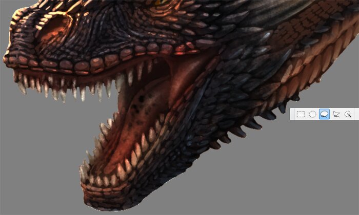
Once you know how it works, you should be able to shade all the body on your own. If you need help, here’s some closeups from my process:
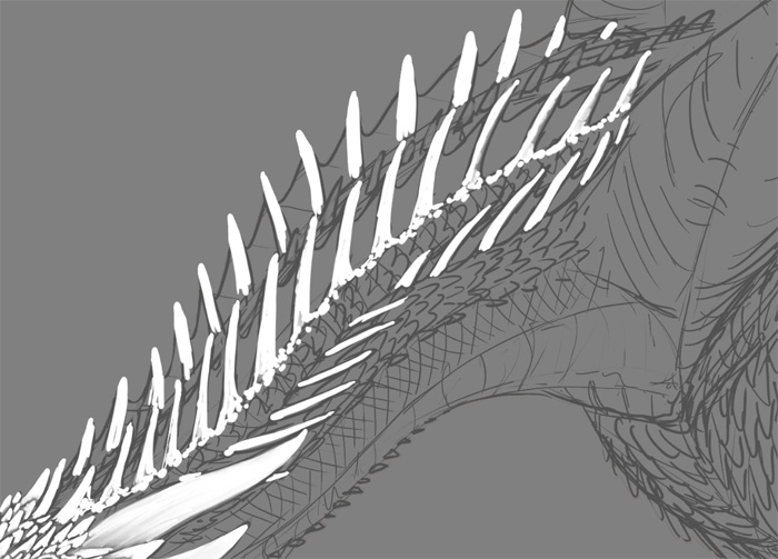
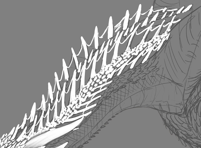
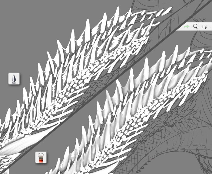

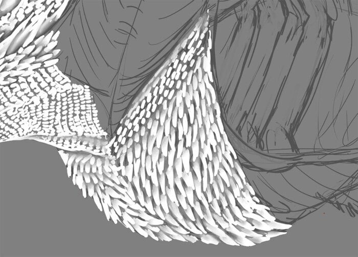
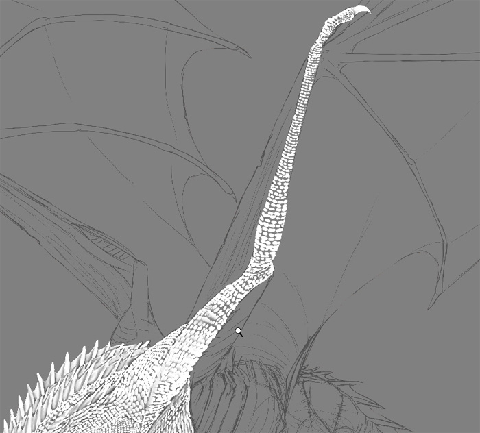
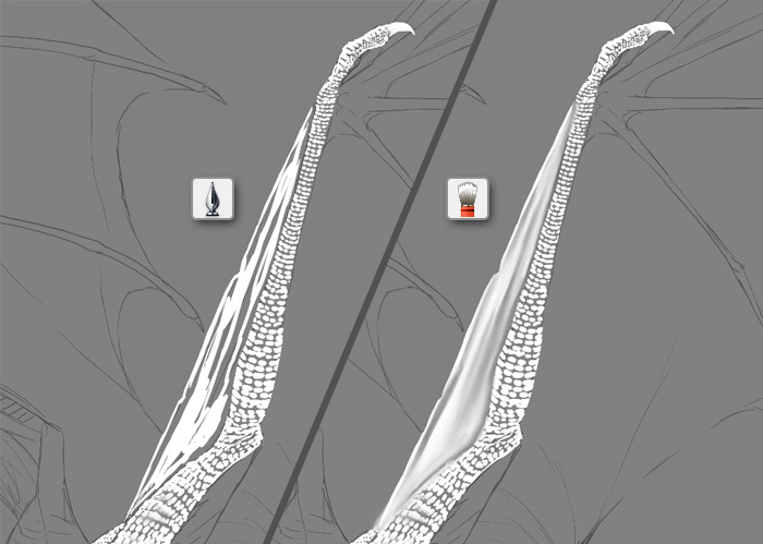
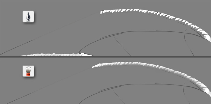
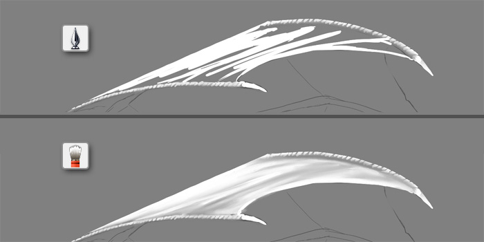
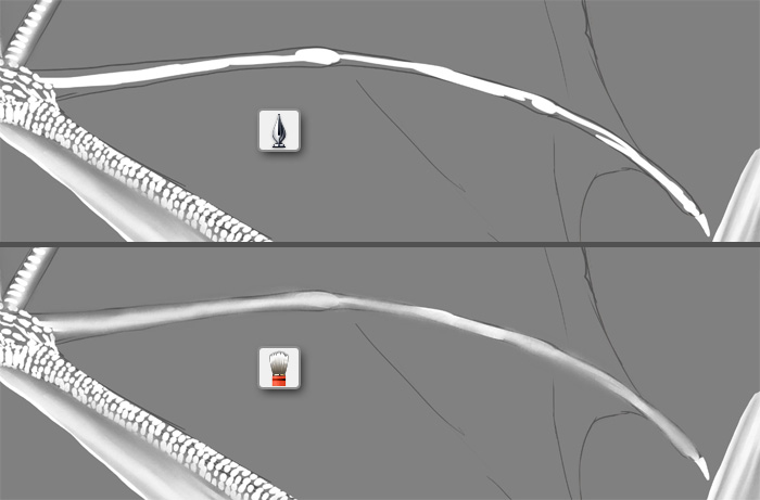

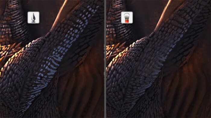
Sometimes it’s good to use the Lasso (L) to keep some edges safe from blending.
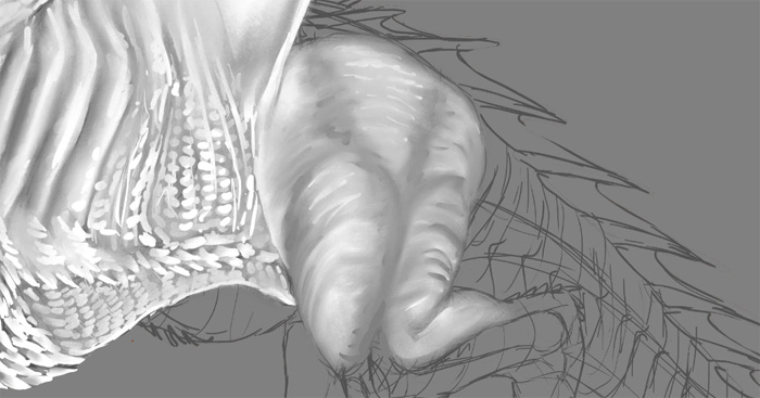
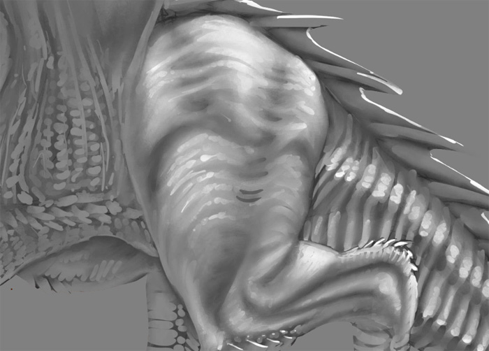
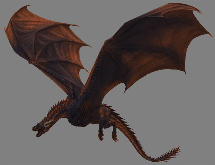
That’s how my Drogon looks after the process is finished.
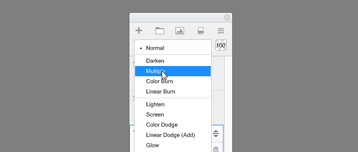
To mix the ambient occlusion layer with the colors beneath, change the Blend Mode of this layer to Multiply. It will make white transparent, and keep the shadows dark.
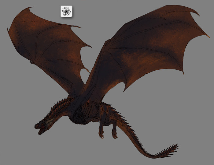
Direct Light
Our Drogon has a 3D form, but it looks pretty dark. Let’s make it brighter and reveal even more form by adding a directional light source somewhere above him.
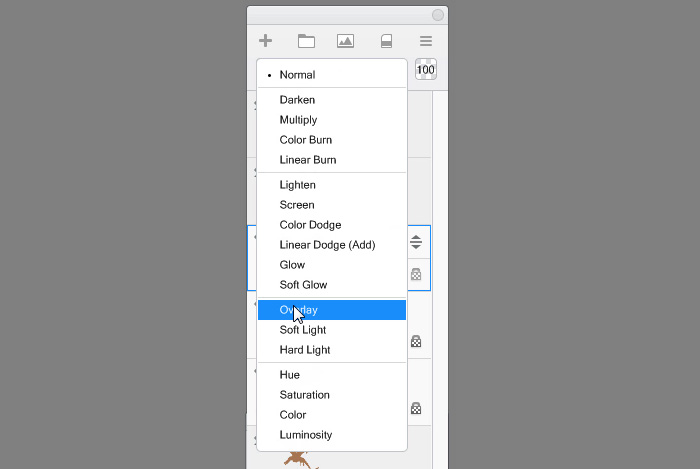
Once again duplicate the original mask. Drag it to the top, fill it with 50% gray and change the Blend Mode to Overlay.
Hide the color layer for now to see the lighting better.
If you paint in Overlay mode with dark grays (lower than 50%), it will make the lower layers darker. If you paint with bright grays (higher than 50%), it will make them brighter. The 50% gray we have used is transparent in this mode. We’re going to use white and bright grays to add some light to Drogon. Don’t go lower than 50% though-we don’t need any more shadow!
Add 50% gray and 100% white to your swatches, to have them within reach. Then pick 70% gray.

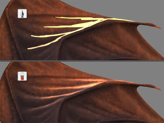
Paint the general lighting with the Inking Pen brush. Don’t think about details yet, just try to sculpt the general form.
Blend the shading to make it smoother.
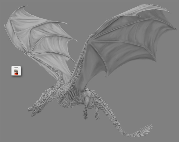
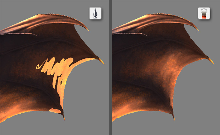
Now, using white as light and 50% gray as shadow, shade all the details. Feel free to show the color layer from time to time to see how it looks all together.
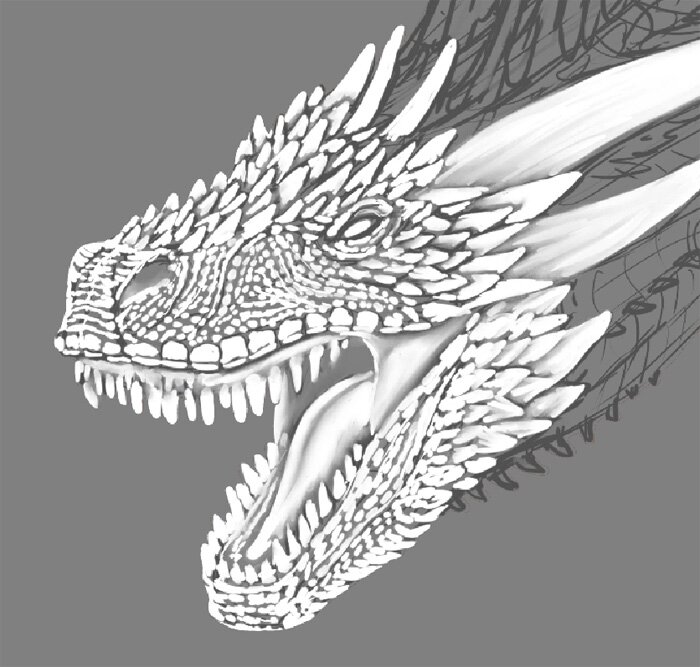
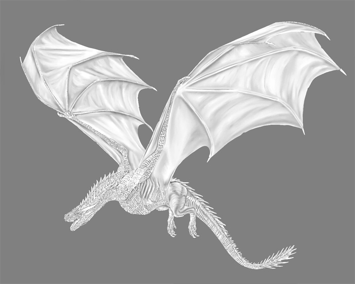
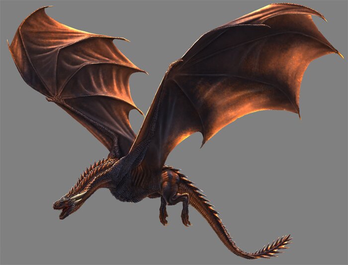
That’s how my Drogon looks with lighting added. Much more alive!
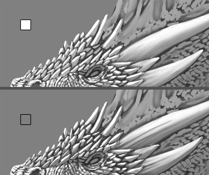
Glow
Drogon has very dark coloring, and even full direct light can’t turn a dark color into a bright color. However, there’s a workaround to this problem: a strong glow that will create an overexposure effect. It must be used sparingly and skillfully, but it will make our Drogon look magical!
Again duplicate the original mask. Drag it on top of the layers and fill it with black.
Change the Blend Mode to Glow. It will make black transparent.
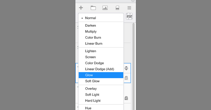
We must paint very carefully in this mode, lest we destroy the realistic colors. Select a color of the light source, but make it desaturated and not 100% bright.

Now paint over the details, just where it’s needed, and don’t be afraid to blend to make the effect less striking.
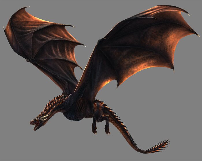
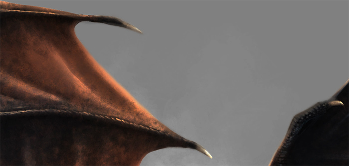
You can use this effect to brighten the translucent parts of Drogon-the fins. Their shadow should be broken by the light coming through them.
And done! Doesn’t he look much prettier now? And that was just a simple trick!

Reflected Light (Optional)
This part is optional, because our Drogon seems pretty well illuminated because of ambient occlusion. However, additional reflected light coming from the side opposite to the light source will help us define the important details that have been staying in the shadow.
For reflected light we can use another Glow layer. This time use a cool color, still desaturated, but even darker than before. Reflected light can’t be stronger than direct light!

Carefully paint the details you want to show.
Here’s my Drogon with its reflected light finished.
Final Rendering
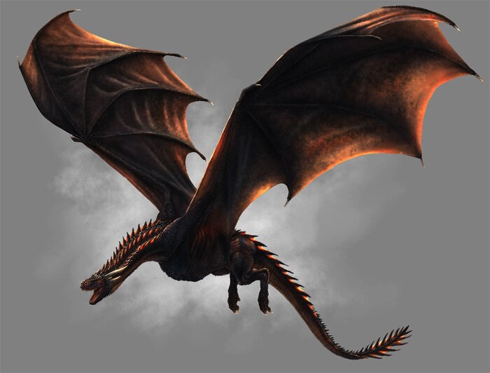
Our Drogon looks very fine now, but there’s still room for more. I have been intentionally ignoring certain mistakes up until this point, to not get caught up in them. They say: “Better done than perfect”-but once it’s done, you can keep working on making it better.
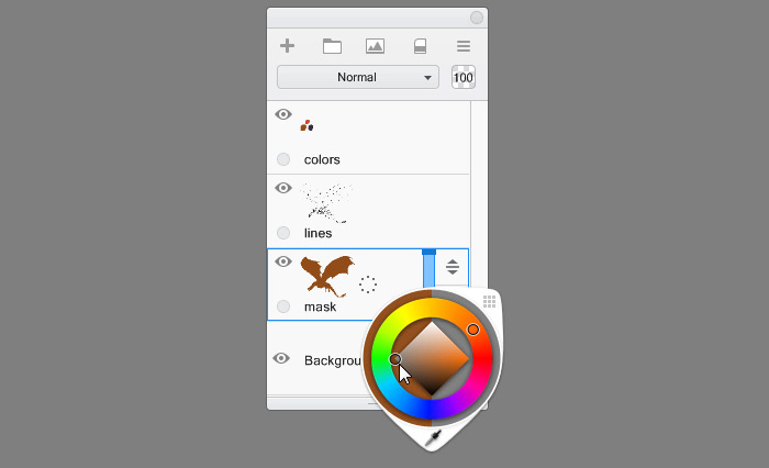
We have finished the lighting, so now we can take a second look at the colors. Come back to that color layer, and adjust everything that doesn’t seem right. For example, you can safely add very dark shades without any risk of concealing the lines (which have been replaced with shading).
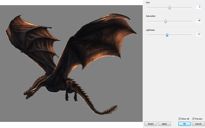
I have noticed my Drogon is too brightly colored. If you have the same problem, go to Image | Adjust | Hue/Saturation and make some adjustments to make the image more accurate.
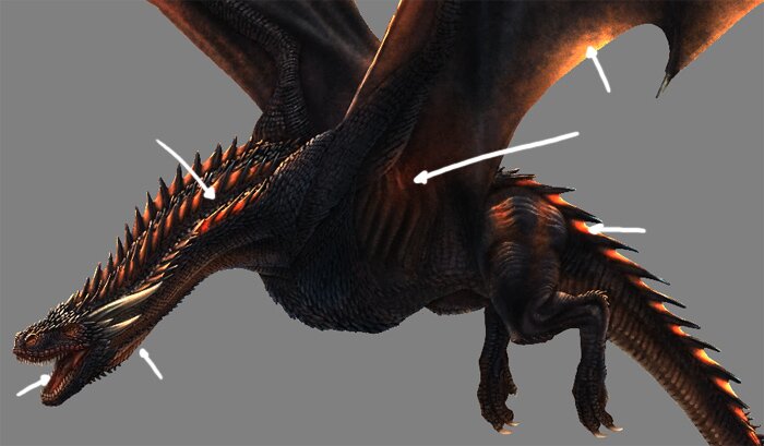
Although Drogon is not brightly colored, he makes up for it with special effects. Let’s add some subsurface scattering! Duplicate the original mask again, move it up and fill it with black. Change its mode to Color Dodge.

Select medium bright, saturated orange.

Gently paint over the areas where the light shines through the surface, or where the body is soft, bright, with veins just beneath. It will make these parts look more alive.
Finally, merge all the layers and fix all the minor mistakes.
You can add some blurry background, for example using the Cloud Brush Set.
To make the dragon more dynamic, you can softly blend the edges. Just be careful not to destroy the edges completely!
Finally, make sure the contrast of the image is right (Image | Adjust | Brightness/Contrast) and change the size of the picture to something more approachable for your viewers.
We’re Done!
Whew, that was a long tutorial! But I hope you have learned a lot about painting dragons in SketchBook – not only Drogon, but all the beasts you can imagine.
0 Comments