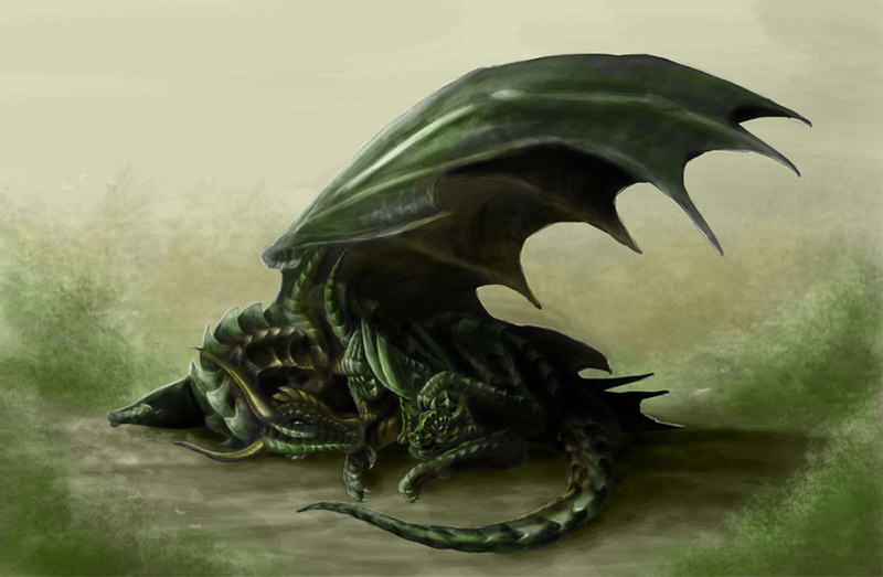
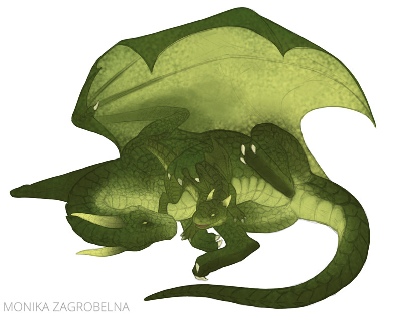
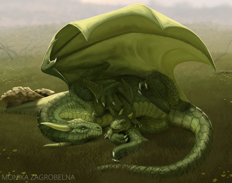
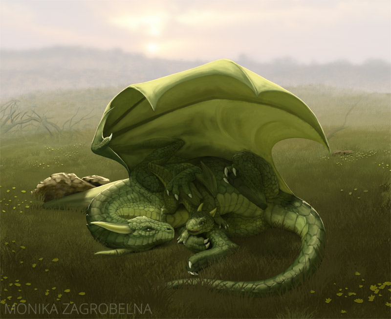
In July 2011 I painted this nice heartwarming scene of a dragon mama with her baby. I was very proud of it at that time—I thought it was quite realistic.
But 10 years passed by, and I’ve imporved a lot. So I’ve started to wonder—what would this scene look like if I painted it today? I think showing how my techniques changed over the years can be pretty educational, and that’s why I’ve created this article. I hope you’ll find it useful!
1. Sketch
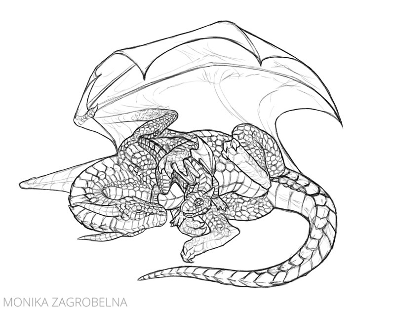
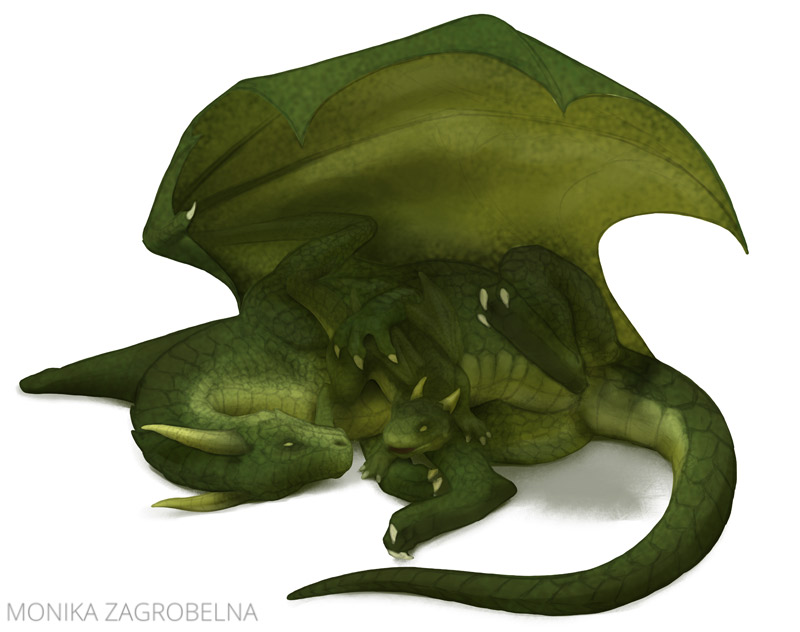
I decided to create new line art for this picture first. I think I did a pretty good job in the original image, but I find the pose slightly too stiff. I did my best to make the new sketch very similar, while “fixing” it in the areas that were bothering me.
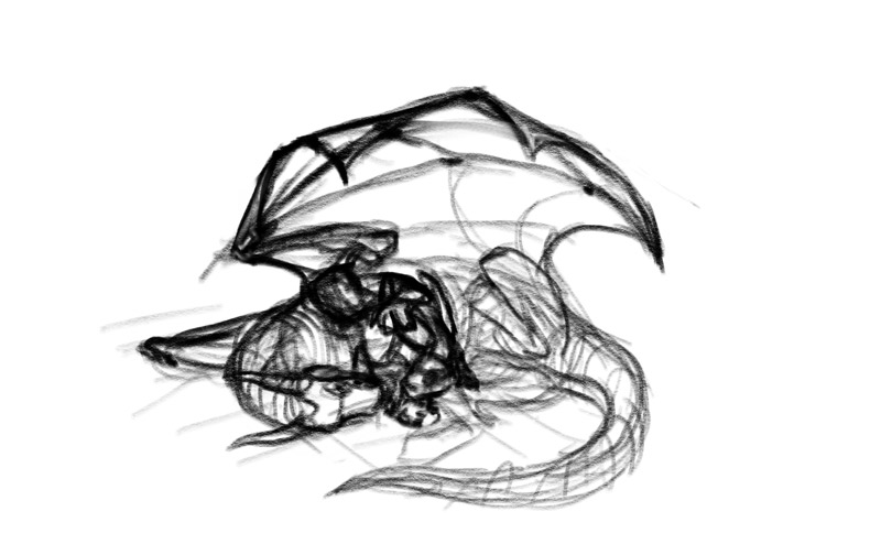
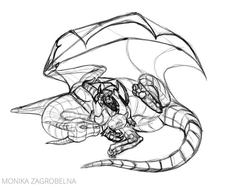
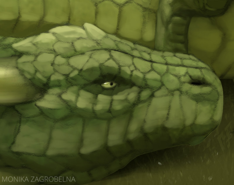
Nowadays when I draw dragons I avoid covering them with big scales, to save time. But I wanted to be faithful to the original, so I’ve added detailed scales all over the body.
2. Colors
When I painted the original image, coloring was still every confusing to me, so I did the whole thing in grayscale. Then I experimented with various Blend Modes to color the shades of gray underneath. But because I had no idea about the concept of value, both greens and yellow turned out equally dark.
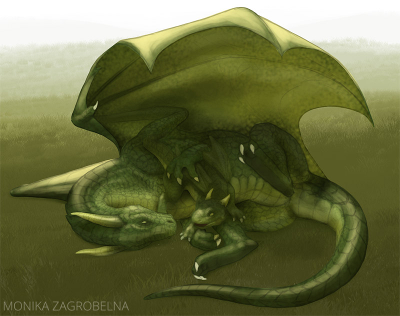
This time I used colors from the start—to make it simpler, I’ve imagined what the colors would look like if there were no shadows in the scene.
3. Shadows
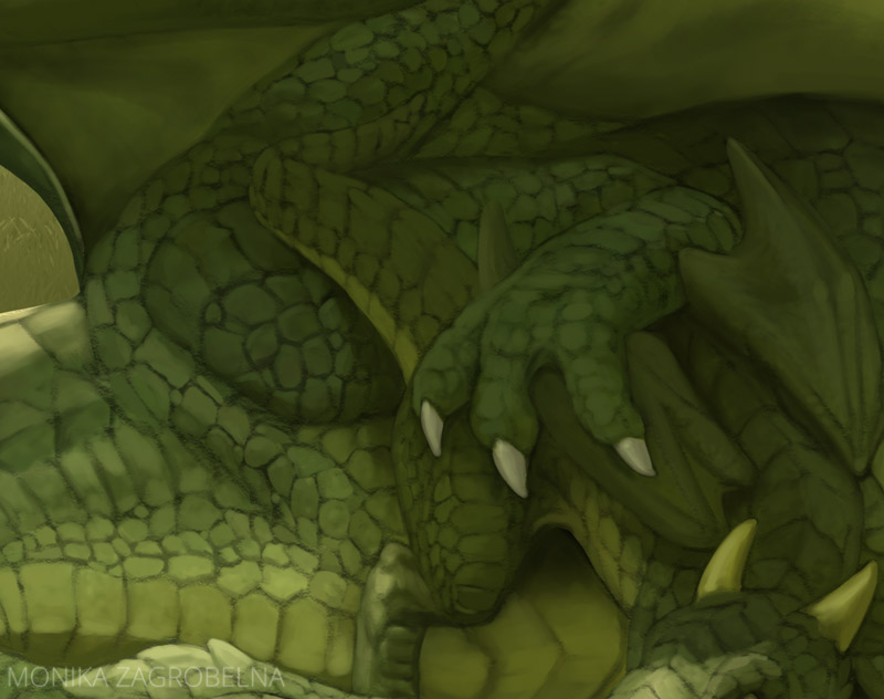
The shadows are the biggest offender in the original image. Because my initial colors were so dark, I had to make the shadows much, much darker to create a proper contrast. In result, a lot of the details got lost in the shadow, and they also turned out completely black, which isn’t very natural.
In the new version I made the shadow very subtle—just enough to accentuate the 3D form of the bodies. Although the wing covers both dragons, I think it’s not thick enough to keep the light from shining through, so it shouldn’t cast a dark shadow either.
4. Highlights
The original has a very simple background—I wasn’t comfortable with painting them, and I still don’t like painting them. I can do a decent job, if I really try, but it’s very time consuming, and I prefer to keep my artworks without a background most of the time. But because I wanted to be close to the original, I’ve added a simple grassy background to my image.
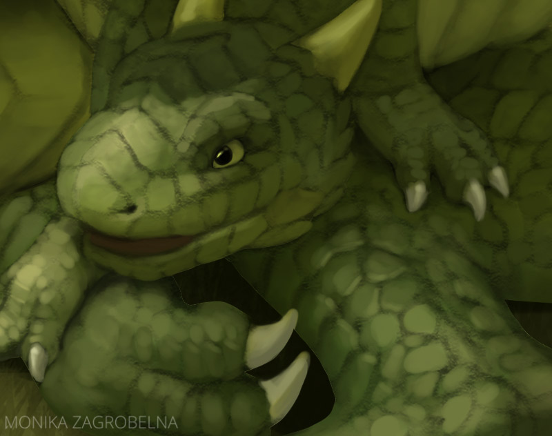
It was also the time to add some shine to the bodies. In the original I painted it with white; this time I’ve used creamy-yellow which looks more like sunlight. Over the years I’ve learned that white looks great in the form of very small highlights, and if I try to use it on bigger areas, it only desaturates the colors.
5. Details
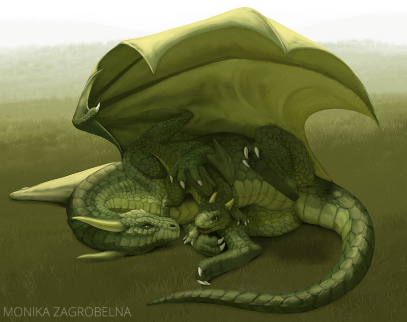
In the original I was done with the details even before adding the colors. Today I prefer to quickly prepare a rough sketch of all the elements of the image—colors, shadows, highlights—and only then slow down and add the details. This way I can see what the image is going to look like before investing more time in it.
But after I finish and accept the rough sketch, it’s time to put the hours in. I didn’t remove the line art, but instead I used the lines as a shadow, covering it where necessary. Because all the colors were already in place, I just had to use the Eyedropper tool to pick the colors from the area, and apply them with a smaller brush.
6. Final Touches
To make the artwork look more finished, I added more details to the background. Then, to increase the contrast, I darkened the main shadow a little, and added a subtle rim light.
To finish the background faster, I’ve replaced the sky with this photo.
Conclusion
Let’s compare both images now! Even though the second painting is far from perfect (I can already spot a couple of issues I would fix if I were to do it again), it’s clear I’ve improved a lot during last 10 years. This is an exercise I recommend to every perfectionist out there—you may feel like you haven’t been progressing at all, but comparing your current skills to the ones you had in the past will show you how wrong you are.
1 Comment