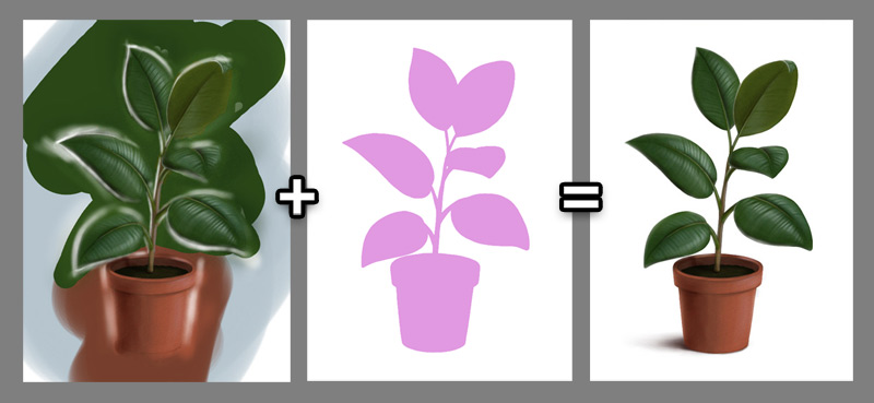
The newest version of Sketchbook Pro comes with a completely new panel called Custom Colors. At first it may seem just like a window for color swatches—but it’s far more than that!
How to Use the Color Sets in Sketchbook Pro
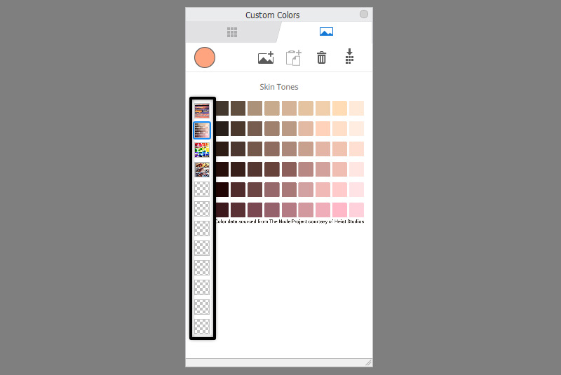
The Custom Colors window has two tabs: Palettes and Images.
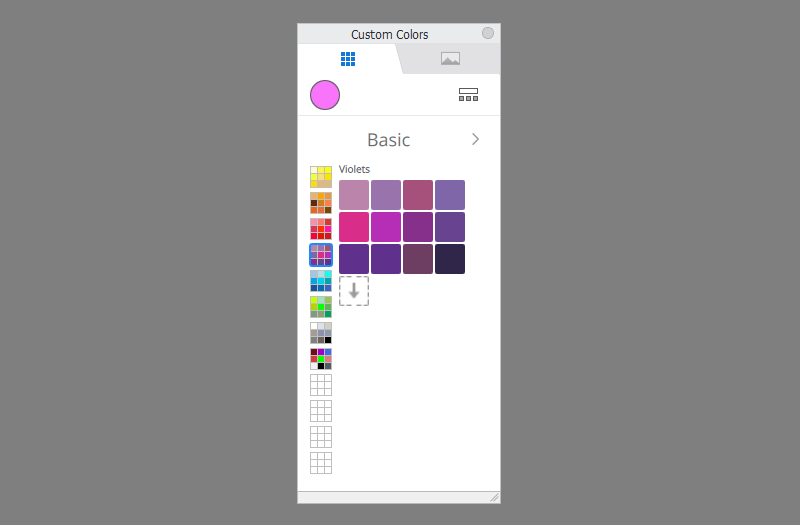
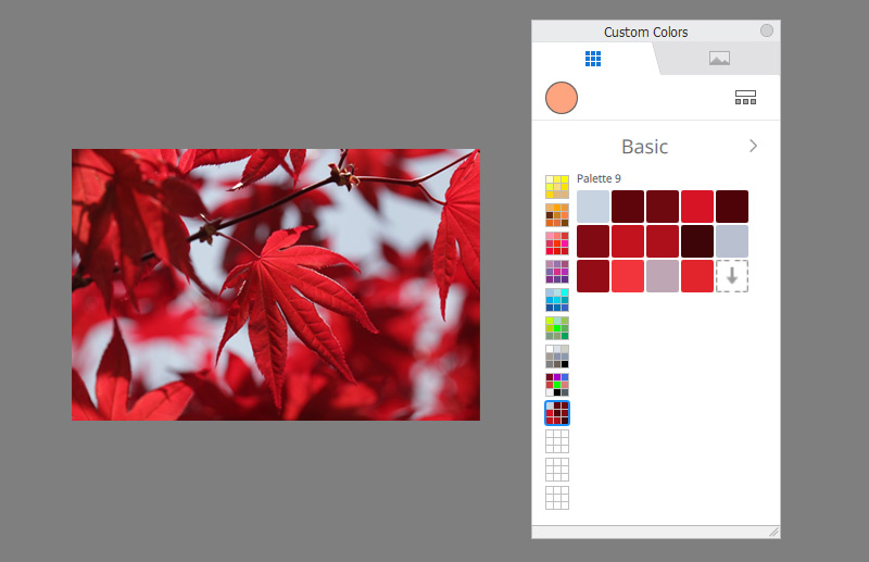
The Palettes tab (1) contains groups of color swatches, called Color Sets (2). Each Color Set contains 12 subgroups called Palettes (3): for example, the Greys set contains palettes like Neutral Greys or Cool Greys. Each palette can contain up to 60 color swatches.
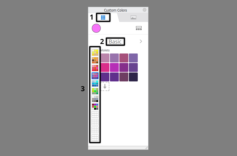
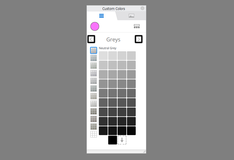
To move between the Color Sets, use the arrows next to the Color Set name.
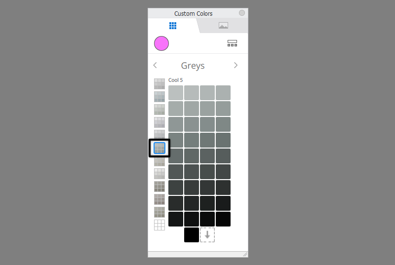
To move between the Palettes, just click their thumbnail on the left.
If you want to manage the Color Sets, click the icon on the right. Here you can change the order in which the sets appear once you click the arrows (2). In the menu of each Color Set (1) you can also change its name, duplicate it, export it, or delete it.
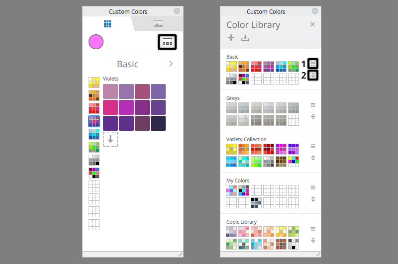
You can also create a new Color Set by clicking the plus icon in the upper bar.

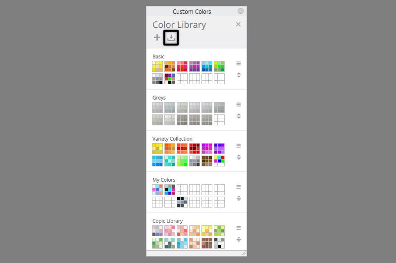
To import a previously exported set, use the icon next to the plus icon.
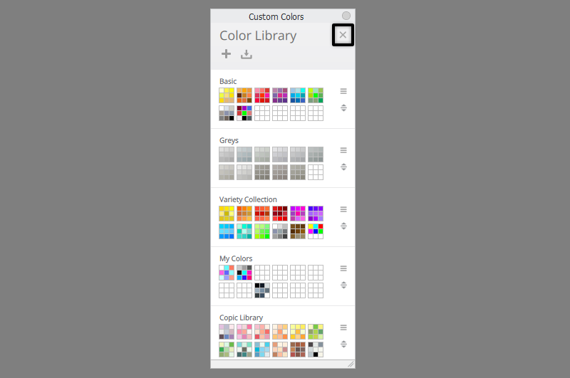
To go back to the previous view, just click the X icon in the upper right corner.
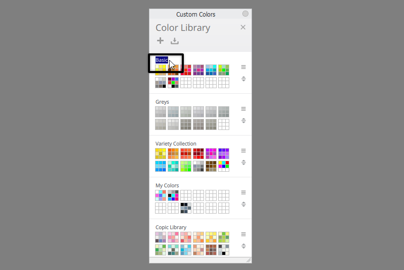
You can also change the name of the Color Set right where it appears. Similarly, you just need to click on the Palette name to change it.
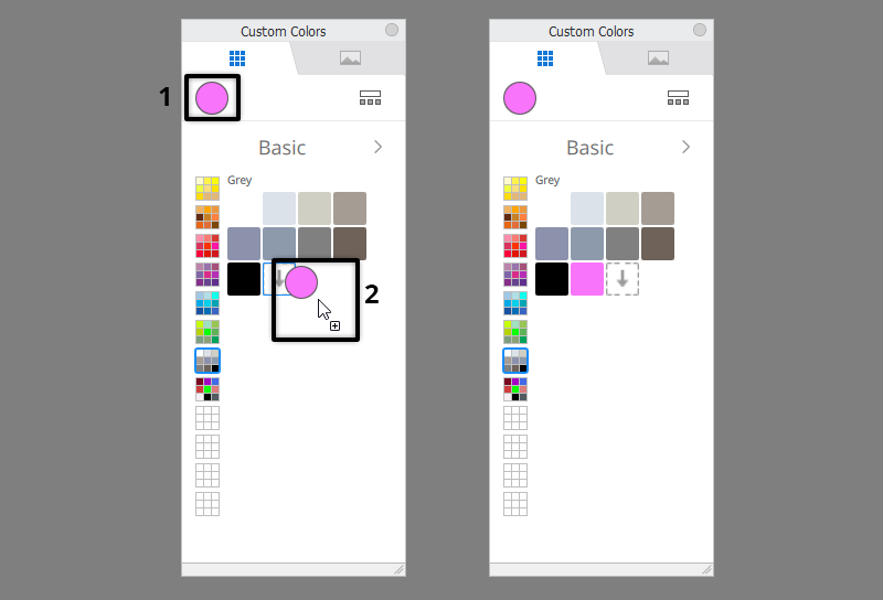
To add a new color to any Palette, just drag the colorful circle in the upper left corner to the selected list, or simply click the arrow icon (“the empty swatch”).
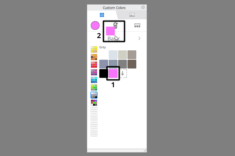
To remove a swatch, drag it up, towards the trashcan icon that will appear in the process.
How to Use the Color References in Sketchbook Pro
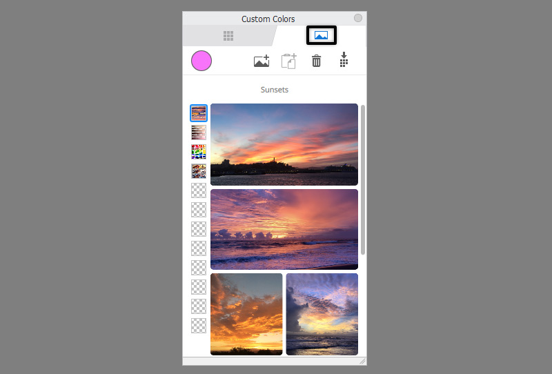
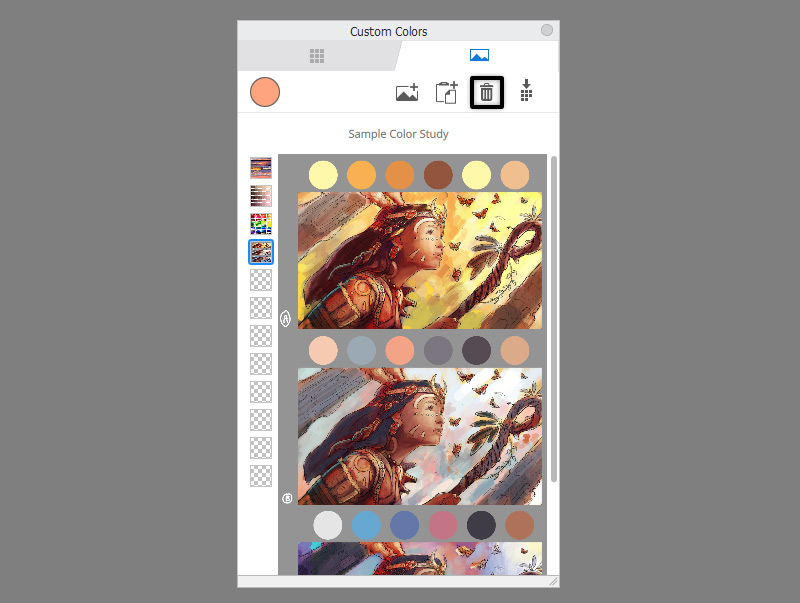
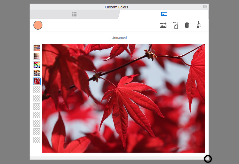
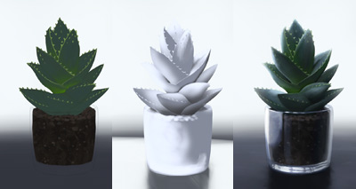
Let’s move to the second tab now—the Images tab. At first, it may seem just like a window where you can put a photo that you want to look at while drawing. And it can certainly be used like this, but it’s more than that!
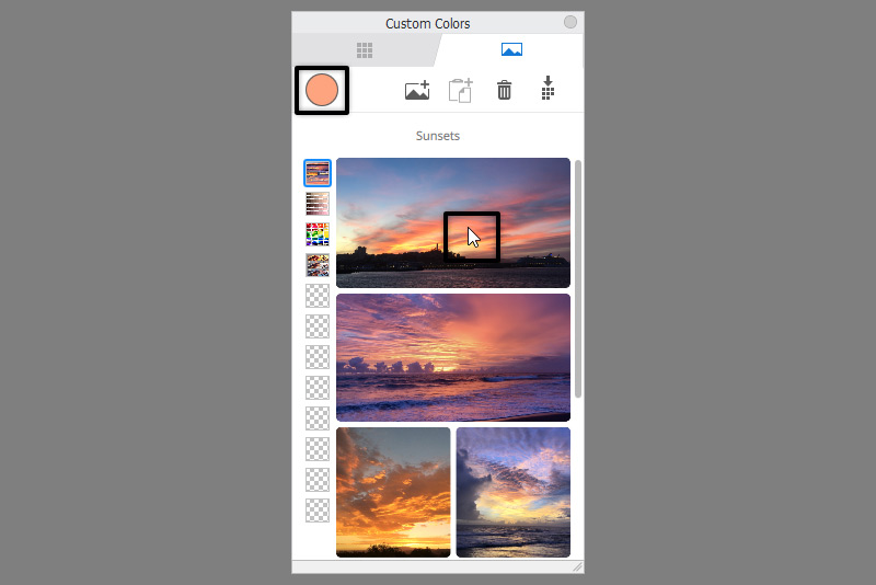
First, just click at the photo, in any place—you’ll see that it will automatically load the color from that area to your brush. No need to use the color picker! So you can just click and draw, click and draw—just as if you were simply reaching to the paint palette with your brush.
Now that you know why this panel is so useful, let me show how to use it. First, take a look at the thumbnails on the left—you can use them to switch between various references, just like you did with the Color Palettes.
You can load a photo to any of those sets in two ways: you can click the first icon in the upper to load a photo from a file (1), or click the second icon to paste the content you currently have in your clipboard (2). The second option is great if you’ve mixed your colors directly in Sketchbook, and now you want to put them next to the canvas like a paint palette.
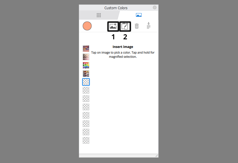
The third icon—the trashcan—deletes the image loaded into the current set.
The last icon is the most interesting one of them all. You can use it to convert the colors from the image into a Color Palette!
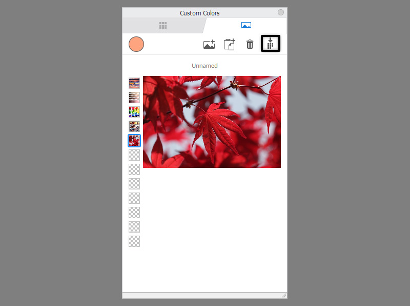
First decide where you want to save this new Palette to (an existing set or a new one) (1), and then experiment with the settings to get the amount and variety of swatches you need:
- Drag the Maximum Colors slider (2) to decide how many colors you want to extract from the photo.
- Choose the Extraction Method (3) to decide which colors the algorithm should focus on: the Most Frequent ones, the Brightest ones, or the Darkest ones.
- Let the algorithm know how you want it to tell one color from the other: by comparing RGB values, Hue, Lightness, or Saturation (4). No Merge option doesn’t compare the colors, so it can result in plenty of duplicates.
- Drag the difference slider (5) to tell the algorithm how different the colors must be in order for it to consider them separate swatches. The lower the value, the more swatches you’ll get, but the higher the value, the more different they will be from each other.
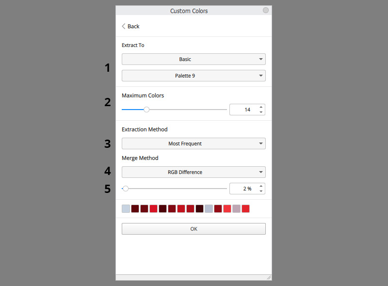
Once you click OK, the Palette will be added to the chosen location.
One last thing: there’s no zoom option at the moment, but you can make the reference photo larger by resizing the window.
That’s All!
So, isn’t it a great feature? You can finally create a Color Palette for each of your characters, pick colors directly from a photo reference, or extract a color scheme from a photo. Another great tool in the artistic arsenal!
Check out my tutorials for other features from the 9.0 update here:
0 Comments