The newest update to Sketchbook Pro has brought some improvements to the Color Editor to make it more convenient to use. However, this has also made the Color Editor panel look more complicated at first glance, so here’s a quick guide on how to use it.
Current and Previous Colors
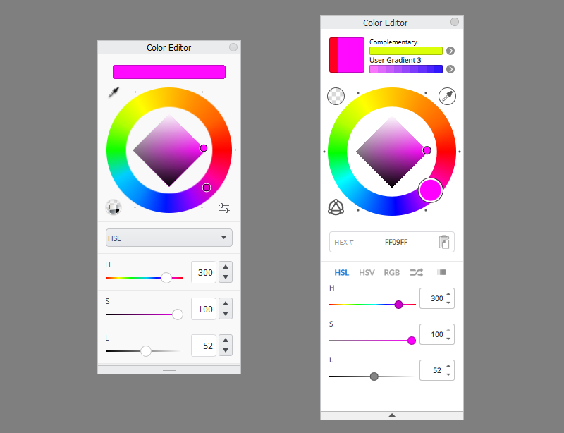
Let’s start from the top. In the first section you can see a big square presenting the current color (the active color) compared to the last used color. So if you want to achieve a slightly darker shade, or slightly more saturated shade, just look at this square to get a clear comparison.

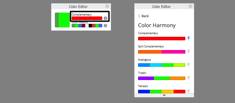
Next to it you have two bars. The upper bar is the Color Harmony bar. By default it shows you the color complementary to the one you’ve selected, and you can quickly load it by clicking the bar. If you click the arrow on the right, you’ll be able to switch to other harmonies known from color theory, like analogous or triadic.
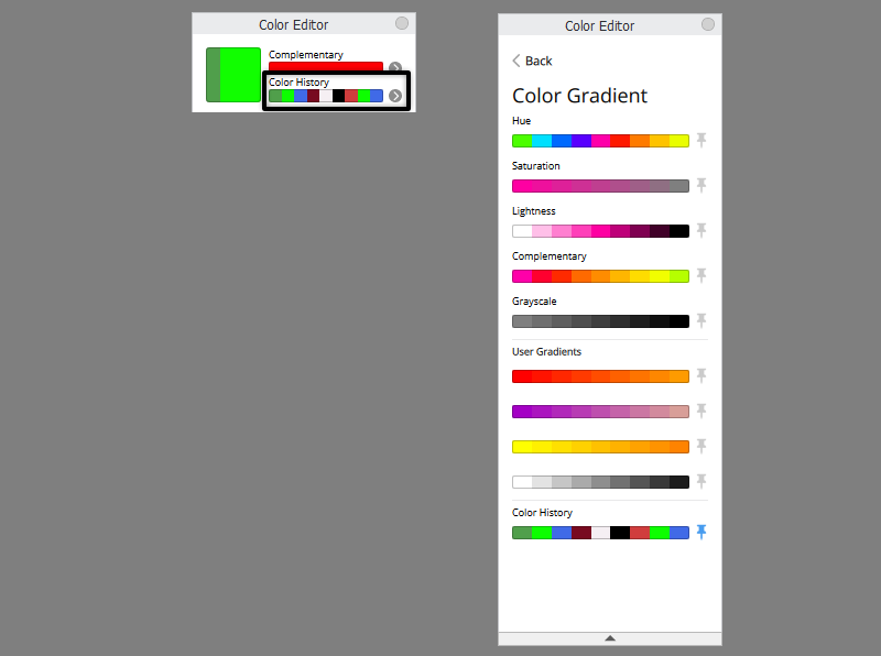
The lower bar by default shows you the colors you’ve used before—the Color History. However, if you click the arrow on the right, you can replace it with plenty of other useful swatch sets! For example, this bar can show you the Saturation variants of the chosen color, or one of your gradients.
The Color Wheel
The color wheel hasn’t changed that much: the square shows the variants of different Brightness and Saturation of the current color, and the wheel around it allows you to change the Hue. But let’s take a look at the icons around the wheel:
- This is the Toggle Transparent Color button. It allows you to quickly turn the current brush into an eraser. Once you click it, the active color will show a transparency checkerboard instead of a color. Click it again to bring your brush back.
- This is the Color Picker button. So this is where you can activate the Color Picker tool if you don’t have a keyboard and can’t use the Alt shortcut.
- This button will show you a visualization of the chosen Color Harmony mode. It’s great for learning the basic color theory!

There’s also a text field below the wheel. It shows you the hexadecimal value of the current color. You can easily copy it by clicking the button on the right. You can also type/paste any hex value into this field.

Hue, Saturation, Lightness Sliders
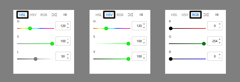
The last section contains color sliders. Sketchbook, by default, uses Hue/Saturation/Lightness sliders. But if you’re more used to Hue/Saturation/Value that Photoshop uses, you can switch to it now. You can also switch to the RGB mode.
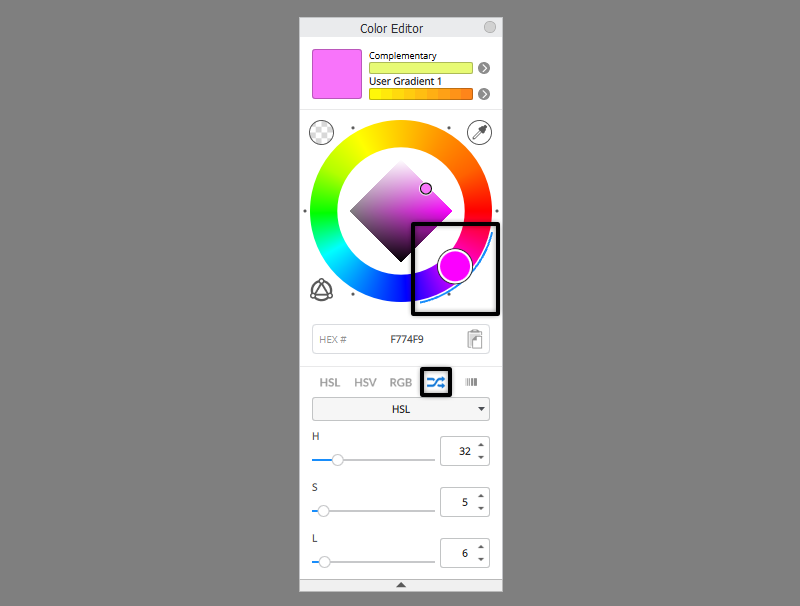
The next mode is called Randomize. This is an extremely useful mode that will help you add a natural color variety to your artwork! Basically, it loads a new color for you with every stroke you make, using a predefined range of colors for it. You can select three types of ranges:
HSL allow you to define the range within each component of HSL—so you can define how much variety in Hues, Saturation, and Lightness you want. That range will be indicated on the Color Wheel.

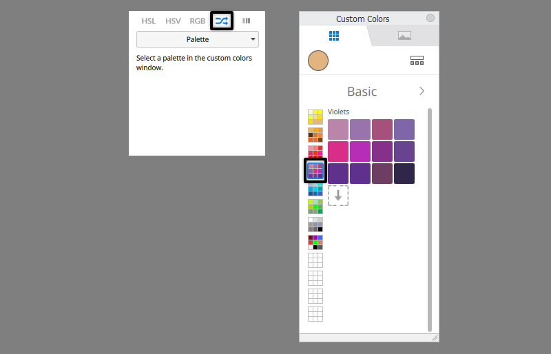
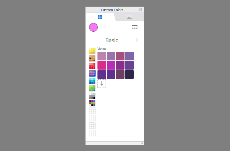
Palette will randomly pick colors from the palette you have currently active in your Custom Colors panel. So this allows you to create a very precise range of colors beforehand, and then use them all in your drawing without having to pick them one by one.

Gradient picks the colors from a selected gradient. How to select a gradient? Just use that lower bar in the first section to pin one of the gradients. This option allows you to draw with colors that are transitional between two selected colors.
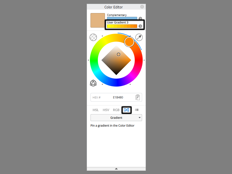

The last position gives you access to four user gradients. To edit a gradient, select either the first or the last color, and adjust it with the Color Wheel.

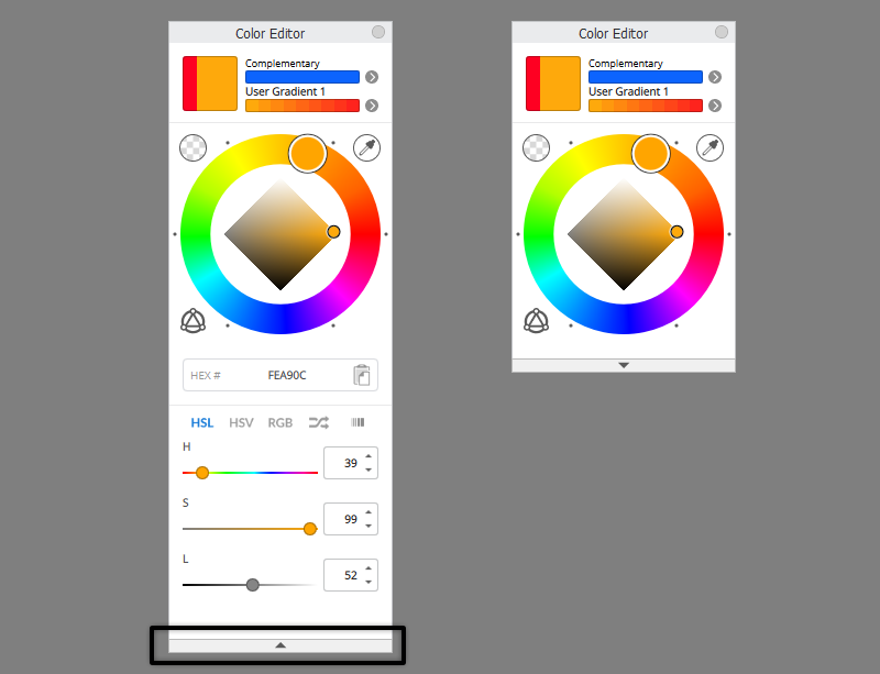
One last thing: if you don’t use the color sliders, and want to have a cleaner workspace, you can use the arrow on the bottom to hide the last section of the Color Editor.
That’s All!
Now you know all the secrets of the new Color Editor in Sketchbook Pro!
Check out my tutorials for other features from the 9.0 update here:


0 Comments